Band 6.5 IELTS Writing Task 1 Model Answer
Overall Band Score: 6.5 · Cambridge IELTS 17 · 2026-11-18
IELTS Writing Task 1 question
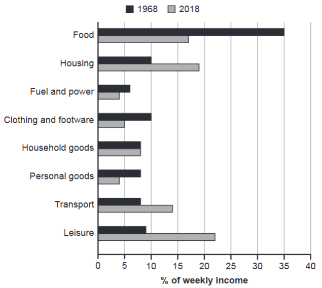
The chart below gives information about how families in one country spent their weekly income in 1968 and in 2018.
Summarise the information by selecting and reporting the main features, and make comparisons where relevant.
1968 and 2018: average weekly spending by families
Student answer (Band 6.5)
THE GRAPH GIVEN HERE ILLUSTRATES THE WEEKLY INCOME SPEND ON THE FAMILIES IN TWO DIFFERENT ERA. THE DETAILS ON WHAT THINGS THEY HAVE SPENT THEIR INCOME IS MADE LEARN SUCH AS DAILY EXPENSES .
OVERALL 35% OF INCOME HAS BEEN SPENT ON FOOD IN 1968 WHEREAS IN 2018 THAT RATIO HAS BEEN REDUCED TO 18%.IT CAN BE SEEN THAT 23% ON INCOME WAS SPENT ON LIESURE IN THE YEAR 2018 WHICH IS PROBABLY THE HIGHEST PERCENT OF 2018 AS COMAPRED TO OTHER EXPENSE .
HOUSING ALSO SAW A BIG INCREASE , RISING FROM 10% TO NEARLY 20%. SIMILARLY , TRANSPORT SPENDING WENT UP FROM 8% TO 14%.
ON THE OTHER HAND , SPENDING ON CLOTHING AND FOOTWEAR DROPPED FROM10% TO 5%. PERSONAL GOODS ALSO HALVED , FROM 8% TO 4%. FUEL AND POWER SAW A SMALLER FALL , FROM 6% TO 4%.
THE ONLY CATEGORY THAT STAYED ALMOST THE SAME WAS HOUSEHOLD GOODS , WHICH WAS AROUND 8% IN BOTH YEARS .
AI examiner evaluation
| Criterion | Band |
|---|---|
| Task Achievement / Task Response | 7.5 |
| Coherence and Cohesion | 7.0 |
| Lexical Resource | 5.5 |
| Grammatical Range and Accuracy | 5.5 |
| Overall | 6.5 |
Task Achievement / Task Response: Band 7.5
The response identifies the main shifts clearly: food falls substantially, while leisure, housing and transport rise, and household goods remain stable. It also supports these points with relevant figures, such as food at 35% and about 18%, housing rising from 10% to nearly 20%, and transport from 8% to 14%. The overview correctly highlights food as the leading category in 1968 and leisure as the largest in 2018. Most reported values match the chart, with small approximations acceptable. To strengthen the account further, make the overall comparison more comprehensive by noting that food was the largest category in 1968, whereas leisure became the largest in 2018, and that several other categories declined. The opening description is unclear and does not add useful information about the chart’s subject or units.
Coherence and Cohesion: Band 7.0
The information is arranged in a clear progression: an introduction and overview are followed by increases, decreases and the unchanged category. This grouping makes the comparisons easy to follow, and linking phrases such as “whereas,” “similarly” and “on the other hand” help signal contrasts. The final paragraph also gives a useful closing comparison. However, the opening sentences are difficult to interpret, so the reader does not receive a clear introduction before the overview. Some transitions and punctuation are separated awkwardly, as in “increase , rising” and “On the other hand ,”. Use a concise opening that names the chart and its measure, then connect the overview and detail paragraphs smoothly without unnecessary spacing around punctuation.
Lexical Resource: Band 5.5
The response uses some suitable comparison language, including “reduced,” “rising,” “dropped,” “halved” and “stayed almost the same.” These choices help describe the main trends without repeating the same verb throughout. However, several word choices and collocations are inaccurate or unclear, particularly in the opening: “weekly income spend on the families” and “made learn such as daily expenses.” There are also spelling errors, including “liesure” and “comapred,” and “ratio” is not the most precise term for a percentage share. Aim for standard chart-reporting phrases such as “families’ weekly expenditure” and “accounted for,” and check spelling carefully. More precise vocabulary would make the meaning consistently clear.
Grammatical Range and Accuracy: Band 5.5
There is some variety in sentence structure, including comparison clauses with “whereas,” participle phrases such as “rising from 10% to nearly 20%,” and a relative clause in “which was around 8% in both years.” These structures generally communicate the trends. However, grammatical control is uneven, especially in the opening: “The details on what things they have spent their income is made learn” has problems with clause structure and verb formation. The first sentence also has errors in number and construction (“two different era”), while missing spaces after full stops and inconsistent comma spacing affect punctuation. Practise building clear subject–verb sentences, for example, “The chart shows how families allocated their weekly income,” and proofread agreement, sentence boundaries and punctuation.
See this exact question answered at other band scores. The same prompt compared across bands.
Browse more IELTS Writing model answers or get your own writing scored by the same AI examiner.