Band 5.0 IELTS Writing Task 1 Model Answer
Overall Band Score: 5.0 · Cambridge IELTS 17 · 2026-11-18
IELTS Writing Task 1 question
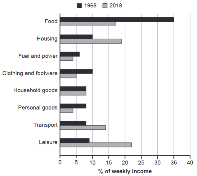
The chart below gives information about how families in one country spent their weekly income in 1968 and in 2018.
Summarise the information by selecting and reporting the main features, and make comparisons where relevant.
1968 and 2018: average weekly spending by families
Student answer (Band 5.0)
The chart below gives information about how families in one country spent their weekly income in 1968 and in 2018.
The income of families spent in many things like food,housing ,fuel,clothing and leisure.
in 1968,we noticed that food ,housing took a big part of income .oppsite to fuel ,clothing ,transport and leisure.
in 2018 we noticed that the percentages decreasing the half on spending food 35% to 17%,clothing and software10% to 5% .
besides we noticed that the percentages increase on spending transport 8% to 14% and leisure 8% to 23% also housing 10% to 19%. morever the personla goods is the same between the two times 8%.
in conclusion the percentages of needs are changed between the two times .families must be aware and responsible for the needs of thier childreen and must be wise how to split the income.
AI examiner evaluation
| Criterion | Band |
|---|---|
| Task Achievement / Task Response | 5.0 |
| Coherence and Cohesion | 5.5 |
| Lexical Resource | 5.0 |
| Grammatical Range and Accuracy | 5.0 |
| Overall | 5.0 |
Task Achievement / Task Response: Band 5.0
You identify several important changes, including the fall in food spending from 35% to 17% and rises in housing and transport. However, the response only partially covers the chart: it gives no clear overview of the main pattern, omits notable categories such as fuel and power and household goods, and incorrectly says personal goods stayed at 8% (it fell to 4%). Leisure is reported as rising to 23%, close to the chart’s approximate 22%. The final advice about families being responsible for children’s needs is not supported by the chart and should be replaced with a data-based summary. The response is 121 words, below the 150-word minimum; 20 copied prompt words were excluded from the count.
Coherence and Cohesion: Band 5.5
There is some basic organisation: the response moves from 1968 to 2018 and uses linking expressions such as “besides” and “in conclusion.” This gives the reader a general sense of the comparison. However, the ideas are compressed into one block, with no clear paragraphing or distinct overview, and the sequence of categories is difficult to follow. Connectors such as “oppsite” and “morever” are either inaccurate or misspelled, while the conclusion introduces advice rather than drawing together the chart’s main trends. Grouping the largest falls and rises into separate paragraphs, then ending with a concise overview, would make the progression clearer and reduce the impression of a list.
Lexical Resource: Band 5.0
The response uses some relevant chart vocabulary, including “percentages,” “spending,” “income,” and category names, so the topic is generally understandable. However, the range is limited and several word-choice, collocation, and spelling problems make parts unclear. “The income of families spent” is an awkward way to describe expenditure, and “clothing and software” appears to misname clothing and footwear. Other errors include “oppsite,” “morever,” and “personla.” The phrase “needs of their children” is also an unsupported interpretation rather than precise chart language. Use accurate category labels and expressions such as “accounted for,” “rose,” and “fell” to report the figures more clearly.
Grammatical Range and Accuracy: Band 5.0
Most of the response relies on short, simple statements, with limited evidence of varied sentence structures. Attempts to connect ideas often produce faulty constructions, for example, “The income of families spent in many things” and “the percentages decreasing the half on spending food.” There are also inconsistent verb forms and sentence boundaries, as in “in 1968,we noticed” and “in 2018 we noticed that the percentages increase.” Capitalisation and punctuation are frequently missing or inconsistent, which makes the text harder to read. Practise forming complete comparison sentences with a clear subject and verb—for example, “Food spending fell from 35% to 17%”—and check tense, articles, and punctuation throughout.
See this exact question answered at other band scores. The same prompt compared across bands.
Browse more IELTS Writing model answers or get your own writing scored by the same AI examiner.