Band 5.5 IELTS Writing Task 1 Model Answer
Overall Band Score: 5.5 · Cambridge IELTS 17 · 2026-11-19
IELTS Writing Task 1 question
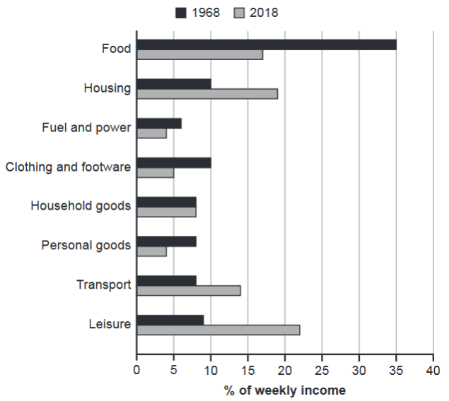
The chart below gives information about how families in one country spent their weekly income in 1968 and in 2018.
Summarise the information by selecting and reporting the main features, and make comparisons where relevant.
1968 and 2018: average weekly spending by families
Student answer (Band 5.5)
The given bar graph depicts the information about the portion of their weekly income on Food,Housing,Transport and much more spent by the families in one country during 1968 and 2018.
Overall, the chart shows that the food is a specific category in which most of the income was spent in the year 1968.In addition, the weekly expenditure on personal goods,Fuel and power was relatively very low.
In 1968, the average weekly spending on food is almost 35% which was gradully decrease to 17%. Futhermore, families spend almost 10% of their income on Housing, Clothing and footwear.While the other categories including Fuel and power,household and personal goods, Transport and leisure lies bleow 10%.
In 2018, Most of the people spend their weekly income on their leisure which about 22%. Moreover, they spend approximate 18% income on housing. In this year people was not spending their income on personal goods and Fuel which is comparitively low almost 4%.While the other categories like household goods, clothing and footwear, Trans
AI examiner evaluation
| Criterion | Band |
|---|---|
| Task Achievement / Task Response | 5.5 |
| Coherence and Cohesion | 5.5 |
| Lexical Resource | 5.5 |
| Grammatical Range and Accuracy | 5.0 |
| Overall | 5.5 |
Task Achievement / Task Response: Band 5.5
You identify the main contrast that food took the largest share in 1968, while leisure was highest in 2018, and you include several relevant figures, such as food falling from about 35% to 17% and leisure reaching about 22%. However, the account is only partial: it does not clearly compare all the categories across the two years, and the final sentence is cut off before the remaining 2018 figures are reported. The overview also says personal goods and fuel were very low without making clear that this applies across both years, and the claim that people were “not spending” on them is inaccurate because both categories still account for around 4% in 2018. A fuller overview and more complete, accurate comparisons would strengthen the response.
Coherence and Cohesion: Band 5.5
The response has a recognisable structure, moving from an introduction and overview to separate comments on 1968 and 2018. This gives the reader some organisation, and linking expressions such as “Overall,” “Furthermore,” and “Moreover” help signal relationships. However, progression is limited because several categories are grouped together without a clear comparison, and the final sentence ends abruptly at “Trans,” leaving the discussion incomplete. Some connections are also unclear: “In addition” introduces a low-spending point that does not directly develop the preceding overview, while repeated “In this year” phrasing makes the account feel list-like. Use complete paragraphs and organise the details around the largest rises and falls to make the progression clearer.
Lexical Resource: Band 5.5
You use relevant chart vocabulary, including “weekly income,” “average weekly spending,” “category,” and “expenditure,” so the topic is generally clear. There is also some attempt to vary wording through phrases such as “portion” and “spend.” However, the range is limited and several word-choice or spelling problems reduce precision: “specific category” is unclear for the intended meaning, “gradully decrease” is not an appropriate description of the change, and “comparitively” is misspelled. “People was not spending” also expresses the data too strongly; a phrase such as “spending was relatively low” would be more accurate. Aim for precise trend language and check spelling, especially for category names and common academic terms.
Grammatical Range and Accuracy: Band 5.0
You attempt both simple and more developed sentences, including a relative clause in “a specific category in which most of the income was spent” and a comparison using “which was … decrease to 17%.” However, control is inconsistent, and errors sometimes make the intended relationships difficult to follow. For example, “the average weekly spending … is almost 35% which was … decrease” shifts tense and has a faulty verb construction; “people was not spending” has incorrect subject–verb agreement; and “they spend approximate 18% income” lacks grammatical elements needed for a complete phrase. Punctuation is also unreliable, with missing spaces after commas and full stops. Practise accurate past-tense reporting and complete sentence patterns before adding more complex structures.
See this exact question answered at other band scores. The same prompt compared across bands.
Browse more IELTS Writing model answers or get your own writing scored by the same AI examiner.