Band 6.0 IELTS Writing Task 1 Model Answer
Overall Band Score: 6.0 · Cambridge IELTS 17 · 2026-11-19
IELTS Writing Task 1 question
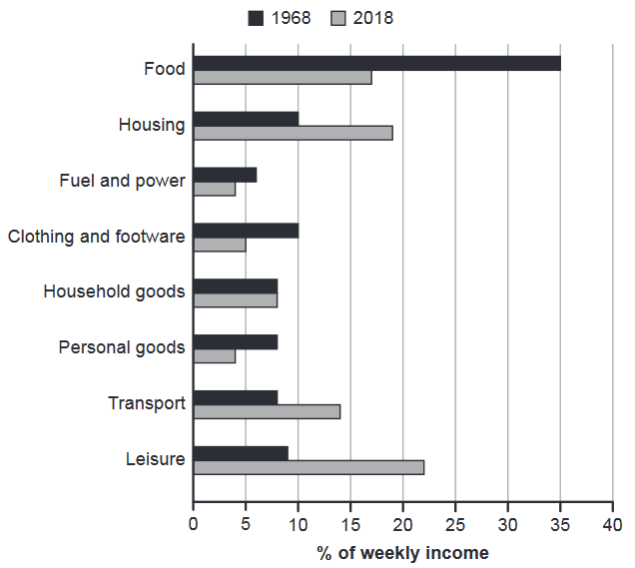
The chart below gives information about how families in one country spent their weekly income in 1968 and in 2018.
Summarise the information by selecting and reporting the main features, and make comparisons where relevant.
1968 and 2018: average weekly spending by families
Student answer (Band 6.0)
The bar chart illustrates the comparison among figures for average weekly spending by family across different categories between 1968 and 2018.
Overall, food experienced the highest proportion in 1968 and leisure witnessed the biggest proportion in 2018, while families constituted the smallest proportion of money for fuel and power in 1968, and personal goods also recorded with least percentage in 2018. However, considerable differences can be observed between the categories.
To begin with, family had to spent a huge amount of money about 35% for food in 1968 which reduced to 17% in 2018. This is followed by Housing in which people had to spend approximately 10%of their income in 1968, while in 2018 it increased to around 19%. Furthermore, expenditures for the fuel and power had relatively almost similar percentage with a minor difference of 2-3% in both years. While, expenditures for for household goods were approximately same around 8% in both years.
In 1968, for personal goods, residents had to spend almost 7% of their income while in 2018 it decreased to 4%. Moreover, people had to spend 23% earning for leisure, while it was less in in 1968 about 8%. Lastly, the difference between expenditures for clothing and footware purpose were about 5% in both relative years.
AI examiner evaluation
| Criterion | Band |
|---|---|
| Task Achievement / Task Response | 6.5 |
| Coherence and Cohesion | 6.5 |
| Lexical Resource | 6.0 |
| Grammatical Range and Accuracy | 5.5 |
| Overall | 6.0 |
Task Achievement / Task Response: Band 6.5
You identify the main shifts accurately: food falls from about 35% to 17%, while leisure rises to become the largest category in 2018, at roughly 22–23%. The overview also notes the low shares for fuel and power in 1968 and personal goods in 2018, and you include several relevant comparisons. This gives the response a clear account of the chart’s central features. Some details, however, are less fully or precisely reported: transport, which rises from 8% to 14%, is omitted, and the clothing comparison is described only as a difference of about 5% rather than giving the two figures. The fuel comparison is also vague. Include these key changes and state the values more clearly to make the coverage more complete.
Coherence and Cohesion: Band 6.5
The response has a recognisable structure: an introduction, an overview, and two paragraphs grouping the category details. The sequence from food and housing to the remaining categories is generally easy to follow, and linking expressions such as “Furthermore,” “Moreover,” and “Lastly” help signal progression. This is a coherent overall arrangement. However, some connections feel mechanical or unclear, particularly “This is followed by Housing,” which does not clearly explain the comparison, and the sentence beginning “While” is left as a fragment. The overview’s “However” also introduces a contrast that is not clearly established. Use more precise links between comparisons and ensure each sentence forms a complete, logically connected unit.
Lexical Resource: Band 6.0
You use a reasonable range of chart-related vocabulary, including “proportion,” “expenditures,” “approximately,” and “decreased,” and the meaning is generally clear. There are also attempts at more formal phrasing, such as “considerable differences can be observed.” Some word choices and collocations are inaccurate or unnatural, though: “families constituted the smallest proportion of money” and “spend 23% earning” do not express the intended data clearly. Repetition of “had to spend” also limits flexibility, while “footware” is misspelled and the chart label is “footwear.” Aim for concise, natural reporting verbs and accurate collocations, such as “accounted for,” “rose to,” and “fell to,” rather than forcing formal-sounding phrases.
Grammatical Range and Accuracy: Band 5.5
You attempt both simple and more complex sentence forms, including comparisons with “while” and clauses introduced by “which.” Most of the chart’s meaning remains understandable, but some grammatical errors recur and occasionally make relationships unclear. For example, “family had to spent” has an incorrect verb form, “expenditures … had relatively almost similar percentage” has faulty sentence construction and agreement, and “While, expenditures…” is an incomplete clause. There are also problems with articles and number agreement in phrases such as “the smallest proportion” and “were approximately same.” Work on complete clause structure, subject–verb agreement, and consistent past-tense reporting. Proofreading sentence boundaries and verb forms would improve accuracy while preserving your attempts at complex structures.
See this exact question answered at other band scores. The same prompt compared across bands.
Browse more IELTS Writing model answers or get your own writing scored by the same AI examiner.