Band 5.5 IELTS Writing Task 1 Model Answer
Overall Band Score: 5.5 · Cambridge IELTS 17 · 2026-11-19
IELTS Writing Task 1 question
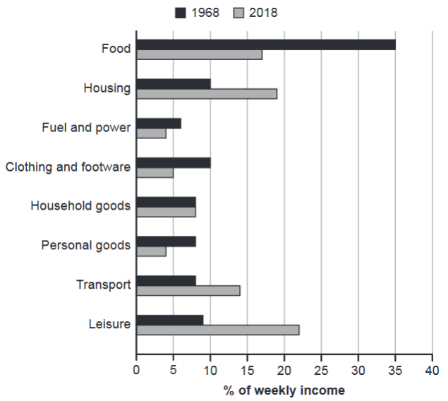
The chart below gives information about how families in one country spent their weekly income in 1968 and in 2018.
Summarise the information by selecting and reporting the main features, and make comparisons where relevant.
1968 and 2018: average weekly spending by families
Student answer (Band 5.5)
The chart illustrates the information about families in a country that spent their weekly income on their households and makes the comparison between the years 1968 and 2018 on how the money is being spent.
Firstly, the highest amount of savings are being spent on food in both years reaching up to 35 percent of weekly income in 1968 and 17%in 2018. In contrast, the lowest amount of weekly average is being spent on fuel and power in both years, 7% in 1968 and 4% in 2018. However, household goods , clothing and personal goods have been taking more percentage of weekly income whereas, transport and leisure has been taking out more cash from the families weekly income.
Overall, there are specific changes in how the family spent from their weekly savings and these changes are not constant some have changed over time while other remained static and the data will continue to change overtime.
AI examiner evaluation
| Criterion | Band |
|---|---|
| Task Achievement / Task Response | 5.5 |
| Coherence and Cohesion | 6.0 |
| Lexical Resource | 5.5 |
| Grammatical Range and Accuracy | 5.5 |
| Overall | 5.5 |
Task Achievement / Task Response: Band 5.5
You identify the main contrast that food takes a smaller share in 2018, and you report several relevant figures, including food at 35% and 17% and fuel and power at 4% in 2018. However, the overview is unclear and partly inaccurate: food is not the highest category in both years, because leisure is highest in 2018 at about 22%, while housing is also higher than food. The claim that household goods, clothing and personal goods “have been taking more” is incorrect or too broad: household goods stayed at 8%, while clothing and personal goods fell. The response also omits major changes such as the rise in leisure, housing and transport. Select the largest increases and decreases, and give a clear, accurate overview of the overall shift.
Coherence and Cohesion: Band 6.0
The response has a recognisable sequence, moving from an introduction to comparisons and then an overall statement, and connectors such as “Firstly,” “In contrast” and “However” help signal relationships. This gives the reader a coherent basic arrangement. However, the progression is not consistently clear: the overview comes last and says the changes are “not constant” without specifying what changed most. The sentence beginning “However” combines several categories and trends, making the comparison difficult to follow. Group the information into clear paragraphs—for example, an overview followed by the main decreases and increases—and use linking words only where the relationship is precise. This would make the organisation more purposeful and the comparisons easier to track.
Lexical Resource: Band 5.5
You use some relevant task vocabulary, including “weekly income,” “percentage” and “comparison,” and the meaning is generally understandable. However, several expressions are imprecise or unnatural for describing a chart. “Highest amount of savings are being spent” confuses savings with expenditure, while “taking out more cash” is informal and does not clearly describe a proportion of income. “Weekly average” is also unclear, and “spent from their weekly savings” misrepresents the chart, which shows income. There is some repetition of “spent” and “weekly income,” and “overtime” is not the intended expression for change across years. Use accurate terms such as “share,” “proportion” and “accounted for,” and choose verbs that describe increases, decreases or stability.
Grammatical Range and Accuracy: Band 5.5
You attempt both simple and more extended sentences, including a contrast introduced by “whereas,” and the main message can usually be understood. However, some errors in sentence construction, agreement and tense reduce accuracy. In “the highest amount of savings are being spent,” the subject and verb do not agree, and the passive progressive form is unsuitable for reporting chart data. “Transport and leisure has been taking” also has a plural subject with a singular verb. The final sentence joins several ideas with “and” and lacks clear control of the clause structure. Prefer concise present-tense reporting forms, such as “Food accounted for…” and “Transport and leisure increased…”. Check subject–verb agreement, sentence boundaries and punctuation, especially around lists and contrast clauses.
See this exact question answered at other band scores. The same prompt compared across bands.
Browse more IELTS Writing model answers or get your own writing scored by the same AI examiner.