Band 4.5 IELTS Writing Task 1 Model Answer
Overall Band Score: 4.5 · Cambridge IELTS 17 · 2026-11-20
IELTS Writing Task 1 question
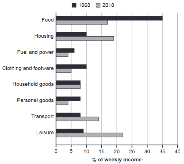
The chart below gives information about how families in one country spent their weekly income in 1968 and in 2018.
Summarise the information by selecting and reporting the main features, and make comparisons where relevant.
1968 and 2018: average weekly spending by families
Student answer (Band 4.5)
The chart delineate information about how families in one country spent their weekly income in 1968 and in 2018.
Overall,There are eight parts of income spent their families, the weekly income of families in one country spent in food is very high whereas, the low is fuel and power in 1968 and in 2018.
Initially, the food is very high cost of families spent in their weekly income.There are about 35% of the families cost, because their are commonly used in health. The second is housing, its cost is high, because they are used as shelters for every human being. The third is fuel and power, its average is about 8% of weekly. The families who have a car abd other vehicle, they used this facility. The next is clothing and footware, there average is only 10% of the total used in week. The next one is household goods and personal goods, the average of weekly income spent are 8% both in the total. The next is transport, it is used in about 14% of the total. The last one is leisure, its is rised up into 22% of the total
AI examiner evaluation
| Criterion | Band |
|---|---|
| Task Achievement / Task Response | 4.5 |
| Coherence and Cohesion | 4.5 |
| Lexical Resource | 5.0 |
| Grammatical Range and Accuracy | 4.5 |
| Overall | 4.5 |
Task Achievement / Task Response: Band 4.5
You identify the two years and several categories, and you correctly report food at about 35% in 1968 and leisure at about 22% in 2018. However, the overview is inaccurate: fuel and power was not the lowest category in 2018, where personal goods and fuel and power were both about 4%, and leisure—not food—was the largest share in 2018. Some figures are also misreported: fuel and power in 1968 was about 6%, not 8%, and transport in 1968 was about 8%, not 14%. The response mainly lists categories rather than selecting and comparing the key changes, such as food falling sharply and housing, transport and leisure rising. Explanations about health, shelters and cars are not shown by the chart and distract from reporting its data.
Coherence and Cohesion: Band 4.5
The response has a basic sequence, beginning with an introduction and overview before moving through the categories, so the reader can recognise the general topic. However, the progression is largely a repetitive list, with repeated transitions such as “The next” and “The next one,” rather than a clear comparison of 1968 with 2018. The overview is not clearly separated from the details, and several sentences combine unrelated points, making relationships between categories difficult to follow. For example, the discussion of fuel and power shifts to car use, then clothing, without a clear comparison between years. Organise the details into groups of increases and decreases, and use accurate linking phrases such as “by contrast” or “while” to show the comparisons.
Lexical Resource: Band 5.0
You use some relevant topic vocabulary, including “weekly income,” “housing,” “fuel and power,” “household goods” and “leisure,” and the reader can generally identify the categories being discussed. However, the range is limited and several word choices or collocations are inaccurate or awkward, such as “the chart delineate information,” “families cost,” and “the total used in week.” Repeated use of “high,” “cost” and “used” also makes the description imprecise. There are spelling errors in “footware” and “abd,” and “rised up” is not an appropriate form for describing a chart trend. Aim to use precise reporting language, for example “accounted for,” “share,” “rose” and “fell,” and check spelling and word forms.
Grammatical Range and Accuracy: Band 4.5
There are attempts to use longer sentences and clauses, but sentence structures are limited and errors are frequent enough to make some statements difficult to interpret. Examples include “There are eight parts of income spent their families” and “There are about 35% of the families cost,” where the sentence patterns and relationships between words are unclear. Subject–verb agreement and verb forms are also problematic, as in “the chart delineate” and “its is rised up.” Punctuation and spacing are inconsistent, including “Overall,There” and missing spaces after full stops. Practise building clear simple sentences first, then add comparisons using structures such as “Food accounted for 35% in 1968, compared with 17% in 2018.”
See this exact question answered at other band scores. The same prompt compared across bands.
Browse more IELTS Writing model answers or get your own writing scored by the same AI examiner.