Band 5.5 IELTS Writing Task 1 Model Answer
Overall Band Score: 5.5 · Cambridge IELTS 17 · 2026-11-20
IELTS Writing Task 1 question
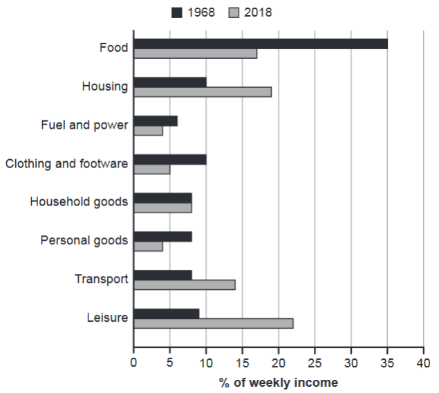
The chart below gives information about how families in one country spent their weekly income in 1968 and in 2018.
Summarise the information by selecting and reporting the main features, and make comparisons where relevant.
1968 and 2018: average weekly spending by families
Student answer (Band 5.5)
The bar chart represented how families in one nation used their weekly salary in both year 1968 and 2018. overall, it can be clearly seen that food display high demanded in both years. while, the fuel and power category show lowest percentage.
To begin with, in 1968 the families spend their income in food was dominant with 35%. whereas, in 2018 around 17%. furthermore, the other section housing in 1968 the average money spend by families accounted only 10% but on the other side in year 2018 show the second largest figure approximately 19%. however, the least proportion was fuel and power in 1986 and 2018 presented only 6% and 4% respectively. now the other stable category the household goods a families used their 7 days income at around 7%. in contrast, leisure in this sector the individuals in 2018 accounted 22% and in 1968 only 8% showed. now moved to personal goods in this area the families spend their weekly fund in 1968 only 8% and year 2018 show little percentage 4%.
AI examiner evaluation
| Criterion | Band |
|---|---|
| Task Achievement / Task Response | 5.5 |
| Coherence and Cohesion | 5.0 |
| Lexical Resource | 5.5 |
| Grammatical Range and Accuracy | 5.0 |
| Overall | 5.5 |
Task Achievement / Task Response: Band 5.5
You identify the main contrast between the two years: food falls from 35% to 17%, while housing and leisure take larger shares in 2018. You also report several other figures, including fuel and power and personal goods. However, the overview is not fully accurate: food was the largest category in 1968, but leisure—not food—was highest in 2018, at 22%. The statement that fuel and power was the lowest in both years is also incorrect for 1968, when it was 6% and personal goods and transport were 8%. Some categories, notably clothing and transport, are omitted, and household goods is described as stable without giving the chart’s approximate values of 8% in both years. A more accurate overview and fuller selection of key comparisons would strengthen the response.
Coherence and Cohesion: Band 5.0
The response has an opening overview followed by a paragraph of figures, and phrases such as “in contrast” and “whereas” show an attempt to connect comparisons. However, the progression within the main paragraph is difficult to follow: categories are introduced in a loose sequence, and repeated transitions such as “now” and “however” do not always clarify how the information relates. The overview is also separated from the details without a clear, systematic grouping of the data. Organise the body by meaningful comparisons—for example, categories that rose versus those that fell—and use precise linking phrases. Clearer sentence boundaries and more consistent paragraph development would make the information easier to track.
Lexical Resource: Band 5.5
You use relevant chart vocabulary, including “percentage,” “proportion,” “accounted,” and “category,” and you attempt to vary expressions for spending. However, several word choices and collocations are noticeably inaccurate or unnatural, such as “food display high demanded,” “used their weekly salary,” and “the average money spend.” These can make the intended meaning less clear. Some expressions are also vague, including “the other stable category” and “in this sector.” Choose standard reporting language and use it consistently: for example, “accounted for,” “share of weekly income,” and “rose/fell to.” Check word forms and spelling as well, including “footwear” if you refer to that category.
Grammatical Range and Accuracy: Band 5.0
You attempt to combine comparisons in longer sentences, but the range of sentence structures is limited and many attempts are not controlled. Errors include subject–verb agreement in “food display” and “the fuel and power category show,” incorrect verb forms in “families spend” and “money spend,” and incomplete or awkward clauses such as “in 2018 show the second largest figure.” Sentence boundaries and punctuation are also inconsistent: “overall” should begin with a capital letter, and several clauses are joined with full stops or connectors in ways that interrupt the flow. Practise accurate past-tense reporting and complete sentence patterns, such as “Families spent 35% on food in 1968, compared with 17% in 2018.”
See this exact question answered at other band scores. The same prompt compared across bands.
Browse more IELTS Writing model answers or get your own writing scored by the same AI examiner.