Band 5.5 IELTS Writing Task 1 Model Answer
Overall Band Score: 5.5 · Cambridge IELTS 17 · 2026-11-20
IELTS Writing Task 1 question
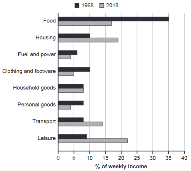
The chart below gives information about how families in one country spent their weekly income in 1968 and in 2018.
Summarise the information by selecting and reporting the main features, and make comparisons where relevant.
1968 and 2018: average weekly spending by families
Student answer (Band 5.5)
The horizontal chart illustrates the spent of income on basis of week of families in a country in a time period of 1968 and in 2018.
Overall, it is clearly noticeable that highest spend of income in food. While, in fuel and power show the lowest share of incomes' spent.
To commence with food sector, in 1968, 38% of people want to spent their income but in 2018 the percentages of money spent in food is about 17%. In fuel and power, people spent 7% and 4% in respective years in 1968 and in 2018. In 1968, the percentages of people spending in clothing and footware with 10% but only 5% people interested in this sector in 2018.
Moving further with next sector is household goods which is remained same in both time period with 8% spending in this sector. In transport, people spent 8% in 1968 but this percentages change as time with 14% in 2018. In leisure activity people spent 9% in 1968 , in compare of 2018 this percentages were increase by 14%.
AI examiner evaluation
| Criterion | Band |
|---|---|
| Task Achievement / Task Response | 5.5 |
| Coherence and Cohesion | 6.0 |
| Lexical Resource | 5.0 |
| Grammatical Range and Accuracy | 5.0 |
| Overall | 5.5 |
Task Achievement / Task Response: Band 5.5
You identify the chart’s subject and make relevant comparisons, including the substantial fall in food spending (from about 35% to 17%), the unchanged 8% for household goods, and increases in transport and leisure. However, the overview is not fully accurate: food was the largest category in 1968, but leisure was largest in 2018, so saying food was the highest overall is misleading. The claim that fuel and power was the lowest in both years also overlooks that personal goods was equally low in 2018. Housing, which rose from 10% to 19%, is omitted entirely, and the leisure increase is described unclearly as “increase by 14%” rather than giving the 2018 figure. Select the main changes more precisely and cover the important categories.
Coherence and Cohesion: Band 6.0
The response has a recognisable structure: an introduction, an overview, and two paragraphs grouping categories. This gives the reader a basic route through the information, and phrases such as “Moving further” signal a transition. However, progression is weakened by listing categories without a clear comparison pattern, and the overview does not accurately prepare the reader for the later details. Some linking is mechanical or awkward, as in “To commence with” and “in compare of 2018.” The final paragraph also combines household goods, transport, and leisure without clearly distinguishing stable figures from increases. Organise the body around the most notable changes, and use straightforward links such as “By contrast” or “Meanwhile” to make relationships clearer.
Lexical Resource: Band 5.0
You use some relevant chart vocabulary, including “percentages,” “sector,” “spent,” and “share,” so the topic is generally understandable. However, the range is limited and several word choices or collocations are noticeably inaccurate: “the spent of income,” “highest spend of income,” and “people want to spent their income” do not express the chart data naturally. “Interested in this sector” suggests preference rather than expenditure, while “increase by 14%” is imprecise for a change from 9% to 22%. There is also a spelling error in “footware.” Use precise terms such as “accounted for,” “expenditure,” and “rose to,” and check spelling and word forms to make comparisons clearer.
Grammatical Range and Accuracy: Band 5.0
The response attempts both simple statements and longer comparative sentences, but control is inconsistent, and errors sometimes make relationships difficult to follow. For example, “in fuel and power show the lowest share” lacks a clear subject, while “which is remained same” combines incompatible verb forms. There are also problems with infinitives and agreement in “people want to spent” and “this percentages change,” as well as article and preposition patterns in “on basis of week.” Sentence boundaries and punctuation need attention too, particularly the comma before a space in “1968 , in compare.” Practise accurate past-tense reporting and build comparisons with reliable patterns such as “spending fell from X to Y” and “the figure remained at X.”
See this exact question answered at other band scores. The same prompt compared across bands.
Browse more IELTS Writing model answers or get your own writing scored by the same AI examiner.