Band 6.0 IELTS Writing Task 1 Model Answer
Overall Band Score: 6.0 · Cambridge IELTS 17 · 2026-11-20
IELTS Writing Task 1 question
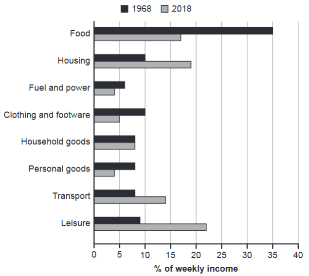
The chart below gives information about how families in one country spent their weekly income in 1968 and in 2018.
Summarise the information by selecting and reporting the main features, and make comparisons where relevant.
1968 and 2018: average weekly spending by families
Student answer (Band 6.0)
The bar chart depicts the percentage how families in a particular country spent their weekly income in the daily life expenses between 1968 and 2018.
Overall, it is clear that in 1968 mostly the money was spent in food, housing, and clothing and footware while, in 2018 highly money was spent in leisure, housing and food.
Firstly, in 1968 the percentage of income spent in food is 35%, which marked the highest figure. And followed by the housing, clothing and footware at 10% both are same furthermore, the percentage of all household goods, personal goods and transport were same about 8% and in leisure is 9%. Lastly, in fuel and power is around 6%.
In contrast of it, in 2018 the proportion of income spent in leisure is approximately 22%, which marks the highest figure. And followed by the housing at 19%, around 17% in food, 14% in transport. While, the percentage of fuel and power and personal goods are same about 4%, which marked the lowest figure. Similarly, proportion of household goods are same in both year.
AI examiner evaluation
| Criterion | Band |
|---|---|
| Task Achievement / Task Response | 6.5 |
| Coherence and Cohesion | 6.5 |
| Lexical Resource | 5.5 |
| Grammatical Range and Accuracy | 5.0 |
| Overall | 6.0 |
Task Achievement / Task Response: Band 6.5
You identify the main shifts accurately: food falls from 35% to 17%, while leisure rises to about 22% and becomes the largest category in 2018. The overview also highlights food, housing and clothing in 1968, and leisure, housing and food in 2018. Most reported figures match the chart, including the shared 8% for household goods and the low 4% figures in 2018. This gives the response a clear, relevant account of both years. To make the summary more complete and precise, explicitly compare categories across the two years—for example, note that housing rises from 10% to 19%, while clothing falls from 10% to 5% and transport increases from 8% to 14%. Some details are listed rather than interpreted.
Coherence and Cohesion: Band 6.5
The response has a clear overall structure: an introduction, an overview, and separate paragraphs for 1968 and 2018. The contrast marker “In contrast” helps signal the move between years, and the categories are generally presented in a sensible order. However, cohesion is sometimes mechanical because several sentences begin with “And followed by” or “Similarly,” and the long first-year sentence strings together many figures with limited punctuation. The reference in “proportion of household goods are same in both year” is understandable but not fully clear about the comparison. Use complete, varied sentence structures and connect related comparisons directly—for instance, group categories that rose, fell or remained unchanged. This would make the progression smoother and less list-like.
Lexical Resource: Band 5.5
You use relevant chart vocabulary such as “percentage,” “proportion,” “highest figure” and “lowest figure,” and the reader can understand the categories and comparisons. However, the range is limited and several combinations are unnatural, including “percentage how families…spent,” “mostly the money was spent in food,” and “highly money was spent.” “In contrast of it” is also an inaccurate phrase, while “footware” is misspelled; the chart label is “footwear.” Repetition of “spent,” “percentage” and “figure” further limits flexibility. Aim for precise reporting verbs and natural collocations, such as “accounted for,” “rose to” and “the largest share.” These changes would make the description more fluent and appropriately formal.
Grammatical Range and Accuracy: Band 5.0
The response attempts both simple and more extended sentences, and the main figures remain understandable. However, control is uneven, particularly in sentence construction. For example, “The bar chart depicts the percentage how families…” lacks a grammatical link between “percentage” and the following clause. “And followed by the housing…” is a fragment rather than a complete sentence, and “the percentage of…goods…were same” has agreement and article problems. The final sentence, “proportion of household goods are same in both year,” also contains errors in agreement and number. Build comparisons with a clear subject and verb, such as “Housing accounted for 10% in 1968, compared with 19% in 2018.” Check articles, singular/plural forms and sentence boundaries when editing.
See this exact question answered at other band scores. The same prompt compared across bands.
Browse more IELTS Writing model answers or get your own writing scored by the same AI examiner.