Band 5.5 IELTS Writing Task 1 Model Answer
Overall Band Score: 5.5 · Cambridge IELTS 17 · 2026-11-20
IELTS Writing Task 1 question
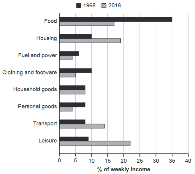
The chart below gives information about how families in one country spent their weekly income in 1968 and in 2018.
Summarise the information by selecting and reporting the main features, and make comparisons where relevant.
1968 and 2018: average weekly spending by families
Student answer (Band 5.5)
The bar chart illustrates information about how families in one specific country use their typical weekly income in different components in the following years in 1968 and in 2018. Units are measured in percentages.
The food recorded highest ratio in 1968 was 35%, whereas in 2018 was almost 17%. Furthermore, leisure shows the second most percentages in 2018 weekly income was 22%, and 9% in 1968. Moreover, housing and transport looks similar in the bar chart. The housing and transport percentages in 1968 was 10% and 9%, and in 2018 was 19% and 14%.
Household goods was the only element in bar graph spent their weekly income in both years still same like 8%. While personal goods is the second most least component in both years, 4% was the 2018 and 1968 was 8%. While fuel and power was the lowest ratio demonstrates in both years 4% in 2018 and 6% in 1968.
Overall, the most money spent their typical weekly income in just one country in both years is food, and the little money spent in these years was fuel and power.
AI examiner evaluation
| Criterion | Band |
|---|---|
| Task Achievement / Task Response | 5.5 |
| Coherence and Cohesion | 6.0 |
| Lexical Resource | 5.5 |
| Grammatical Range and Accuracy | 5.0 |
| Overall | 5.5 |
Task Achievement / Task Response: Band 5.5
You identify several important comparisons, including the sharp fall in food spending (35% to about 17%), the rise in leisure (9% to 22%), and the unchanged figure for household goods (8%). However, the overview is not fully accurate: it says food was the largest category in both years, although leisure at 22% was higher than food in 2018. It also calls fuel and power the lowest in both years, but in 1968 fuel and power (6%) was below several categories at 8% or 9%, not uniquely the lowest. Some comparisons are reported without a clear overall pattern. To strengthen the response, give an accurate overview of the main shifts and select figures that support it.
Coherence and Cohesion: Band 6.0
The response has a generally understandable arrangement: it introduces the chart, groups several comparisons in the middle, and gives an overall statement at the end. This provides a basic progression through the information. However, the overview comes after the detailed figures, so the main message is not established early, and the sequence of categories can feel like a list. Connectors such as “Furthermore,” “Moreover,” and repeated “While” are sometimes mechanical, and “housing and transport looks similar” is not followed by a clear explanation of how their patterns differ. Begin with a concise overview, then group the categories by rising, falling, or stable spending, using clearer links between comparisons.
Lexical Resource: Band 5.5
You use relevant chart vocabulary, including “percentages,” “weekly income,” “component,” and “ratio,” and the reader can generally identify the categories being compared. However, several choices are unnatural or imprecise, such as “food recorded highest ratio,” “shows the second most percentages,” and “the little money spent.” These phrases make the comparisons less clear and show limited control of collocation. “Element” and “component” are also used where “category” would be more natural for a chart. Aim for precise reporting verbs and standard expressions for proportions, while avoiding repeated or awkward wording. Check spelling as well: the chart label is “footwear,” not “footware.”
Grammatical Range and Accuracy: Band 5.0
The response attempts some complex sentence forms, particularly with “whereas” and “while,” and most of the intended comparisons can be understood. However, errors in sentence structure and agreement are frequent enough to make parts awkward or unclear. For example, “The food recorded highest ratio in 1968 was 35%” lacks a natural grammatical construction, while “The housing and transport percentages … was” has a plural subject with a singular verb. The fragment “and 9% in 1968” also needs to be joined to a complete clause. Practise forming complete comparison sentences with accurate subjects and verbs, and check articles and sentence boundaries before finishing.
See this exact question answered at other band scores. The same prompt compared across bands.
Browse more IELTS Writing model answers or get your own writing scored by the same AI examiner.