Band 6.0 IELTS Writing Task 1 Model Answer
Overall Band Score: 6.0 · Cambridge IELTS 17 · 2026-11-21
IELTS Writing Task 1 question
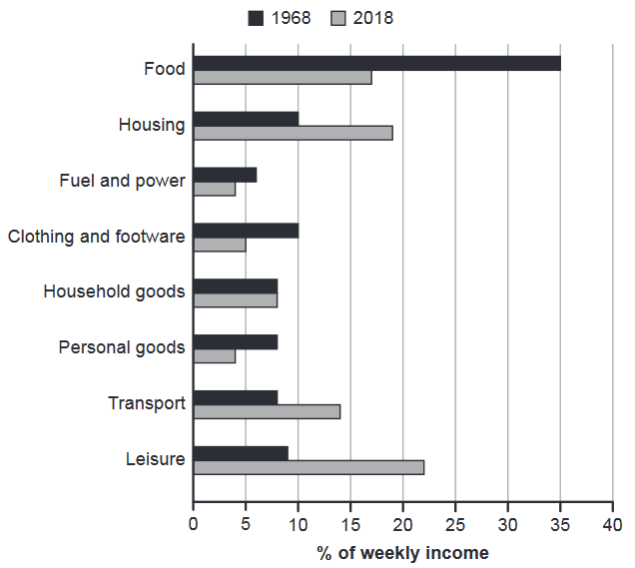
The chart below gives information about how families in one country spent their weekly income in 1968 and in 2018.
Summarise the information by selecting and reporting the main features, and make comparisons where relevant.
1968 and 2018: average weekly spending by families
Student answer (Band 6.0)
The given bar charts illustrates the data about how families in a country spent their weekly income in various expenditure (food, housing, fuel and power, clothing and footware, household goods, personal goods, transport, leisure activities) in 1968 and in 2018, and the weekly income is presented as percentage. Overall, the general trend of the both year figures were eratic comparing with each other although food consumption cost highest in 1968 comparing with other, whereas leisure activities got an interests of people more in 2018.
At first glance, it is evident that there are several outlays which represents the weekly income of the families in one country. Moreover, food consumption was quite high in 1968 which 35% comparing with others, while fuel and power used less income which is around 6% although they should be cost more than it. Apart from that, all the others expenditure were almost same in the spending percentage of weekly income.
On the other hand, it is lucid that food consumption decreased steadily from 35% to around 17% in 2018 which is nearly half of it. Moreover, leisure activities or spending scored more than it was expected to which is 23% approximately, while housing and transport also began to surge in 2018 by 4% to 6%. Apart from that, household goods was only expenditure which was remained constand as it was before in 1968 which is nearly 8%.
AI examiner evaluation
| Criterion | Band |
|---|---|
| Task Achievement / Task Response | 6.0 |
| Coherence and Cohesion | 6.5 |
| Lexical Resource | 6.0 |
| Grammatical Range and Accuracy | 5.5 |
| Overall | 6.0 |
Task Achievement / Task Response: Band 6.0
You identify the main contrast: food takes the largest share in 1968, while leisure is the largest category in 2018, and you report several relevant figures. The comparison that food fell from 35% to about 17% and household goods stayed at 8% is accurate. However, the overview is unclear when it describes the figures as “eratic,” and the claim that leisure spending was “more than it was expected to” is not a chart-based comparison. Some details are also imprecise: housing rose from 10% to 19%, not by 4% to 6%, while transport increased from 8% to 14%. To strengthen the response, give a clear overview of the largest rises and falls, and compare the categories with accurate figures rather than unsupported expectations.
Coherence and Cohesion: Band 6.5
The response has a recognisable structure: an introduction and overview are followed by discussion of 1968 and then 2018. This gives the reader a generally coherent route through the information, and linking phrases such as “On the other hand” and “Apart from that” help connect points. The progression is not always clear, however: the first body paragraph mixes a high figure, a low figure, and a broad claim that the other categories were similar, without systematically comparing them. Some transitions also imply a contrast that is not fully developed. For stronger organisation, group the most important changes together—for example, the decline in food and the increases in housing, transport, and leisure—and use references that clearly identify which year or category is being discussed.
Lexical Resource: Band 6.0
You use a reasonable range of vocabulary for describing the chart, including “decreased,” “surge,” “outlays,” and “percentage,” and the intended meaning is generally understandable. There are also attempts at less common language, such as “lucid” and “eratic,” but some choices are inaccurate or unnatural in context. “Food consumption cost” does not describe the share of income spent on food, and “leisure activities got an interests of people” is difficult to interpret. Spelling and word-form slips, including “footware” and “constand,” also reduce precision. Aim for standard chart language and accurate collocations, such as “accounted for,” “share of weekly income,” and “remained constant.” This would make the comparisons clearer and more natural.
Grammatical Range and Accuracy: Band 5.5
You attempt both simple and complex sentences, including clauses with “while” and “although,” and the overall message can usually be followed. Some grammatical errors remain, particularly with agreement, articles, and sentence construction. For example, “The given bar charts illustrates” has a plural subject with a singular verb, while “the general trend of the both year figures were” has problems with both the noun phrase and agreement. In “food consumption was quite high in 1968 which 35%,” the clause needs a clearer grammatical link, such as “at 35%.” There are also awkward constructions such as “which was remained.” Work on subject–verb agreement and building complete comparison clauses; these corrections would improve accuracy while preserving your attempts at varied sentence forms.
See this exact question answered at other band scores. The same prompt compared across bands.
Browse more IELTS Writing model answers or get your own writing scored by the same AI examiner.