Band 5.5 IELTS Writing Task 1 Model Answer
Overall Band Score: 5.5 · Cambridge IELTS 17 · 2026-11-21
IELTS Writing Task 1 question
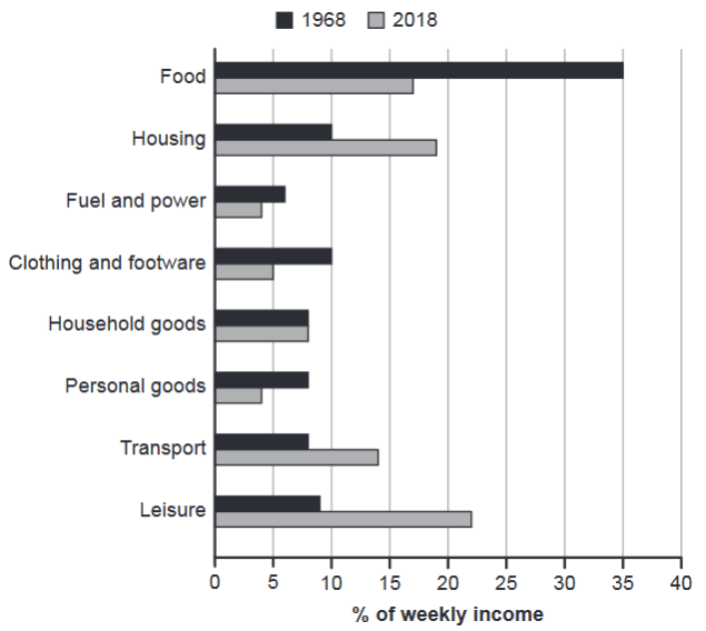
The chart below gives information about how families in one country spent their weekly income in 1968 and in 2018.
Summarise the information by selecting and reporting the main features, and make comparisons where relevant.
1968 and 2018: average weekly spending by families
Student answer (Band 5.5)
The given graph provides us with information about various families in each country spend their income in the year 1968 and 2018. Overall, in 1968 food shows the highest percentage and in 2018 leisure shows the highest percentage.
First of all, in 1968, food shows the highest percentage that was about 35% of total and in 2018, food shows the percentage of about 15% to 20%. The second highest percentage in the year 1968 were housing showed 10% and housing in 2018 shows the second highest percentage taht showed 15% to 20%. The following catagories shows almost equal in both years such as fuel and power shows almost equal that are 5% to 10% respectively. Than household goods shows almost equal in both years that are 5% to 10% for each. But in the year 2018 leisure shows the highest percentage that are about 20% to 25% and leisure in 1968 shows 5% to 10% respectively.
AI examiner evaluation
| Criterion | Band |
|---|---|
| Task Achievement / Task Response | 6.0 |
| Coherence and Cohesion | 5.5 |
| Lexical Resource | 5.5 |
| Grammatical Range and Accuracy | 5.0 |
| Overall | 5.5 |
Task Achievement / Task Response: Band 6.0
You identify the chart’s main contrast in the overview: food was the largest spending category in 1968, while leisure was largest in 2018. You also report several relevant figures, including food at about 35% in 1968 and housing at around 10%. However, the account is selective and some comparisons are unclear or inaccurate: housing in 2018 is described as 15–20%, whereas the chart shows about 19%, and fuel and power are given as 5–10% in both years rather than distinguishing roughly 6% from 4%. Important changes in transport and clothing are omitted, and the claim that household goods were almost equal is not supported by a clear comparison. Include the main rises and falls more systematically and use precise approximate figures.
Coherence and Cohesion: Band 5.5
The response has a recognisable overall structure: an introductory sentence, a brief overview, and a body paragraph with comparisons. The sequence from 1968 figures to 2018 figures is generally understandable. However, the body reads as a chain of similar statements beginning with “First of all,” “The second highest,” and “The following categories,” rather than grouping the data into clear patterns of change. “Than” also does not clearly signal the relationship between the points that follow, and repeated use of “shows” makes the progression mechanical. Organise the details into meaningful comparisons—for example, categories that fell, those that rose, and those that stayed similar—and use linking phrases to make those relationships explicit.
Lexical Resource: Band 5.5
You use relevant chart vocabulary such as “percentage,” “highest,” “total,” and “categories,” so the reader can follow the general subject. However, the range is limited and several expressions are repetitive or imprecise. “Shows the highest percentage” is repeated where “accounted for the largest share” would be more natural, while “shows almost equal” does not clearly express that values were similar. There are also spelling errors, including “taht” and “catagories,” and “Than” is used where “Then” is intended. Aim for more varied language for describing proportions and change, and check spelling carefully; this will make the comparisons more precise and fluent.
Grammatical Range and Accuracy: Band 5.0
The response communicates its main points using mostly simple sentence patterns, with some attempts to combine ideas using “and” and “that.” However, control is uneven, particularly in clauses describing the figures. For example, “The second highest percentage in the year 1968 were housing showed 10%” combines incompatible structures and has a subject–verb agreement problem. “The following categories shows” also has incorrect agreement, and “leisure shows the highest percentage that are about 20% to 25%” shifts awkwardly between singular and plural forms. Use a clear pattern such as “Housing accounted for 10% in 1968, compared with about 19% in 2018.” Practising accurate comparisons and checking verb agreement would improve clarity.
See this exact question answered at other band scores. The same prompt compared across bands.
Browse more IELTS Writing model answers or get your own writing scored by the same AI examiner.