Band 5.5 IELTS Writing Task 1 Model Answer
Overall Band Score: 5.5 · Cambridge IELTS 17 · 2026-11-22
IELTS Writing Task 1 question
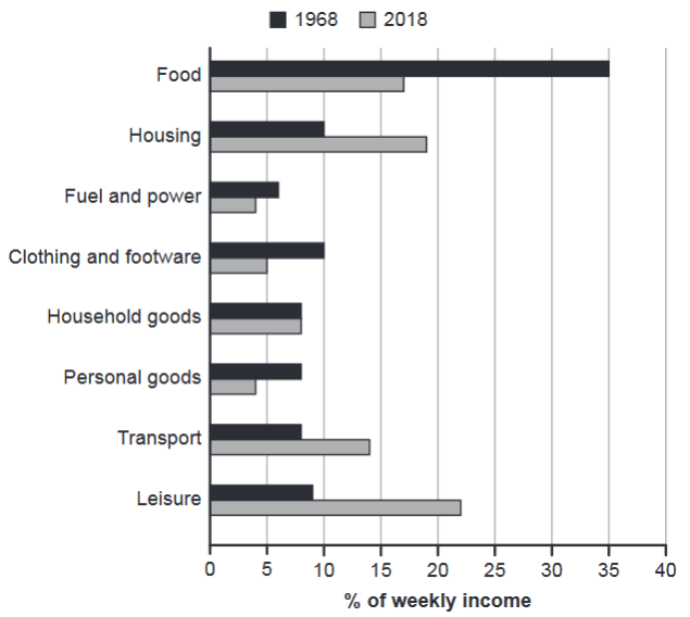
The chart below gives information about how families in one country spent their weekly income in 1968 and in 2018.
Summarise the information by selecting and reporting the main features, and make comparisons where relevant.
1968 and 2018: average weekly spending by families
Student answer (Band 5.5)
The bar chart illustrates information about how in a singel country families use their average weekly income between 1968 and 2018.
Overall, families in the 1968 prioritised food above all, whereas families in 2018 prioritised leisure activity.
in 1968 households used 35% of their weekly income on money, whereas families in 2018 mearly spent approximaitly 18% of money. families of both 1968 and 2018 spent only 6% and 4% on fuel and power which is the least in both era. in housing catagory, families in 2018 spent about 19% which is 9% more that families in 1968 who spent only 10% of their income in it. Both families spent the same amount on household goods around 8% which suprising .People in 1968 were more fashonable than 2018 as they spent 5% more on clothing and footware.In 2018 families spent mearly 4% of their weekly income on personal goods. Transport system was more used by families in 2018 as they spent about 6 % more than in 1968. Additionally people in 2018 spent approximatly 23% of their weekly income on leisure which is the highest spending by them.
AI examiner evaluation
| Criterion | Band |
|---|---|
| Task Achievement / Task Response | 6.5 |
| Coherence and Cohesion | 5.5 |
| Lexical Resource | 5.5 |
| Grammatical Range and Accuracy | 5.0 |
| Overall | 5.5 |
Task Achievement / Task Response: Band 6.5
You identify the main contrast accurately: food dominates spending in 1968, while leisure is highest in 2018. Several comparisons are also relevant and broadly correct, including housing (10% versus 19%), household goods (about 8% in both years), and the rise in transport. This gives the response a clear overview and covers most categories. To make the report more complete and precise, state the key changes across the chart systematically: food falls from 35% to about 17%, leisure rises from 9% to about 22%, and clothing, fuel and personal goods all decline. The claim that 1968 families were “more fashionable” is an unsupported interpretation; report the clothing figures neutrally instead. Some figures are imprecise, but the main trends are generally represented.
Coherence and Cohesion: Band 5.5
The response has a recognisable structure, with an opening, an overview and a paragraph of comparisons. The overview helps the reader understand the chart’s main shift, and linking expressions such as “whereas” and “Additionally” show an attempt to connect information. However, most details are crowded into one long paragraph, so the comparisons do not develop in a clear sequence. The repeated pattern of “families spent” also makes the report feel list-like, while transitions such as “which is surprising” interrupt the factual progression. Group the categories by major increases and decreases, and use clearer sentence boundaries and references to the two years. This would create stronger progression and make the relationships between figures easier to follow.
Lexical Resource: Band 5.5
You use some task-relevant vocabulary, including “prioritised,” “weekly income,” “category,” and “spent,” and the reader can generally understand the comparisons. However, the range is limited and several choices are inaccurate or informal for an academic chart report. “Spent … on money” does not express the intended category; name food directly. “More fashionable” adds an unsupported judgement, and “transport system was more used” is an awkward way to describe a higher spending share. Spelling errors such as “singel,” “approximaitly,” “catagory,” and “fashonable” also reduce accuracy. Aim for precise reporting verbs and category-specific phrases, such as “accounted for,” “the proportion allocated to,” and “rose/fell to.”
Grammatical Range and Accuracy: Band 5.0
You attempt some complex comparisons, particularly with “whereas” and clauses beginning “which,” and the basic meaning is usually recoverable. However, sentence control is inconsistent, and several sentences contain errors in articles, agreement, or punctuation. For example, “families in the 1968” needs a different article construction, while “Both families spent the same amount … which suprising” is not a complete, well-formed sentence. The opening “how in a singel country families use” also has an awkward clause structure, and lowercase sentence beginnings and missing spaces after full stops affect punctuation. Use shorter, complete sentences when reporting figures, then add a smaller number of carefully controlled comparison clauses.
See this exact question answered at other band scores. The same prompt compared across bands.
Browse more IELTS Writing model answers or get your own writing scored by the same AI examiner.