Band 6.5 IELTS Writing Task 1 Model Answer
Overall Band Score: 6.5 · Cambridge IELTS 17 · 2026-11-22
IELTS Writing Task 1 question
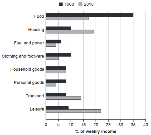
The chart below gives information about how families in one country spent their weekly income in 1968 and in 2018.
Summarise the information by selecting and reporting the main features, and make comparisons where relevant.
1968 and 2018: average weekly spending by families
Student answer (Band 6.5)
The chart below illustrates how families in one country spent their weekly earnings in various categories in year 1968 and 2018.
Overall, it can be clearly observed that, families spent most of their income on food consumption in 1968, while in 2018 they spent most of their income on leisure. Another noteworthy point is that, the lowest amount spent in 1968 was fuel and power, while in 2018 they spent minimum percentage of their income on personal goods.
In 1968, families spent highest proportion of income on buying food which is 35% compares to 17% in 2018. For housing, they spent 10% in 1968 which increased to 19% in 2018. Fuel and power accounted the lowest spending in both years. For clothing and footware they spent 10% in 1968 which reduced in half in 2018.
In addition, they speant exact same amount for household goods in both years. However, for transport and leisure expenditure the chart shown a massive jump from year 1968 to 2018. In contrast spending on personal goods has been reduced to 8% to 4%.
AI examiner evaluation
| Criterion | Band |
|---|---|
| Task Achievement / Task Response | 7.0 |
| Coherence and Cohesion | 6.5 |
| Lexical Resource | 6.0 |
| Grammatical Range and Accuracy | 5.5 |
| Overall | 6.5 |
Task Achievement / Task Response: Band 7.0
You address the task with a clear overview, identifying the main shift from food as the largest category in 1968 to leisure in 2018, and you report several relevant comparisons accurately: food fell from 35% to 17%, housing rose from 10% to 19%, and household goods remained at 8%. The statement that fuel and power was the lowest category in both years is inaccurate: personal goods, at 4%, was the lowest in 2018. You also mention transport and leisure rising substantially, but do not give their figures, so these important changes are less fully supported. To strengthen the response, report the key values for those categories and distinguish the lowest category in each year more precisely.
Coherence and Cohesion: Band 6.5
The response has a clear overall arrangement: an introduction, an overview, and two paragraphs of supporting comparisons. The progression from the main spending categories to the remaining categories is easy to follow, and linking expressions such as “Overall,” “In addition,” and “In contrast” help signal relationships. However, some connections are mechanical or unclear. For example, “However” introduces the unchanged household-goods figure without a clear contrast, and “the chart shown a massive jump” does not specify which figures are being compared. The repeated use of “they spent” also makes the final paragraph less fluid. Use more precise links and group related increases and decreases together to make the comparisons more cohesive.
Lexical Resource: Band 6.0
You use an adequate range of vocabulary for describing the chart, including “proportion,” “accounted,” “reduced,” and “expenditure.” These choices help communicate the main trends, and the meaning is generally clear. Some word choices and collocations are inaccurate or informal, however: “weekly earnings” is less precise than “weekly income,” “spent minimum percentage” is awkward, and “massive jump” is too informal for an academic report. There are also spelling errors, including “footware” and “speant.” Aim for more natural chart-description phrases and check spelling carefully. More precise verbs such as “rose,” “fell,” and “remained stable” would also help you describe changes efficiently.
Grammatical Range and Accuracy: Band 5.5
You attempt a mix of simple and more complex sentence forms, and the overall meaning remains understandable. However, some grammatical errors recur and limit accuracy. In the overview, the comma in “it can be clearly observed that, families” is unnecessary; “the lowest amount spent in 1968 was fuel and power” also uses an awkward grammatical construction. Other examples include “families spent highest proportion” (missing an article), “which is 35% compares to 17%” (incorrect verb form), and “Fuel and power accounted the lowest spending” (missing a preposition). The final paragraph also shifts between past and present forms. Practise articles, verb forms, and sentence punctuation, and keep past-tense reporting consistent.
See this exact question answered at other band scores. The same prompt compared across bands.
Browse more IELTS Writing model answers or get your own writing scored by the same AI examiner.