Band 5.5 IELTS Writing Task 1 Model Answer
Overall Band Score: 5.5 · IELTS Complete Catalyst · 2026-11-09
IELTS Writing Task 1 question
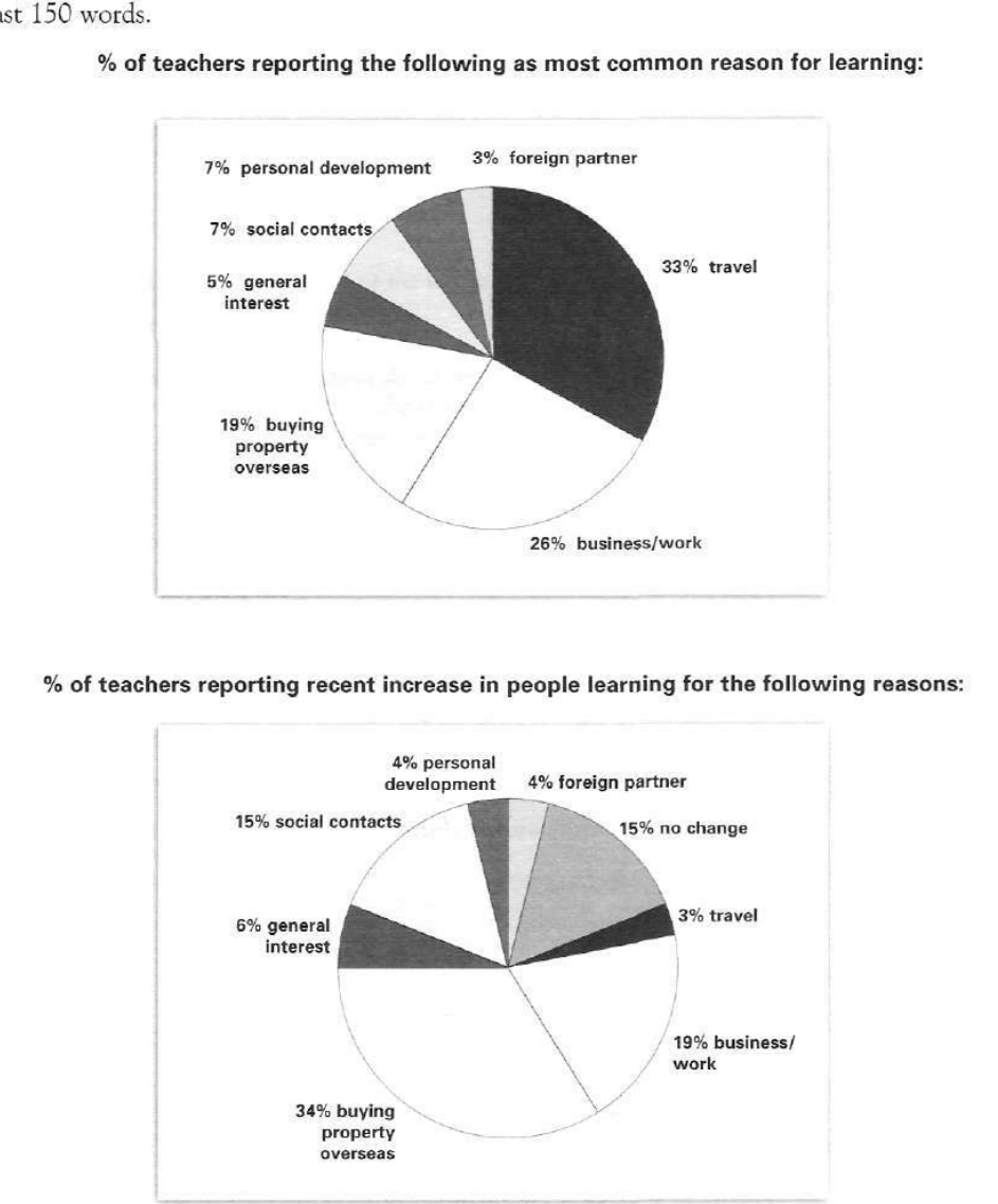
The pie charts below show responses by teachers of foreign languages in Britain to a survey concerning why their students are learning a foreign language. The first chart shows the main reason for learning a foreign language. The second chart shows how many teachers felt that there has been a recent change in the reason.
Write a report for a university lecturer describing the information below.
% of teachers reporting the following as most common reason for learning:
Student answer (Band 5.5)
The pie chart compares the proportion that why the participants of school are learning the language of other countries which is shown by responses of foreign language teacher in Britian.
Overall, the most common reason for learning is travel while the less common is foriegn partner. The recent increase in learning process is due to buying properties overseas while the least value is shown by travel.
The valid reason of learning is travel 33% which progressively declined over the years reaching just 3%. The rapid fall of businessmen or workers is seen having the proportion of 26% to 19% .Buying property overseas succesfully surged with percentage of 19% to 34%. The main concern which is contributing to interest in learning was social contacts ranging between 7% -14%.
On of the reason which is represents no change that is 15% in learning process illustrating that some individual interest is still constant during these recent years.
AI examiner evaluation
| Criterion | Band |
|---|---|
| Task Achievement / Task Response | 5.5 |
| Coherence and Cohesion | 5.5 |
| Lexical Resource | 5.5 |
| Grammatical Range and Accuracy | 5.0 |
| Overall | 5.5 |
Task Achievement / Task Response: Band 5.5
You identify the main pattern in both charts: travel is the leading reason in the first, while buying property overseas is the largest reported recent increase. You also include several relevant figures, such as 33%, 26%, 19% and 34%. However, coverage is partial and some comparisons are inaccurate or unclear. The statement that travel “declined over the years” compares two different charts, not a time series; the second chart reports teachers’ views of recent increases. Social contacts are given as 7% in the first chart and 15% in the second, not “7%–14%.” Several categories, including foreign partners, general interest and personal development, are omitted, and the 15% “no change” figure is not clearly distinguished from reasons for an increase. A more complete, precise overview and accurate comparisons would strengthen the report.
Coherence and Cohesion: Band 5.5
The response has a recognisable structure: an introduction, an overview and two detail paragraphs. This gives the reader some organisation, and the overview usefully highlights travel and overseas property. However, progression within the detail is difficult to follow because figures from the two charts are sometimes presented as if they describe change over time. For example, “travel 33% which progressively declined…reaching just 3%” does not explain that these values refer to separate survey questions. The final sentence about “no change” is also added without a clear link to the preceding comparison. Use one paragraph for the first chart and another for the second, and group related categories with clear references such as “in the first chart” and “by contrast, in the second.”
Lexical Resource: Band 5.5
You use some task-relevant vocabulary, including “proportion,” “recent increase,” “declined” and “surged,” and the main topic remains understandable. However, the range is limited and several word choices or collocations are inaccurate, which sometimes makes the meaning unclear. “The proportion that why” is not a natural way to introduce the data, while “valid reason” and “main concern” do not accurately describe survey categories. “The rapid fall of businessmen or workers” also mislabels the business/work category and suggests a decline that the chart does not show. Spelling errors such as “Britian,” “foriegn” and “succesfully” are noticeable. Prefer precise chart language such as “share of teachers,” “business or work,” and “reported increase,” and check spelling carefully.
Grammatical Range and Accuracy: Band 5.0
You attempt both simple and more complex sentences, including an overview and clauses describing the figures. However, grammatical control is inconsistent, and errors in sentence construction, agreement and punctuation sometimes make the relationships between ideas difficult to understand. For example, “The pie chart compares the proportion that why…” has an incomplete, incorrectly formed clause, and “On of the reason which is represents no change” contains errors in number and verb structure. The sentence beginning “The valid reason of learning is travel 33%” also lacks a clear grammatical link between the category and its figure. Work on complete subject–verb structures, articles and plural forms, and separate figures from explanations with appropriate punctuation. Clearer sentence patterns will help your comparisons read accurately.
See this exact question answered at other band scores. The same prompt compared across bands.
Browse more IELTS Writing model answers or get your own writing scored by the same AI examiner.