Band 5.5 IELTS Writing Task 1 Model Answer
Overall Band Score: 5.5 · IELTS Complete Catalyst · 2026-11-21
IELTS Writing Task 1 question
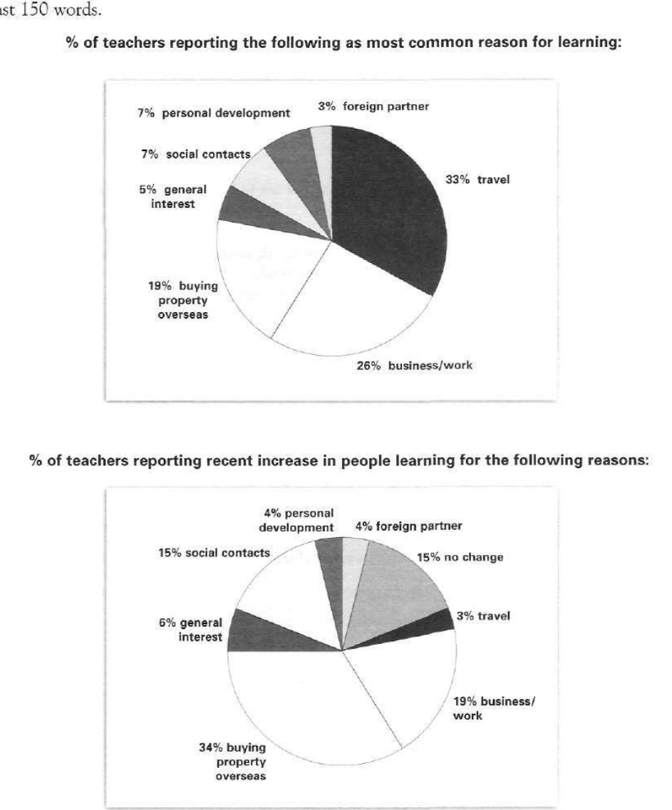
The pie charts below show responses by teachers of foreign languages in Britain to a survey concerning why their students are learning a foreign language. The first chart shows the main reason for learning a foreign language. The second chart shows how many teachers felt that there has been a recent change in the reason.
Write a report for a university lecturer describing the information below.
% of teachers reporting the following as most common reason for learning:
Student answer (Band 5.5)
The pie chart illustrates the result of the survey of teachers and students who are learning foreign language in Britain and reason behind learning.Other chart showing the reason that has been
currently change .
Overall it has categorized in 8 sections.All of these fluctuated over the periods,However travel faced a major decline and added no change in a list .
The most common reason of learning a foreign language was travel which accounted for 33% and recently decreased dramaticaly at 3% Followed by Business/Work 26% and recent dropped slightly 19%,While buying property overseas increased from 19% to 34 % respectively and social contach also jumped from 7% to 15% recently .
Meanwhile foreign was 3% and reached 4% in contrast personal development decreased from 7% to 4% ,general interest marginaly increase 5% to 6 % recent ,No change who recently rise with 15% .
However all categories faced dramaticaly changes over the periods .
AI examiner evaluation
| Criterion | Band |
|---|---|
| Task Achievement / Task Response | 5.5 |
| Coherence and Cohesion | 5.0 |
| Lexical Resource | 5.5 |
| Grammatical Range and Accuracy | 5.0 |
| Overall | 5.5 |
Task Achievement / Task Response: Band 5.5
You identify the main reason in the first chart—travel at 33%—and make useful comparisons with business/work and buying property overseas. You also report several figures from the second chart accurately, including the rise for property-related learning to 34% and the fall in travel to 3%. However, the task is only partly addressed because the overview is unclear: “All of these fluctuated over the periods” suggests a time series, although the charts compare reasons and teachers’ reports of recent change. The claim that “all categories faced dramaticaly changes” is also too broad; some reported changes are small, such as foreign partner (3% to 4%) and general interest (5% to 6%). State the charts’ different purposes clearly and summarise the strongest contrasts without implying that every category changed dramatically.
Coherence and Cohesion: Band 5.0
There is some organisation: you begin by introducing the charts, give an overview, and then compare several categories. Linking expressions such as “Followed by,” “Meanwhile,” and “in contrast” show an attempt to connect information. However, the progression is difficult to follow because the overview and comparisons are not clearly separated, and several ideas are crowded into long sentences. For example, the sentence beginning “The most common reason…” moves through travel, business/work, property, and social contacts without clear sentence boundaries. Some connectors are also used inaccurately or mechanically, such as “respectively” where no paired sequence is being presented. Use distinct paragraphs for the overview and details, and group the largest increases and decreases so the reader can follow the comparisons more easily.
Lexical Resource: Band 5.5
You use relevant chart vocabulary, including “accounted for,” “increased,” “decreased,” and “marginally,” and you attempt to describe differences in degree. However, the range is limited and several word choices or collocations are inaccurate, which sometimes makes the meaning less clear. “Currently change” and “recently dropped slightly” do not express the chart’s second measure precisely, while “faced a major decline” treats the two charts as a time series. There are also noticeable spelling errors, including “dramaticaly,” “contach,” and “marginaly.” Choose precise reporting language such as “teachers reported a recent increase” and check spelling carefully. Avoid repeating broad terms such as “change” when a more exact description is available.
Grammatical Range and Accuracy: Band 5.0
You attempt both simple statements and longer sentences with comparisons, but the longer structures are often faulty, and errors occur frequently enough to make some relationships difficult to interpret. For example, “The pie chart illustrates the result of the survey of teachers and students who are learning foreign language” has unclear noun relationships and missing articles. In “travel … recently decreased … at 3%,” the subject and verb imply that travel itself changed over time, rather than that teachers reported a recent increase for particular reasons. Several sentences also run together, with inconsistent capitalisation and punctuation, such as “19%,While.” Practise writing one clear comparison per sentence, use accurate articles and verb forms, and punctuate sentence boundaries before adding more complex structures.
See this exact question answered at other band scores. The same prompt compared across bands.
Browse more IELTS Writing model answers or get your own writing scored by the same AI examiner.