Band 5.0 IELTS Writing Task 1 Model Answer
Overall Band Score: 5.0 · Cambridge IELTS 21 · 2026-11-09
IELTS Writing Task 1 question
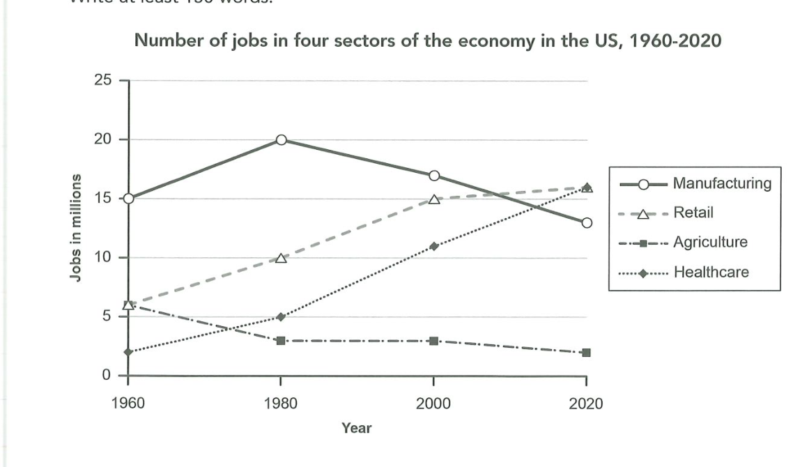
The graph below gives information about the number of jobs in four sectors of the economy in the US between 1960 and 2020.
Summarise the information by selecting and reporting the main features, and make comparisons where relevant.
Number of jobs in four sectors of the economy in the US, 1960-2020
Student answer (Band 5.0)
The line grpah diclinate the proportion of jobs in four sectors of the economy in the us namely manufacturing , retail , agriculture and healthcare in [redacted phone]
Overall,It can clearly be seen that healthcare sector were the dramatical increase over the period while,Agriculture fell down at the begining of the period until now.
In 1960 the manufacturing job sector consumption consiuption 15% this proportion rose to 20% in 1980.However the percentage decline to 14% in 2000 and 11 % in 2020 comparison Retail sector stood at 6% in the starting of the stage the proportion continuesly rose until 2000. 10%in 1980 whereas 15% in 2000 ans 16 % in 2020 respectively.
display the agriculture economy in united state only 6% in 1960 moreover this proportion decline to 4% in 1980 until 2000 comparison
healthcare being with 3% in 1960 increase to 5 percent in 1980 While, agriculture became 3% in 2020 In contrast in 2000 healthcare showed 11% and 16% in 2020.
AI examiner evaluation
| Criterion | Band |
|---|---|
| Task Achievement / Task Response | 5.5 |
| Coherence and Cohesion | 4.5 |
| Lexical Resource | 5.0 |
| Grammatical Range and Accuracy | 5.0 |
| Overall | 5.0 |
Task Achievement / Task Response: Band 5.5
You identify the four sectors and include several relevant figures, such as manufacturing at 15 in 1960 and 20 in 1980, and healthcare rising to 16 by 2020. The overview also correctly highlights healthcare’s strong growth and agriculture’s decline. However, some data are inaccurate or unclear: manufacturing is reported as 14 in 2000 and 11 in 2020, rather than about 17 and 13, and agriculture’s 2020 figure is confused with its 2000 value. The response also describes jobs as percentages, although the chart measures numbers of jobs in millions. Coverage is therefore partial, and the main comparisons are not consistently reported. Use the correct unit and check each series against the graph.
Coherence and Cohesion: Band 4.5
There is an attempt to organise the response into an introduction, an overview and detail, and the reader can identify some comparisons between sectors. However, progression is difficult to follow because information is crowded into long, loosely connected sentences. For example, the manufacturing and retail figures run together after “However,” while the final paragraph shifts between agriculture and healthcare without a clear sequence. Linking words such as “moreover,” “until,” and “in contrast” are sometimes used inaccurately or do not clarify the relationship between the figures. Separate the sectors or group them by trend, and use one clear sentence for each comparison. This would make the organisation more coherent and reduce the need for the reader to reconstruct the intended meaning.
Lexical Resource: Band 5.0
You use some task-relevant vocabulary, including “proportion,” “decline,” “increase,” and “stood at,” and you attempt to describe changes over time. However, the range is limited and several word choices or spellings make the report difficult to understand. “The line grpah diclinate” does not accurately introduce what the graph shows, and “manufacturing job sector consumption consiuption” is unclear. “Agriculture fell down” is also an unnatural way to describe a downward trend. In addition, calling the figures “percentages” is inaccurate for a chart measured in millions of jobs. Choose precise terms such as “number of jobs,” “rose,” and “fell,” and check spelling and collocations before submitting.
Grammatical Range and Accuracy: Band 5.0
You attempt both simple statements and longer sentences, and some basic time comparisons can be understood. However, the longer structures are often faulty, which sometimes makes the relationships between figures unclear. For example, “Overall,It can clearly be seen that healthcare sector were…” has problems with spacing, article use and subject–verb agreement, while “the proportion continuesly rose until 2000. 10%in 1980 whereas…” is not a complete, well-formed sentence. Tense and sentence boundaries are also inconsistent, particularly in the final paragraph. Practise forming complete sentences with a clear subject and verb, and use past-tense forms consistently for the historical data. Check punctuation and agreement when joining clauses with “while” or “whereas”.
See this exact question answered at other band scores. The same prompt compared across bands.
Browse more IELTS Writing model answers or get your own writing scored by the same AI examiner.