Band 5.0 IELTS Writing Task 1 Model Answer
Overall Band Score: 5.0 · Cambridge IELTS 18 · 2026-11-18
IELTS Writing Task 1 question
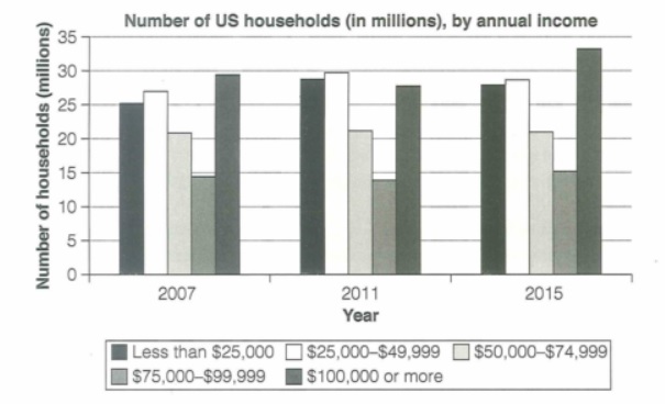
The chart below shows the number of households in the US by their annual income in 2007, 2011 and 2015.
Summarize the information by selecting and reporting the main features and make comparisons where relevant.
Student answer (Band 5.0)
The bar graph demostrates the number of households in the US by their annual income in 2007, 2011, 2015. Basically, graph shows income that were spend in the following years.
First of all, in 2007 the highest income was around $100,000 that was spend by the 29 millions households. Second highest income that was spend by 27 millions and that was between $25,000-$49,000 income. Then we have 25 millions households that spend less than $25000 income. After that we have second least that were around 21 millions households and their income were around $50,000-$74,999. Lower one is around 14 millions households that and their income were $75,000-$99,999.
Secondly, we have 2011, in 2011 the highest income are that were spend by the most of the households is about $25,000-$49,999. Then on second number there were less than $25,000 that were spend by 30 millions households. And same this method apply on 2015 however, in 2015 the highest income that were spend by the most of the households was around $100,000 or more.
In conclusion, we noticed that in 2015 income that spend by most of the households is hghest is 2015. However, one thing is same in all three years that was income around $75,000-$99,999 of 14 millions individuals.
AI examiner evaluation
| Criterion | Band |
|---|---|
| Task Achievement / Task Response | 4.5 |
| Coherence and Cohesion | 5.0 |
| Lexical Resource | 4.5 |
| Grammatical Range and Accuracy | 5.0 |
| Overall | 5.0 |
Task Achievement / Task Response: Band 4.5
You identify the three years and several relevant income groups, and you correctly note that the $100,000-or-more category is highest in 2015. However, the response only partially reports the chart and does not give a clear, accurate overview of the main changes. For example, the $25,000–$49,999 group is highest in 2011 at about 29.5 million, while the under-$25,000 group is about 28.5 million, not 30 million. The claim that the $75,000–$99,999 figure is 14 million in all three years is also inaccurate; it rises to about 15 million in 2015. Focus on the overall patterns and compare key figures accurately, rather than describing each year as a list.
Coherence and Cohesion: Band 5.0
The response has a basic structure, with an opening, separate discussion of 2007 and later years, and a concluding sentence. Sequencing phrases such as “First of all,” “Secondly,” and “In conclusion” help signal stages. However, progression is limited because the information is organised year by year without clearly comparing trends across the categories. Some links are repetitive or unclear, especially “And same this method apply on 2015,” which does not explain what is being compared. The conclusion also repeats an inaccurate detail rather than summarising the main pattern. Grouping categories by whether they rose, fell, or remained stable would create a clearer progression and make comparisons easier to follow.
Lexical Resource: Band 4.5
Vocabulary is basic and repetitive, particularly the repeated use of “income,” “spend,” “highest,” and “households.” The wording “income that were spend” is not an appropriate way to describe what the chart measures: it shows numbers of households within income bands, not money spent. Some category labels are recognisable, but expressions such as “second least” and “on second number” are imprecise and make the comparisons harder to understand. There are also spelling errors, including “demostrates” and “hghest.” Use a small range of accurate chart-reporting terms, such as “income bracket,” “number of households,” “stood at,” and “remained stable,” and preserve the chart’s income categories precisely.
Grammatical Range and Accuracy: Band 5.0
You use some simple sentence forms and attempt longer sentences with connectors, but control is inconsistent. Errors in verb forms and agreement recur, as in “the highest income are” and “income that were spend”; the latter also makes the relationship between households and income unclear. Plural and article patterns are often faulty in phrases such as “29 millions households” and “by the 29 millions households.” Sentence construction is also awkward in “Lower one is around 14 millions households that and their income were…”. These errors sometimes make the intended comparison difficult to follow. Practise accurate subject–verb agreement and concise patterns such as “There were about 29 million households in this bracket,” then check each sentence for a clear subject and verb.
See this exact question answered at other band scores. The same prompt compared across bands.
Browse more IELTS Writing model answers or get your own writing scored by the same AI examiner.