Band 5.5 IELTS Writing Task 1 Model Answer
Overall Band Score: 5.5 · Cambridge IELTS 18 · 2026-11-18
IELTS Writing Task 1 question
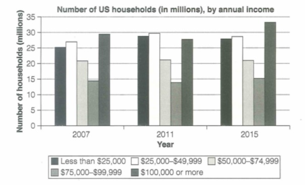
The chart below shows the number of households in the US by their annual income in 2007, 2011 and 2015.
Summarize the information by selecting and reporting the main features and make comparisons where relevant.
Student answer (Band 5.5)
The bar graph illustrates the information about number of households in the US by their annual income in 2007, 2011 and 2015.
Overall, the numbers of households earning their income $100,000 or more, their income significantly increase it is the largest portion in 2015. while, the numbers of households whoes earn $25,000 or less than its is the smallest portion from 2007 to 2015.
In 2007, the number of households who earn their income $100,000 or more are roughly 29 millions while, less than $25,000 is almost in 25 millions, $25,000 - $49,999 is roughly 26 millions, $50,000-$74,999 is 21 millions, or last one households income is $75,000- $99,999 thats is in 14%.
In 2011, Roughly about 30 millions individuals who earn $25,000 -$49,999, while amost around 27 millions of peoples they earn $100,000 or more , 28 millions of individuals earning $25,000 or less than , $75,000 - $99,999 earning income is 14 millions, while the last one is $50,000- $74,999 is 21 millions.
In 2015, almost 33 millions number of households they earn their income around $100,000 or more , while the 15 millions of individuals earning is $75,000-99,999, $25,000-$49,999 number of households is roughly 28 millions however, less then $25,000 is 27 millions while, last one is $50,000-$74,999 are in 21 millions.
AI examiner evaluation
| Criterion | Band |
|---|---|
| Task Achievement / Task Response | 5.5 |
| Coherence and Cohesion | 5.5 |
| Lexical Resource | 5.0 |
| Grammatical Range and Accuracy | 5.0 |
| Overall | 5.5 |
Task Achievement / Task Response: Band 5.5
You cover all three years and report figures for each income group, so the response is relevant and gives the reader a useful account of the chart. You also identify the $100,000-or-more group as the largest in 2015, which is accurate. However, the overview contains a key misreading: households earning $25,000 or less were not the smallest group; the $75,000–$99,999 category was smallest in every year. The overview also says the highest-income group increased significantly without clearly describing its dip in 2011 before rising to a peak in 2015. Some figures are imprecise, such as 26 million for the $25,000–$49,999 group in 2007, but the main limitation is the inaccurate overview and limited comparison of trends.
Coherence and Cohesion: Band 5.5
The response has a recognisable structure: an introduction, an overview, and separate paragraphs for 2007, 2011 and 2015. This makes the information easy to locate by year. However, the organisation is largely a sequence of figures rather than a clear comparison of patterns across the period. Linking words such as “while” and “however” are repeated and sometimes do not show a clear contrast; for example, “however” introduces the $25,000–$49,999 figure in the 2015 paragraph without explaining the comparison. Several sentences also contain many categories joined together, making relationships between figures difficult to follow. Grouping similar trends and using clearer references would create stronger progression and cohesion.
Lexical Resource: Band 5.0
You use relevant chart vocabulary, including “bar graph,” “households,” “income,” and “roughly,” and you attempt to describe quantities and comparisons. However, the range is limited and several word choices or collocations are inaccurate, which sometimes makes the meaning awkward. For example, “individuals” and “peoples” are used where the chart counts households, and “the smallest portion” is not a natural description of a category’s number of households. Phrases such as “earning their income” and “almost in 25 millions” also show weak control of common expressions for reporting data. Aim for precise, repeated use of terms such as “the number of households,” “stood at,” and “rose to,” rather than varying them with inaccurate alternatives.
Grammatical Range and Accuracy: Band 5.0
You attempt both simple and longer sentences, and the year-by-year paragraphs show an effort to report several figures in connected clauses. However, complex sentences are often faulty, and frequent errors in agreement, verb forms, articles and sentence boundaries can make the account difficult to read. For instance, “the numbers … significantly increase it is the largest portion” combines clauses without a workable structure, while “the number … are roughly” has subject–verb disagreement. The sentence beginning “In 2011, Roughly about 30 millions…” also lacks a clear grammatical connection between its clauses. Practise building accurate short sentences first, then combine them with controlled linking clauses and consistent past-tense reporting.
See this exact question answered at other band scores. The same prompt compared across bands.
Browse more IELTS Writing model answers or get your own writing scored by the same AI examiner.