Band 6.0 IELTS Writing Task 1 Model Answer
Overall Band Score: 6.0 · Cambridge IELTS 14 · 2026-11-17
IELTS Writing Task 1 question
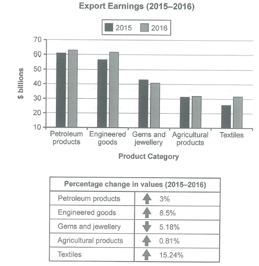
The chart below shows the value of one country’s exports in various categories during 2015 and 2016. The table shows the percentage change in each category of exports in 2016 compared with 2015.
Summarise the information by selecting and reporting the main features, and make comparisons where relevant.
Student answer (Band 6.0)
The bar graph illustrates the value of exports across different categories of one country in billion dollars during 2015 and 2016. Whereas, the table illustrates the proportion change of exports for each category in 2016 as compared to 2015. At a glance, Gems and jewellery is the only category which experiences a drop.
In 2016, as compared to 2015 each and every product experienced the rose in the earnings except for Gems and jewellery. In 2016, the industry experienced a drop of 5.18% in the earnings. The earning dropped from somewhat around 43 billion dollars to close to 40 billion dollars. Furthermore, Petroleum products, Engineered goods, Agriculture products and Textiles experienced the rose in the export earnings. Among all these Agricultural product's propotion change increased the least which was 081% whereas, Textiles market experienced the most proportion change of 15.24% followed by Engineered goods. In 2015, export earning from textiles was approximately 25 billion dollars and in 2016, it crosses the 30 billion dollars mark.
Overall, every product category's export earnings increased as compared to the previous year. From which Textiles experienced the most change in its values.
AI examiner evaluation
| Criterion | Band |
|---|---|
| Task Achievement / Task Response | 6.0 |
| Coherence and Cohesion | 6.0 |
| Lexical Resource | 5.5 |
| Grammatical Range and Accuracy | 5.5 |
| Overall | 6.0 |
Task Achievement / Task Response: Band 6.0
You identify the main contrast: most categories rose, while gems and jewellery fell, and you correctly highlight textiles as having the largest percentage increase and agricultural products the smallest. Several figures are also reported accurately, including the 5.18% decline and textiles’ rise from about $25 billion to above $30 billion. However, the overview is inconsistent: the opening says gems and jewellery is the only category to drop, but the final overview says every category increased. The account also gives limited attention to the leading export categories and their comparisons; petroleum products and engineered goods remained the highest earners, at roughly $63 billion and $62 billion in 2016. Clarify the overview and develop the key comparisons more evenly.
Coherence and Cohesion: Band 6.0
The response has a recognisable structure, moving from an introduction to a summary of changes and then a concluding overview. This makes the information generally easy to follow. However, the final paragraph repeats and contradicts the opening overview: “every product category’s export earnings increased” conflicts with the stated fall in gems and jewellery. Some linking is also awkward or mechanical, as in “Furthermore” and “Among all these,” while the long middle paragraph combines several categories without a clear comparison pattern. Grouping the highest-value categories together, then the declining and smaller categories, would create a more logical progression. Use transitions to show contrast and ranking, and ensure the conclusion accurately reflects the data already described.
Lexical Resource: Band 5.5
You use relevant task vocabulary such as “export earnings,” “experienced a drop,” and “proportion change,” and the meaning is usually understandable. However, several word choices and collocations are inaccurate or unnatural, including “the rose in the earnings,” “the industry experienced a drop,” and “the most proportion change.” “Agriculture products” is also less precise than the chart’s category label, “agricultural products.” There are spelling errors in “propotion” and the number format “081%,” which should be written as 0.81%. Aim for standard chart-reporting phrases such as “increased,” “recorded a decline,” and “the largest percentage rise.” More accurate collocations and careful spelling would make the comparisons clearer and more formal.
Grammatical Range and Accuracy: Band 5.5
You attempt both simple and more complex sentences, including a comparison introduced by “Whereas” and a sentence beginning “Among all these.” Most of the message remains understandable, but some grammatical errors affect accuracy. “Whereas” is incorrectly followed by a full stop, leaving a fragment; connect it to the main clause or use “The table, meanwhile, shows…”. In “each and every product experienced the rose,” the verb pattern and sentence construction are faulty, and “it crosses the 30 billion dollars mark” shifts tense in a past-time report. The final overview also has an unclear construction: “From which Textiles experienced…” Use consistent past tense and complete sentence structures, and check articles, possessives, and punctuation when joining clauses.
See this exact question answered at other band scores. The same prompt compared across bands.
Browse more IELTS Writing model answers or get your own writing scored by the same AI examiner.