Band 4.0 IELTS Writing Task 1 Model Answer
Overall Band Score: 4.0 · Cambridge IELTS 14 · 2026-11-18
IELTS Writing Task 1 question
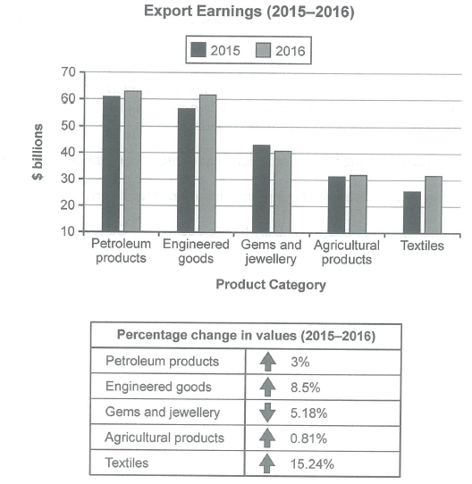
The chart below shows the value of one country’s exports in various categories during 2015 and 2016. The table shows the percentage change in each category of exports in 2016 compared with 2015.
Summarise the information by selecting and reporting the main features, and make comparisons where relevant.
Student answer (Band 4.0)
The chart below shows the value of one country's export in various categories during 2015 and 2016. The table shows the percentage change in each category of export in 2016 compperd with 2015.
summarise the information by selecting and reporting the main features, and make comparison where relevant.
export ernning
in this chart they explain the percentage change in values
in this thet show the percentage of petroleum product who increase by 3%
in this chart they also show the percentages of engineered good who increas by 8.5 percentage , gems amd jewellery decrease 5.18 percent, agricultural products increas by 0.81 percent and in last textiles increas by 15.24 percent .
in this chart we can see the percentages many percentage increas and decreas than last year.
in this chart highest increas is taxtiles by 15.24 percentage
in this chart highest dedcreas is aricultural products by 0.81 percentage.
i think this chart may helps you .
AI examiner evaluation
| Criterion | Band |
|---|---|
| Task Achievement / Task Response | 3.5 |
| Coherence and Cohesion | 3.0 |
| Lexical Resource | 4.5 |
| Grammatical Range and Accuracy | 4.5 |
| Overall | 4.0 |
Task Achievement / Task Response: Band 3.5
The response identifies several percentage changes, including the 3% rise in petroleum and the 8.5% rise in engineered goods, but it does not adequately summarise the chart’s export values or give a clear overview of the main comparisons. It also misreports the largest decrease: agricultural exports rose slightly, while gems and jewellery fell by 5.18%. The claim that agricultural products had the highest decrease is therefore inaccurate. The response is 117 words, below the required 150, and 39 words copied from the prompt were not counted. To improve, describe the main value patterns as well as the percentage changes, accurately identify the strongest rise and only decline, and support these points with key figures.
Coherence and Cohesion: Band 3.0
There is a basic attempt to group information, and the reader can identify a list of percentage changes. However, the response has no clear progression from an overview to supporting details: repeated openings such as “in this chart” make the points feel disconnected, and the final comments repeat the idea of increases and decreases rather than developing a comparison. The heading “export ernning” also does not help organise the report. Use a clear structure: introduce the chart, give an overview of the main trends, then compare the categories in one or two focused paragraphs. Linking phrases such as “By contrast” would help distinguish the decline in gems and jewellery from the increases elsewhere.
Lexical Resource: Band 4.5
The response uses some relevant task vocabulary, including “percentage change,” “increase,” “decrease,” and category names, so the basic subject is understandable. However, the range is narrow and repetitive, with “in this chart” and “percentage” used repeatedly. Several spelling errors, including “ernning,” “compperd,” “increas,” and “taxtiles,” reduce accuracy and polish. Some expressions are also imprecise, such as “the percentages many percentage increase and decrease,” which does not clearly describe the data. Build a more varied set of accurate reporting phrases, such as “export earnings,” “recorded a rise,” and “experienced a decline,” and check spelling carefully before submitting.
Grammatical Range and Accuracy: Band 4.5
The response mainly uses short, simple statements, and some basic sentence patterns communicate individual changes. However, the range is limited, and errors in sentence construction and verb forms are frequent enough to make several lines awkward or unclear. For example, “in this chart they explain the percentage change” uses an unclear subject, while “highest increas is taxtiles” lacks an appropriate grammatical structure for a comparison. The opening also has problems with articles and number agreement in “one country's export” and “each category of export.” Practise complete comparison sentences, for example, “Textile earnings rose by 15.24%, the largest increase,” and check subject–verb agreement, articles, and punctuation.
See this exact question answered at other band scores. The same prompt compared across bands.
Browse more IELTS Writing model answers or get your own writing scored by the same AI examiner.