Band 6.0 IELTS Writing Task 1 Model Answer
Overall Band Score: 6.0 · Cambridge IELTS 14 · 2026-11-18
IELTS Writing Task 1 question
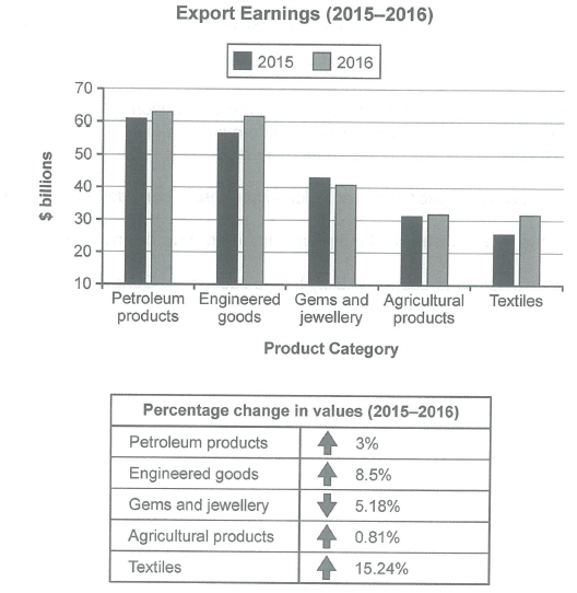
The chart below shows the value of one country’s exports in various categories during 2015 and 2016. The table shows the percentage change in each category of exports in 2016 compared with 2015.
Summarise the information by selecting and reporting the main features, and make comparisons where relevant.
Student answer (Band 6.0)
The pie chart illustrates the value of one country's exports in various categories during 2016 and 2015 and the table shows the percentage change change in each section of exports in 2016 compared with 2015.
Petroleum products and engineered goods are approximately same during 2015 and 2016 then others, whereas, textiles are at least. Moreover, textiles have the highest increase in percentage, while, agricultural products has lowest increase.
Firstly, let's talk about the export earnings during 2015 and 2016. The petroleum products and engineered goods had almost same earnings in 2015and 2016 which is around to 60 billions. While the textiles had minimum earning which is about 25 billions in 2015. moreover it rose to 32 billions in 2016. The agricultural products earned same ratio in both years which is about 31 billions. In addition, gems and jewellery earned 40 billions in 2016 and 42 billions in 2015.
Lastly, let's discuss about the percentage changes. Textiles had the maximum rise during both years which is 15.24%, in contrast, agricultural products increased least during both years. Petroleum products percentage increased minorly, while, gems and jewellery declined about 5%.
AI examiner evaluation
| Criterion | Band |
|---|---|
| Task Achievement / Task Response | 6.0 |
| Coherence and Cohesion | 6.0 |
| Lexical Resource | 5.5 |
| Grammatical Range and Accuracy | 5.5 |
| Overall | 6.0 |
Task Achievement / Task Response: Band 6.0
You cover both the chart and the table, and your overview identifies important patterns: petroleum and engineered goods are the leading categories, textiles show the strongest growth, and agricultural products change very little. Most figures are broadly consistent with the visual, including textiles rising from about 26 to 31.5 billion and gems and jewellery declining. However, the opening calls the visual a “pie chart,” although it is a bar chart, and the comparison that petroleum and engineered goods had “almost same earnings” is imprecise: engineered goods rose from about 57 to 62 billion. The percentage changes are not consistently reported with figures. A more precise overview and fuller comparison of the main rises and fall would make the response more complete.
Coherence and Cohesion: Band 6.0
The response has a recognisable structure, moving from an introduction and overview to the chart figures and then the percentage changes. This makes the information generally easy to follow. However, the sequence is somewhat mechanical, with “Firstly” and “Lastly” announcing sections rather than showing relationships between the data. Some linking is awkward or unclear, as in “Petroleum products and engineered goods are approximately same during 2015 and 2016 then others,” and “Moreover” begins a sentence without a clear connection to the preceding point. Grouping the categories by their trends—leading earners, declining earnings, and strongest growth—would create clearer progression. Use linking expressions selectively and make comparisons within the same paragraph where possible.
Lexical Resource: Band 5.5
You use relevant topic vocabulary such as “export earnings,” “percentage change,” “declined,” and “increase,” so the main information is usually understandable. However, several choices are imprecise or unnatural for describing a chart: “the pie chart” misidentifies the visual, “same ratio” is not suitable for earnings, and “increased minorly” is an awkward collocation. There is also repetition of “during” and “earned,” while “minimum” and “maximum” are less natural here than “lowest” and “highest.” Aim for accurate chart language and varied verbs such as “stood at,” “rose,” and “fell.” These improvements would make your descriptions more precise and fluent.
Grammatical Range and Accuracy: Band 5.5
You attempt both simple and more extended sentence forms, and the reader can generally understand the comparisons. Some grammatical errors remain, particularly with articles, agreement, and sentence boundaries. For example, write “were approximately the same” rather than “are approximately same,” and “agricultural products had the lowest increase” rather than “agricultural products has lowest increase.” The phrase “in 2015and 2016” also needs spacing, and “While the textiles had minimum earning” is a fragment when separated from the preceding sentence. Review article use, past-tense consistency, and punctuation around linking words such as “whereas” and “moreover.” More accurate control of these patterns would strengthen the response.
See this exact question answered at other band scores. The same prompt compared across bands.
Browse more IELTS Writing model answers or get your own writing scored by the same AI examiner.