Band 5.5 IELTS Writing Task 1 Model Answer
Overall Band Score: 5.5 · Cambridge IELTS 14 · 2026-11-21
IELTS Writing Task 1 question
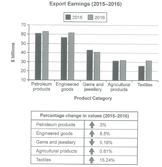
The chart below shows the value of one country’s exports in various categories during 2015 and 2016. The table shows the percentage change in each category of exports in 2016 compared with 2015.
Summarise the information by selecting and reporting the main features, and make comparisons where relevant.
Student answer (Band 5.5)
The bar chart illustrates the value of one country's exports in various categories during 2015 and 2016. The table represents the percentage change in each category of exports in 2016 compared with 2015.
Overall, petroleum products had the highest proportion in both years. While textiles product were least common category. Whereas, textiles industry grew significantly in percentage.
Regarding export earnings, petroleum accounted for the highest earning in both years. The figure was around 60 billion in 2015 and rose gradullay to 62 billion in 2016 making it the major category in terms of generating earning in billion dollars. The proportion for engineered goods increased from 55 billion in 2015 to 60 billion in 2016. This category ranked second. Gems and jewellery was around 42 billion in 2015 and fell slighlty to 40 billion in 2016. followed by agricultural products figure was 30 billion in 2015 and 31 billion in 2016. Whereas, textiles was 25 billion in 2015 and 30 billion in 2016 this is the least category.
Related to percentage, textile increased largely to 15.24%. followed by enigineered goods at 8.5%. Petroleum products and agricultural products were 3% and 0.81% Whereas, gems and jewellery dropped to 5.18%.
AI examiner evaluation
| Criterion | Band |
|---|---|
| Task Achievement / Task Response | 6.5 |
| Coherence and Cohesion | 5.5 |
| Lexical Resource | 5.5 |
| Grammatical Range and Accuracy | 5.0 |
| Overall | 5.5 |
Task Achievement / Task Response: Band 6.5
You cover both the chart and the table, and your overview identifies the main patterns: petroleum products earned the most in both years, while textiles showed the strongest percentage growth. Most figures and directions are reported accurately, including the fall in gems and jewellery and the small rise in agricultural products. This meets the task well, with some features more fully reported than others. However, the overview says textiles were the “least common category,” which is unclear because they had the lowest earnings in 2015 but tied with agriculture in 2016. Also, the table gives percentage changes, but the final paragraph does not clearly state that gems and jewellery fell by 5.18%. Clarifying these points and using the chart’s approximate values more consistently would make the report more complete.
Coherence and Cohesion: Band 5.5
The response has a recognisable structure: an introduction, an overview, a paragraph on export values and a final paragraph on percentage changes. This gives the reader a basic route through the information. However, progression within paragraphs is weakened by abrupt or incomplete links, such as “followed by agricultural products figure…” and the sentence fragment “Whereas, textiles was…”. “Regarding export earnings” and “Related to percentage” also function as repetitive, mechanical transitions rather than smoothly connecting comparisons. Grouping the categories more deliberately—for example, the leading earners together and the smaller categories together—and linking each comparison in complete sentences would improve the overall flow. Clearer referencing would also help the reader follow which category each figure describes.
Lexical Resource: Band 5.5
You use relevant task vocabulary, including “export earnings,” “percentage change,” “accounted for,” and “ranked second,” so the meaning is generally understandable. However, the range is limited and several word choices or collocations are inaccurate or repetitive. “Highest proportion” is not appropriate for monetary values; “highest earnings” is more precise. “Textiles product” and “textiles industry” do not accurately name the chart category, while “least common category” is vague. There are also spelling errors in “gradullay,” “slighlty,” and “enigineered,” and “increased largely” is an unnatural way to describe the largest percentage rise. Use the exact category labels and practise precise verbs such as “rose,” “declined,” and “recorded.”
Grammatical Range and Accuracy: Band 5.0
You attempt both simple and more developed sentence forms, and the main comparisons can usually be understood. However, some sentence structures and punctuation are faulty, which limits clarity. For example, “While textiles product were least common category” is an incomplete clause and lacks an article; “followed by agricultural products figure was…” also joins ideas without a complete grammatical structure. The sentence beginning “Whereas, textiles was…” has the same problem, and “petroleum products and agricultural products were 3% and 0.81% Whereas…” needs clearer sentence boundaries. There are also agreement and article errors, as in “textiles product were.” Build comparisons as complete sentences, check singular and plural agreement, and use punctuation to separate independent clauses.
See this exact question answered at other band scores. The same prompt compared across bands.
Browse more IELTS Writing model answers or get your own writing scored by the same AI examiner.