Band 5.5 IELTS Writing Task 1 Model Answer
Overall Band Score: 5.5 · Cambridge IELTS 11 · 2026-11-09
IELTS Writing Task 1 question
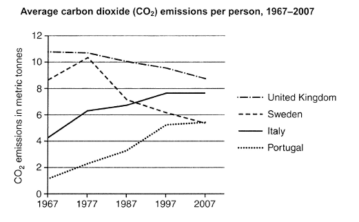
The graph below shows average carbon dioxide (CO2) emissions per person in the United Kingdom, Sweden, Italy and Portugal between 1967 and 2007.
Summarise the information by selecting and reporting the main features, and make comparisons where relevant.
Student answer (Band 5.5)
Introduction:The line graph illustrates the emissions of each persons average carbon dioxide (co2) in the United kingdom,Sweden ,Italy,and Portugal under 1967 and 2007.
Overviwe:2 countries per person emissions are get high year by year and 2 countries emissions are up and then get down.
Body1:In United kingdom and sweden the carbon dioxide level is up 8 and above 12 in 1967 then in 1977 Sweden (co2) level are jump above 10 after that in in 1987 it comes down between 7 and 6.In 1997 the line down between 4 to 6 at last in 2007 the difference are almost as 1997.In United kingdom the line particulary goes down from 12 percent to 8-9 percent.
Body2:The line graph shows that Italy and Portugal each person emissions of average carbon dioxide level are up in each decades in Portugal the percent of average carbon dioxide level in 1967 are between 0 to 2 in 1977 it goes above 2 percent it nearly 4 percent in 1987 and from 1997 to 2007 the percentage stays in 4-6 percent.Italy had their co2 level at 4 percent in 1967 in 1977 it's up to at 6 and in 1977 to 2007 it's almost at 8 percent.
AI examiner evaluation
| Criterion | Band |
|---|---|
| Task Achievement / Task Response | 5.5 |
| Coherence and Cohesion | 5.5 |
| Lexical Resource | 5.0 |
| Grammatical Range and Accuracy | 5.0 |
| Overall | 5.5 |
Task Achievement / Task Response: Band 5.5
You identify the four countries and make a relevant attempt to summarise their broad patterns, including the UK’s decline and the rises in Italy and Portugal. However, the overview is unclear: “2 countries per person emissions are get high year by year” does not accurately distinguish the trends, since Sweden rises and then falls, while Italy and Portugal rise overall. Several figures and comparisons are imprecise or misleading. For example, the UK starts at about 11 tonnes, not “12 percent,” and Italy reaches about 7.6 tonnes by 1997 and remains there, rather than being “almost at 8 percent” throughout 1977–2007. Report the main trends accurately in tonnes and make the overview explicit.
Coherence and Cohesion: Band 5.5
The response has a recognisable structure, with an introduction, an overview and separate paragraphs for the two pairs of countries. This gives the reader a basic route through the information. However, progression within the body paragraphs is difficult to follow because time references and comparisons are not consistently clear. In the UK and Sweden paragraph, “the line down between 4 to 6” is hard to connect to a particular country or year, and “the difference are almost as 1997” does not explain what is being compared. The repeated “in 1977” in the Italy paragraph also disrupts the sequence. Use clear chronological links and refer to each country explicitly when describing changes.
Lexical Resource: Band 5.0
You use relevant topic vocabulary such as “emissions,” “carbon dioxide,” “level” and “line graph,” so the subject is generally recognisable. However, the range is limited and several word choices or collocations make the descriptions unclear, including “the line particulary goes down,” “the percentage stays,” and “the difference are almost as 1997.” The graph reports emissions in metric tonnes, not percentages, so repeatedly calling the figures “percent” is inaccurate and may confuse the reader. Spelling and form errors such as “Overviwe” and “each persons” also reduce control. Aim for precise graph language, such as “per-person emissions,” “rose to,” “declined to” and “remained stable.”
Grammatical Range and Accuracy: Band 5.0
You attempt to describe changes across several years and use some longer sentences, but the range of sentence structures is limited and errors are frequent enough to make parts difficult to interpret. Examples include “2 countries per person emissions are get high,” “the carbon dioxide level is up,” and “the difference are almost as 1997,” where verb forms and subject–verb agreement are not controlled. Articles, plurals and sentence boundaries are also inconsistent, as in “each persons average carbon dioxide” and the long body sentences joined without clear punctuation. Practise forming accurate past-tense comparisons: for example, “Sweden’s emissions rose to about 10 tonnes in 1977, then fell to 7 tonnes by 1987.”
See this exact question answered at other band scores. The same prompt compared across bands.
Browse more IELTS Writing model answers or get your own writing scored by the same AI examiner.