Band 6.0 IELTS Writing Task 1 Model Answer
Overall Band Score: 6.0 · Cambridge IELTS 11 · 2026-11-11
IELTS Writing Task 1 question
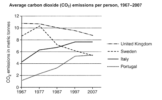
The graph below shows average carbon dioxide (CO2) emissions per person in the United Kingdom, Sweden, Italy and Portugal between 1967 and 2007.
Summarise the information by selecting and reporting the main features, and make comparisons where relevant.
Student answer (Band 6.0)
The line graph illustrates normal release of carbon dioxide (CO2) per person between 1967 and 2007 in the countries like; United Kingdom, Sweden, Italy and Portugal.
Overall, the UK remained at the top in terms of waste gas releasing country, while Portugal showed opposite propotions than Britian. Whereas, Sweden and Italy showed fluctuated ratios in these time period of forty years.
In 1967, United Kingdom released almost 11 metric tonnes carbon dioxide gas, that was the highest amount compared to all other three countries. But this amount declined steadilyat finally reached at almost 9 metric tonnes since 2007. In Sweden the proportion of disposed off gas surged to 10.5 metric tonnes, than dipped at 7 metric tonnes in 1987.After that it remained almost 5 metric tonnes in 2007.Italy emitted almost 4.5 metric tonnes CO2 GAS in 1967, it showed fluctuations itill 1997, then levelled off to 2007.Portugal was at the bottom among the waste gas releasing countries, but at the same time it was the only country whom raised the number of its polluted gas.In 1967, Portugal released almost 1 metric tonnes waste gas but that amount inclined to 5 metric tonnes in these forty years.
AI examiner evaluation
| Criterion | Band |
|---|---|
| Task Achievement / Task Response | 6.5 |
| Coherence and Cohesion | 6.0 |
| Lexical Resource | 5.5 |
| Grammatical Range and Accuracy | 5.0 |
| Overall | 6.0 |
Task Achievement / Task Response: Band 6.5
You identify the main overall contrast: the UK had the highest emissions, while Portugal began lowest and rose substantially. You also report several key figures and trends accurately, including the UK’s decline and Sweden’s peak followed by a fall. This meets the task well, with some features more fully covered than others. However, the overview is partly unclear: saying Sweden and Italy “showed fluctuated ratios” does not distinguish Sweden’s marked rise and fall from Italy’s steady increase before levelling off. The account of Italy is especially underdeveloped, and Portugal’s final figure is given only approximately. To strengthen the response further, make the overview more precise and compare the countries’ end values, noting that Italy and Portugal both finished at about 5.4–7.6 tonnes respectively.
Coherence and Cohesion: Band 6.0
The response has a clear basic structure: an introduction, an overview, and a paragraph of country details. The information generally moves from the overall picture to individual trends, and time markers such as “In 1967,” “After that,” and “in 2007” help readers follow the data. However, the overview’s “Whereas” sentence is not smoothly connected to the preceding clause, and several long sentences join separate facts with commas, making relationships less clear. The country-by-country reporting also gives limited direct comparison between Italy and Portugal, despite their converging trends. Use clearer sentence boundaries and link comparisons explicitly—for example, contrast Italy’s rise and plateau with Portugal’s continued increase.
Lexical Resource: Band 5.5
You attempt a range of vocabulary, including “declined steadily,” “surged,” “dipped,” and “levelled off,” which can describe graph trends effectively. However, several choices are inaccurate or unnatural for this topic: “normal release,” “waste gas releasing country,” “disposed off gas,” and “polluted gas” obscure the intended meaning. “Proportions” is also not the right term for emissions measured in tonnes, and “inclined” is an awkward choice for an increase. Spelling and word-form slips such as “propotions” and “Britian” further reduce precision. Prefer consistent, neutral terms such as “emissions,” “emitted,” “rose,” and “fell”; this will make the report clearer and more appropriately academic.
Grammatical Range and Accuracy: Band 5.0
You use both simple and more complex forms, including the contrast introduced by “while” and time clauses such as “After that.” The main trends are usually understandable, but errors in sentence construction and grammatical control recur. For example, “this amount declined steadilyat finally reached” lacks a clear grammatical connection, while “In Sweden the proportion … surged …, than dipped” has faulty clause linkage. There are also problems with articles, prepositions, and sentence boundaries, as in “almost 11 metric tonnes carbon dioxide gas” and the comma splice in “Italy emitted … in 1967, it showed fluctuations.” Aim for one complete clause per sentence where needed, and check verb forms and punctuation when combining comparisons.
See this exact question answered at other band scores. The same prompt compared across bands.
Browse more IELTS Writing model answers or get your own writing scored by the same AI examiner.