Band 5.5 IELTS Writing Task 1 Model Answer
Overall Band Score: 5.5 · Cambridge IELTS 11 · 2026-11-14
IELTS Writing Task 1 question
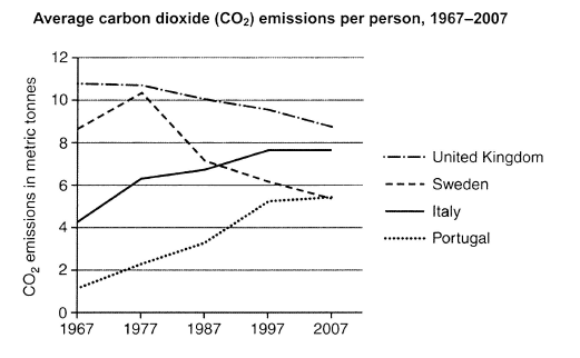
The graph below shows average carbon dioxide (CO2) emissions per person in the United Kingdom, Sweden, Italy and Portugal between 1967 and 2007.
Summarise the information by selecting and reporting the main features, and make comparisons where relevant.
Student answer (Band 5.5)
The line chart illustrates normal cabon dioxide (CO2) emissions per human in the United Kingdom, Sweden, Italy and Protugal between in 1967 and in 2007.
Overall, Average cabon dioxide (CO2) in Portugal was a substantial change, it increase from 1 (CO2) emission in metric tonnes to 7 (CO2) emission in metric tonnes from 1967 to 2007. And a sudden change in Sweden.
Portugal start from 1 (CO2) emission in metric tonnes in 1967. And than noraml increase and than stop in 5(CO2) emission in metric tonnes in 2007. Thus, Italy starting from 4(CO2) emission in metric tonnes in 1967 and it illustrates a suddenly increase in per person and after that it show a noraml increase and than stop in 7(CO2) emission in metric tonnes in 2007.
After that Sweden started from 9(CO2) emission in metric tonnes in 1967 and it illustrates first suddenly increase to 10(CO2) emission in metric tonnes but suddenly it show decrease from 10(CO2) emission in metric tonnes to 7(CO2) emission in metric tonnes. And than it stop in 5 (CO2) emission in metric tonnes in 2007. At the and United Kingdom show a average change starting from 11(CO2) emission in metric tonnes and show no change in 1977 but after that it show a suddenly decrease and than it stop at 9(CO2) emission in metric tonnes in 2007.
My opinion, is that every countries show different line graph from 1967 to 2007.
AI examiner evaluation
| Criterion | Band |
|---|---|
| Task Achievement / Task Response | 5.5 |
| Coherence and Cohesion | 5.5 |
| Lexical Resource | 5.0 |
| Grammatical Range and Accuracy | 5.0 |
| Overall | 5.5 |
Task Achievement / Task Response: Band 5.5
You identify the four countries and describe several main movements, including the UK’s gradual decline, Sweden’s rise and subsequent fall, and the increases in Italy and Portugal. However, the overview is unclear and includes an inaccurate claim: Portugal rises from about 1 to about 5.4 tonnes, not 7. The statement that every country shows a different graph does not summarise the key comparisons. Some details are also imprecise: Italy rises steadily to about 7.6 and then levels off, while Portugal continues rising to about 5.4. To make the report more complete, give a concise overview of the contrasting trends and identify the UK as the highest emitter throughout, with Portugal starting lowest.
Coherence and Cohesion: Band 5.5
The response has a recognisable sequence: an introduction, an overview, and descriptions of the countries. This gives the reader some structure, and phrases such as “Overall” and “After that” signal movement between points. However, the progression is weakened by repeated country-by-country descriptions and frequent, mechanical use of “and than” and “after that.” The overview also combines Portugal’s trend with an unclear reference to Sweden, making the main message difficult to follow. The final sentence, “every countries show different line graph,” adds little to the summary. Grouping the countries by trend—for example, declining emissions versus rising emissions—and using clearer links between comparisons would make the organisation more coherent.
Lexical Resource: Band 5.0
You use relevant topic vocabulary, including “emissions,” “per person,” “increase,” and “decrease,” so the subject is generally understandable. However, the range is limited and several expressions are repeated or imprecise, such as “suddenly change,” “normal increase,” and “stop in 5 emission.” Some word choices and spelling errors also reduce clarity, including “cabon,” “Protugal,” and “noraml.” Use standard chart language and vary the verbs: describe a line as rising, falling, remaining stable, or levelling off, and refer to figures as tonnes per person. Avoid repeating “CO2 emission in metric tonnes” after every number; a clear unit reference in the introduction is enough.
Grammatical Range and Accuracy: Band 5.0
The response attempts some longer sentences to describe changes over time, but control is inconsistent, and many sentences rely on the same simple pattern. For example, “Portugal start from 1 … in 1967” has an incorrect verb form, while “it increase” and “it show decrease” also need correct subject–verb agreement and verb forms. Sentence fragments such as “And a sudden change in Sweden” and “And than stop…” interrupt the flow. Articles and sentence boundaries are also often missing or misplaced. Practise writing complete sentences with a clear subject and verb, and use past-tense forms consistently for this historical period. A few accurate complex sentences comparing two countries would add range without sacrificing clarity.
See this exact question answered at other band scores. The same prompt compared across bands.
Browse more IELTS Writing model answers or get your own writing scored by the same AI examiner.