Band 6.0 IELTS Writing Task 1 Model Answer
Overall Band Score: 6.0 · Cambridge IELTS 11 · 2026-11-15
IELTS Writing Task 1 question
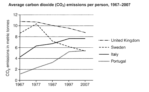
The graph below shows average carbon dioxide (CO2) emissions per person in the United Kingdom, Sweden, Italy and Portugal between 1967 and 2007.
Summarise the information by selecting and reporting the main features, and make comparisons where relevant.
Student answer (Band 6.0)
The Graph illustrates the average Carbon dioxide emission per individual in different countries from 1967 to 2007.
Overall, It was noticed that Portugal shows the increase of percentage over the period of time. while, Sweden shows the rose of carbon in the year of 1997 and then decline drastically. Additionally UK was at the highest percentage in the beginning and fall slowly in every passing years.
At the beginning of the year, Portugal shows least percent of carbon in 1967 and gradually arose at the percent of 5% in 2007. Whereas in the start Sweden was recorded at the highest percentage of 8.5, the line goes upward in 1977, and then drastically goes down in 2007.
The remaining countries like, Italy begin with 4% in 1967, increases at 6.2 in 1977, there was no noticeable change until 1987, eventually increase at 7.5 in 2007. Furthermore, United kingdom reported the highest trend with 10.5% in the year 1967, And as per the chart it is evident that the proportion of the emission was 8.5% which was reduced in 2007. comparatively from the initial years.
AI examiner evaluation
| Criterion | Band |
|---|---|
| Task Achievement / Task Response | 6.0 |
| Coherence and Cohesion | 6.0 |
| Lexical Resource | 5.5 |
| Grammatical Range and Accuracy | 5.5 |
| Overall | 6.0 |
Task Achievement / Task Response: Band 6.0
You identify the main overall patterns: the UK starts highest and declines, Portugal rises, and Italy increases before levelling off. You also include several relevant figures, such as Sweden at about 8.5 tonnes initially and Italy at roughly 6.2 in 1977. However, some details are inaccurate or unclear. Portugal reaches about 5.4 tonnes in 2007, not 5%, and the UK ends at approximately 8.7, rather than 8.5. Sweden peaks in 1977, then declines steadily; describing a rise “in the year of 1997” misplaces this key change. The overview would be stronger if it clearly compared the countries’ final levels and noted that Italy and Portugal converge. Some trends are reported more fully than others.
Coherence and Cohesion: Band 6.0
The response has a recognisable structure, with an introduction, an overview and two paragraphs of supporting details. This gives the reader a coherent route through the information, and transitions such as “Whereas” and “Furthermore” help connect comparisons. However, progression is sometimes weakened by unclear references and mechanical linking. For example, “while, Sweden shows the rose of carbon in the year of 1997” does not clearly identify the peak in 1977, and “the remaining countries” is imprecise because the UK is discussed again afterward. The final sentence is also difficult to follow: “comparatively from the initial years” does not clearly complete the comparison. Grouping the two declining series separately from the two rising series, and using clearer links between data points, would improve cohesion.
Lexical Resource: Band 5.5
You use relevant task vocabulary, including “average,” “emission,” “gradually,” “decline,” and “proportion,” so the main trends can generally be understood. There are also attempts to vary expression, such as “fall slowly” and “goes down.” However, several word choices and collocations are inaccurate or unnatural: “shows the rose of carbon,” “increase of percentage,” and “highest trend” do not describe emissions precisely. The repeated use of “percentage” is especially misleading because the chart reports metric tonnes, not percentages. Capitalisation is inconsistent in “Carbon,” “It,” and “United kingdom.” Aim for precise terms such as “emissions per person,” “tonnes,” “rose,” and “declined,” and avoid substituting percentage language for units.
Grammatical Range and Accuracy: Band 5.5
You attempt a mixture of simple and more complex sentences, including comparisons introduced by “Whereas” and “Additionally.” Most of the intended meaning remains understandable, but some grammatical and punctuation errors reduce clarity. For example, “Portugal shows the increase … while, Sweden shows” has faulty punctuation and sentence connection, while “Italy begin … increases … there was” shifts between verb forms and subjects. “At the beginning of the year” is also an unsuitable time expression for a period spanning several years. Capital letters after commas and full stops are inconsistently handled, as in “while” after a full stop and “And” mid-sentence. Use consistent past-tense reporting, check subject–verb agreement, and separate complete sentences with appropriate punctuation.
See this exact question answered at other band scores. The same prompt compared across bands.
Browse more IELTS Writing model answers or get your own writing scored by the same AI examiner.