Band 5.5 IELTS Writing Task 1 Model Answer
Overall Band Score: 5.5 · Cambridge IELTS 11 · 2026-11-16
IELTS Writing Task 1 question
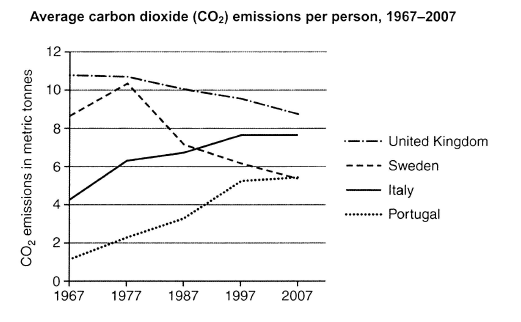
The graph below shows average carbon dioxide (CO2) emissions per person in the United Kingdom, Sweden, Italy and Portugal between 1967 and 2007.
Summarise the information by selecting and reporting the main features, and make comparisons where relevant.
Student answer (Band 5.5)
The following graph shows the data about average carbon dioxide emissions per person in four countries, UK, Sweden, Italy and Portugal in 1967 and 2007.
We can see that during 1967, UK has highest value for carbondioxide emission per person as compared to other countries but graph shows gradual decrease after that. For Sweden there was a large increase firstly from 1967 to 1977 then the line graph started to decrease till 2007. Italy also faced significant increase at start then line graph shows a moderate increase in later years. For postugal the line graph is showing continuous increase from 1967 to 2007.
In 1967, highest value for average carbondioxide emission per person was for UK, which was around 11 metric tonnes. Lowest value for carbondioxide emission per person was in Portugal that was 1 metric ton. For Italy it was above 4 metric tonnes and for Sweden it was around 9 metric tonnes. After 1967 there was increase in carbondioxide emission per person for Sweden, Italy and portugal, while in UK the number decreased.
Two countries faced increase, portugal reached the number of 7 matric tonnes till 2007 from 1 million in 1967 and Italy reached the number around 8 metric tonnes till 2007 from 4 metric tonnes in 1967. However Sweden faced increase at first in 1967 but after 1977 the value started to decrease and reached to 5 metric tonnes from 10 metric tonnes at the end of 2007. Like sweden Portugal also reached the same number in 2007.
AI examiner evaluation
| Criterion | Band |
|---|---|
| Task Achievement / Task Response | 6.0 |
| Coherence and Cohesion | 5.5 |
| Lexical Resource | 5.5 |
| Grammatical Range and Accuracy | 5.5 |
| Overall | 5.5 |
Task Achievement / Task Response: Band 6.0
You identify the main broad patterns: the UK starts highest and declines, Sweden rises before falling, and Italy and Portugal increase. You also include several relevant starting and ending comparisons. However, some details are inaccurate or unclear: Portugal reaches about 5.4 tonnes, not 7, and its 1967 figure is about 1.2 tonnes, not “1 million.” Italy ends at roughly 7.6 tonnes, while the UK remains the highest in 2007 at about 8.7. The overview is also weakened by saying “Two countries faced increase,” since three countries rise overall. To strengthen the response, give a clear overview of the final ranking and distinguish overall trends from changes at particular stages.
Coherence and Cohesion: Band 5.5
The response has a recognisable structure, moving from a general description to figures and comparisons, and paragraph breaks help separate the information. Some progression is present, but ideas are repeated: the opening paragraphs both describe the countries’ trends, and the final paragraph revisits Sweden and Portugal without adding a clear new comparison. Linking phrases such as “However” and “Like Sweden” are used, but the latter does not make the relationship between the figures precise. Organise the report into a concise overview followed by grouped comparisons—for example, the declining countries and the countries that rose—and use references that clearly identify the years and values being compared.
Lexical Resource: Band 5.5
You use relevant topic vocabulary, including “emissions,” “metric tonnes,” “gradual decrease,” and “significant increase,” so the subject is generally clear. However, several expressions are repetitive or imprecise, particularly “the line graph shows” and “reached the number.” There are also spelling and word-choice problems such as “carbondioxide,” “postugal,” “matric,” and “1 million” where a measurement is intended. These errors sometimes make the data harder to interpret. Aim for accurate collocations and vary the language used to describe trends, while checking country names and units carefully. For example, describe a figure as an emissions level or amount, rather than a “number.”
Grammatical Range and Accuracy: Band 5.5
You attempt both simple and more extended sentences, using clauses such as “while in UK the number decreased” and “after 1977 the value started to decrease.” The main message is usually understandable, but some grammatical errors recur. Articles and prepositions are missing or awkward in phrases such as “during 1967” and “in UK”; subject–verb agreement is inconsistent in “UK has highest value”; and tense shifts occur between past and present descriptions. Some sentences also combine several comparisons without clear grammatical control. Use the past tense consistently for this historical period, check articles and agreement, and divide longer sentences when they contain multiple country trends. This would make the comparisons more accurate and easier to follow.
See this exact question answered at other band scores. The same prompt compared across bands.
Browse more IELTS Writing model answers or get your own writing scored by the same AI examiner.