Band 6.0 IELTS Writing Task 1 Model Answer
Overall Band Score: 6.0 · Cambridge IELTS 11 · 2026-11-16
IELTS Writing Task 1 question
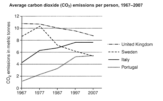
The graph below shows average carbon dioxide (CO2) emissions per person in the United Kingdom, Sweden, Italy and Portugal between 1967 and 2007.
Summarise the information by selecting and reporting the main features, and make comparisons where relevant.
Student answer (Band 6.0)
Given diagram displays per person rate of carbon dioxide emission in four countries from europe including Portugal, Italy, Sweden and United Kingdom from 1967 to 2007.
First of all it is clear that carbon emission rate has decreased slightly like at start it was above 10 metric tones but it dropped to between 9 to 10 metric tones and has always been high in United Kingdom more than other mentioned coutries throughout whole period. Next we can see that Sweden had carbon emission at the start of the period on the point where UKs release ended it fluctuated and rose until 1977 it started to decrease and then fall drastically reaching below 6 metric tones in 2007. Now Italy and Portugal had low carbon dioxide emission at the start of the time in 1967 between 0 to 1 metric tones and just above 4 metric tones for Portugal and Italy respectively and they increase with the passage of time and portugal reaching directly close to Sweden and Italy ending up far above the touch of Sweden in 2007.
In conclusion carbon dioxide emission for Portugese and italian people grew significantly, while the average emission of british and swedish people decreased eventually.
AI examiner evaluation
| Criterion | Band |
|---|---|
| Task Achievement / Task Response | 6.0 |
| Coherence and Cohesion | 6.0 |
| Lexical Resource | 5.5 |
| Grammatical Range and Accuracy | 5.5 |
| Overall | 6.0 |
Task Achievement / Task Response: Band 6.0
You identify the main overall patterns: UK emissions remain the highest while declining, Sweden falls after an early rise, and Italy and Portugal increase. The closing comparison reinforces these trends. However, some details are unclear or inaccurate. The opening says emissions were “above 10” and fell to “between 9 to 10,” but this refers only to the UK, not the overall pattern. The comparison of Italy and Portugal at the start is also reversed: Italy was about 4.3 tonnes and Portugal about 1.2, whereas your sentence assigns the figures in the opposite order. The final claim that Italy ended “far above” Sweden is not supported; Italy was higher, but by roughly 2.2 tonnes. A clearer overview and more precise comparisons would strengthen the report.
Coherence and Cohesion: Band 6.0
The response has a recognisable structure, moving from an introduction to descriptions of the countries and then a concluding summary. Sequencing expressions such as “First of all,” “Next,” and “In conclusion” help signal this progression. However, the body paragraph combines several countries and trends in long sentences, making comparisons difficult to follow. For example, the sentence beginning “Now Italy and Portugal…” contains the starting values, their increases, and their final positions all at once. Some references are also unclear, particularly “the point where UKs release ended” and “the touch of Sweden.” Grouping the two declining countries separately from the two rising ones, and using clearer links between comparisons, would make the organisation more effective.
Lexical Resource: Band 5.5
You use relevant topic vocabulary, including “carbon dioxide emission,” “metric tones,” “fluctuated,” “decrease,” and “grew significantly,” so the main trends can generally be understood. There is also some attempt to vary wording through “rate,” “release,” and “emission.” However, several choices are imprecise or unnatural for describing a graph: “per person rate,” “the point where UKs release ended,” “reaching directly close,” and “far above the touch of Sweden.” Spelling and form errors such as “coutries,” “Portugese,” and “tones” also reduce accuracy. Aim for standard collocations such as “emissions per capita,” “rose to,” “fell to,” and “was slightly higher than,” and use “tonnes” consistently.
Grammatical Range and Accuracy: Band 5.5
You attempt both simple and more complex sentence forms, including clauses linked with “while” and “and,” and the overall meaning is usually recoverable. Some grammatical errors remain, however. The opening phrase “Given diagram displays” needs an article, and “carbon emission rate has decreased” does not clearly match the plural subject and the time period. In “it fluctuated and rose until 1977 it started to decrease,” the clauses need clearer punctuation or a linking word. The sentence about Italy and Portugal also has a confusing structure, with “between 0 to 1… and just above 4” lacking a clear grammatical relationship to the countries. More controlled sentence boundaries, articles, and tense choices would improve accuracy while preserving your attempts at complex sentences.
See this exact question answered at other band scores. The same prompt compared across bands.
Browse more IELTS Writing model answers or get your own writing scored by the same AI examiner.