Band 6.5 IELTS Writing Task 1 Model Answer
Overall Band Score: 6.5 · Cambridge IELTS 11 · 2026-11-16
IELTS Writing Task 1 question
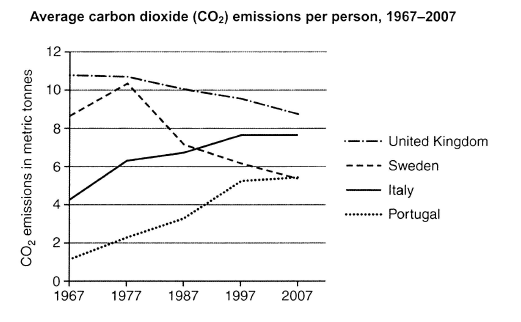
The graph below shows average carbon dioxide (CO2) emissions per person in the United Kingdom, Sweden, Italy and Portugal between 1967 and 2007.
Summarise the information by selecting and reporting the main features, and make comparisons where relevant.
Student answer (Band 6.5)
The graph illustrates average carbon dioxide (CO2) emissions per individual in United Kingdom, Sweden, Italy and Portugal from 1967 to 2007.
Overall, it is clear that although united kingdom was the highest carbon dioxide released country, the figure decreased throughout the period. While the carbon emissions in the Italy and Portugal increased, the figure for the Sweden fluctuated.
The figure of carbon dioxide emissions per person in the United kingdom was just over 10 metric tonnes in the first couple of years. The figure decreased to 10 metric tonnes in 1987. The emissions fell to just under 10 metric tonnes in the last couple of year. In 1967, the figure for Sweden was just over 8 metric tonnes. While emissions increased to just over 10 metric tonnes in 1977, after 10 years the figure dropped to just under 8 metric tonnes, and gradually reached just under 6 metric tonnes in 2007.
The emissions in Portugal increased from just under 2 metric tonnes to just over 2 metric tonnes between 1967 to 1977. After ten years, the figure increased to just under 4 metric tones. In 1997, the figure reached just under 6 metric tonnes and almost remained the same in 2007. Similarly in Italy, the figure was just over 4 metric tonnes in 1967 and increased to just over 6 metric tonnes in 1977. After 20 years, the figure rose to just under 8 metric tonnes and remained the same in 2007.
AI examiner evaluation
| Criterion | Band |
|---|---|
| Task Achievement / Task Response | 6.5 |
| Coherence and Cohesion | 6.5 |
| Lexical Resource | 6.0 |
| Grammatical Range and Accuracy | 6.0 |
| Overall | 6.5 |
Task Achievement / Task Response: Band 6.5
You identify the main overall patterns: UK emissions declined, Italy and Portugal rose, and Sweden peaked before falling. The account also includes relevant approximate figures and comparisons, such as Sweden rising to just over 10 tonnes in 1977 and Portugal reaching about the same level as Sweden by 2007. This gives the response a clear, relevant overview and covers all four countries. However, the overview is not fully precise: the UK was the highest for most of the period, but Italy was higher than Sweden by the end, and Sweden did not simply fluctuate—it rose sharply and then declined. Some details are also imprecise, such as describing the UK as decreasing “throughout” despite its near-stability at first. A sharper overview and more exact comparisons would strengthen the report.
Coherence and Cohesion: Band 6.5
The response is organised into an introduction, an overview and two detail paragraphs, with the countries grouped in a generally sensible way. The chronology is easy to follow, and linking expressions such as “While,” “After ten years” and “Similarly” help connect changes. This provides coherent overall progression. At times, however, the sequencing becomes mechanical because several sentences repeat the same pattern of stating a year and then saying the figure increased or decreased. References such as “the figure” are also repeated and can be unclear when several countries are discussed in the same paragraph. Consider grouping the countries by contrasting trends and using clearer references, for example, naming the country again when the comparison might otherwise be ambiguous.
Lexical Resource: Band 6.0
You use an adequate range of topic vocabulary, including “emissions,” “metric tonnes,” “decreased,” “increased,” “dropped” and “remained.” These choices make the main trends understandable, and you attempt some variation rather than relying on one verb throughout. However, several phrases are unnatural or imprecise, including “highest carbon dioxide released country” and “the figure of carbon dioxide emissions.” “Almost remained the same” is also less natural than a standard description of stability. There are spelling and form slips, such as “metric tones,” and repeated use of “figure” limits flexibility. More accurate collocations and a wider set of trend terms would make the report more precise and fluent.
Grammatical Range and Accuracy: Band 6.0
You use both simple sentences and more complex forms, including a concessive overview beginning “although” and clauses introduced by “While.” Most sentences communicate the intended trend clearly, and the past tense is generally appropriate for the historical period. Some grammatical errors remain, particularly with articles and prepositions: “in United Kingdom” needs an article, and “between 1967 to 1977” uses the wrong pairing of prepositions. There are also agreement and number issues in phrases such as “the last couple of year” and “the figure for the Sweden.” Capitalisation of country names is inconsistent. Review article use, singular and plural forms, and preposition patterns; this would improve accuracy while preserving the range of sentence structures already attempted.
See this exact question answered at other band scores. The same prompt compared across bands.
Browse more IELTS Writing model answers or get your own writing scored by the same AI examiner.