Band 5.5 IELTS Writing Task 1 Model Answer
Overall Band Score: 5.5 · Cambridge IELTS 11 · 2026-11-21
IELTS Writing Task 1 question
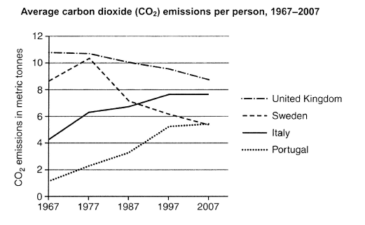
The graph below shows average carbon dioxide (CO2) emissions per person in the United Kingdom, Sweden, Italy and Portugal between 1967 and 2007.
Summarise the information by selecting and reporting the main features, and make comparisons where relevant.
Student answer (Band 5.5)
the given line graph illustrate the average of carbon dioxide (co2) emissions per person in different countries namely,united kingdom,swedan,italy and portugal between 1967 and 2007.according to this graph italy country trend was grew up minimally and united kingdom trend was still fell down and decreased slightly.
first of all united kingdom trend was started from top highest point 11 in 1967 but next four years we can saw a slowly drpped and in 2007 beome at 7 point.furthermore swedan was commence from almost 9 point and next year rapidly increased and reach to 10.3 .morover in the next year there was big decreased and become at 7 point.next two years slightly fall we can see.in addition,italy starting point was 4.1and next four years there is fluctuation but still trend is upward side.consequently,portugal in 1967 average ratio was 0.8 and next 3years there is big increase and carbon dioxide ratio was5+and next year the percentage was remaind stable.
to conclude that the portugal was increase in every years and italy was second number of country who was increased .however,the others coutry was slightly decreased in every year .
AI examiner evaluation
| Criterion | Band |
|---|---|
| Task Achievement / Task Response | 5.5 |
| Coherence and Cohesion | 6.0 |
| Lexical Resource | 5.0 |
| Grammatical Range and Accuracy | 5.0 |
| Overall | 5.5 |
Task Achievement / Task Response: Band 5.5
You identify the four countries and the overall contrast between rising emissions in Italy and Portugal and falling emissions in the UK and Sweden. However, the overview is not fully accurate: Portugal rose throughout, but Italy levelled off at about 7.6 tonnes from 1997 to 2007, while the UK remained the highest emitter at the end. Several figures and periods are misreported: UK emissions ended at about 8.7, not 7; Portugal reached about 5.2 by 1997 and then stayed near 5.4, rather than exceeding 5 earlier and remaining stable thereafter. The account also calls the UK and other countries’ declines yearly, although the graph gives decade points. Select the main trends and compare them more precisely.
Coherence and Cohesion: Band 6.0
The response has a recognisable sequence: an introduction, a description of the countries’ trends, and a concluding summary. Linking expressions such as “first of all,” “furthermore,” and “to conclude” help signal movement between points. However, the middle paragraph combines several series in a way that makes comparisons difficult to follow, and some references are unclear—for example, “next four years” and “next year” do not accurately identify the decade intervals shown. The conclusion repeats earlier claims rather than drawing together the most important contrasts. Grouping the two rising countries together and the two declining countries together, with clear time references, would make the progression more coherent and cohesion less mechanical.
Lexical Resource: Band 5.0
You use relevant topic vocabulary, including “average,” “emissions,” “increased,” and “decreased,” so the reader can generally understand the subject. However, the range is limited and several word choices or collocations are inaccurate or awkward, such as “trend was grew up,” “big decreased,” and “second number of country.” Spelling errors, including “swedan,” “drpped,” and “coutry,” also reduce clarity and control. Use precise language for graph movement, such as “rose,” “declined,” “peaked,” and “remained stable,” and avoid describing the figures as a “percentage,” since they are measured in metric tonnes. Careful spelling checks would further improve readability.
Grammatical Range and Accuracy: Band 5.0
The response attempts to connect ideas with longer clauses, for example, “although” is not used, but “and” and “but” link changes within the country descriptions. Most sentences communicate the intended general trend, yet the range of sentence structures is limited and errors are frequent. Examples include “the given line graph illustrate,” “Italy country trend was grew up,” and “the others coutry was slightly decreased,” which show problems with agreement, verb forms, and sentence construction. Articles and punctuation are also inconsistent, as in the opening sentence, where country names run together after commas. Practise accurate simple past forms and build comparisons with controlled structures, such as “Emissions in Italy rose, whereas those in the UK declined.”
See this exact question answered at other band scores. The same prompt compared across bands.
Browse more IELTS Writing model answers or get your own writing scored by the same AI examiner.