Band 5.5 IELTS Writing Task 1 Model Answer
Overall Band Score: 5.5 · Cambridge IELTS 11 · 2026-11-21
IELTS Writing Task 1 question
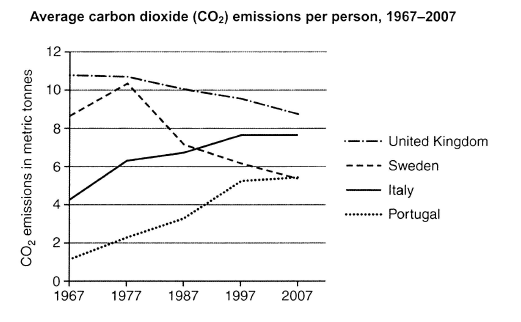
The graph below shows average carbon dioxide (CO2) emissions per person in the United Kingdom, Sweden, Italy and Portugal between 1967 and 2007.
Summarise the information by selecting and reporting the main features, and make comparisons where relevant.
Student answer (Band 5.5)
The line graph illustrate average carbone dioxide emmissions per person in four different countries ( United Kingdom, Sweden, Italy and Portugal) from 1967 and 2007 measured in metric tonnes.
Overall it is clear that in UK and Sweden carbone dioxide emissions declined over the period.On other hand Italy and Portugal emissions in CO2 increased.
In Sweden the graph show a slightly increased starting in 8.5 metric tonnes in 1967 and reached 10.5 in 1977. while after 10 years the trend shows a dramatically drop to stand at 7 metric tonnes. Between 1987 and 2007 Sweden carbon dioxide emissions fall steadly to stand at 5.5 metric tonnes in 2007.
On other hand in 1967 average carbon dioxide emission in Italy started with 4.5 metric tonnes and in each 10 years the graph shows an increased with 1 metric tonnes until 1997 wich after that the trend remain steadly with almost 8 metric tonnes.
In addition Portugal showed a remarkably increase over the period starting in 1 metric tonnes in 1967 and ended with 5 in 2007.
In contrast UK showed slightly decrease over the period with. 11 in 1967 and 8.5 in 2007.
AI examiner evaluation
| Criterion | Band |
|---|---|
| Task Achievement / Task Response | 6.0 |
| Coherence and Cohesion | 6.0 |
| Lexical Resource | 5.5 |
| Grammatical Range and Accuracy | 5.0 |
| Overall | 5.5 |
Task Achievement / Task Response: Band 6.0
You identify the main overall contrast accurately: emissions fell in the UK and Sweden, while they rose in Italy and Portugal. The response also includes relevant figures, such as Sweden’s rise to about 10.5 tonnes in 1977 and the UK’s decline from roughly 11 to 8.5 tonnes. However, some trends are reported less fully or imprecisely. Italy rose from about 4.3 to 7.6 tonnes, then levelled off; describing its increase as roughly one tonne every decade overlooks the smaller rise between 1977 and 1987. Portugal’s final figure is closer to 5.4 tonnes. The overview would be stronger if it also highlighted that the UK remained the highest emitter and that Italy overtook Sweden. Select the key comparisons and report them more precisely.
Coherence and Cohesion: Band 6.0
The response has a clear overall arrangement: an introduction, an overview, and separate paragraphs describing the countries’ trends. This makes the main information easy to locate, and phrases such as “Overall” and “In contrast” help signal relationships. However, the progression within the body is somewhat mechanical, with each country treated in turn and limited direct comparison between them. “On other hand” is repeated and is not always used to connect a clear contrast; the UK comparison, for example, would fit more naturally alongside the other declining series. Some sentence boundaries and punctuation also interrupt the flow. Grouping the two declining countries together and comparing their levels with the rising countries would create a more connected account.
Lexical Resource: Band 5.5
You use relevant vocabulary for describing trends, including “declined,” “increased,” “drop,” and “remain steady,” so the main meaning is generally clear. There are also attempts at more descriptive language, such as “remarkably increase.” However, spelling errors are noticeable, including “carbone,” “emmissions,” “steadly,” and “wich,” and some word combinations are unnatural, such as “a slightly increased” and “a dramatically drop.” “Increased” is also repeated frequently, limiting variety. Choose accurate trend nouns and verbs, and check spelling carefully. For example, use “a slight increase” or “rose slightly,” and “a dramatic drop” or “fell sharply.” More precise vocabulary would make the comparisons sound clearer and more natural.
Grammatical Range and Accuracy: Band 5.0
You attempt both simple and more complex sentences, including time clauses such as “while after 10 years the trend shows…” and a relative clause beginning “which after that.” However, errors in agreement, articles, verb forms, and sentence construction occur often enough to make some sentences awkward. For example, “The line graph illustrate” needs subject–verb agreement, while “the graph show” should be “the graph shows.” The phrase “starting in 8.5 metric tonnes” lacks a clear grammatical construction, and “the trend remain” needs a singular verb. Punctuation also needs attention: several sentences run together after full stops, and the final UK sentence contains an unnecessary full stop after “with.” Practise accurate sentence patterns for describing changes and use a final proofreading check.
See this exact question answered at other band scores. The same prompt compared across bands.
Browse more IELTS Writing model answers or get your own writing scored by the same AI examiner.