Band 6.0 IELTS Writing Task 1 Model Answer
Overall Band Score: 6.0 · Cambridge IELTS 11 · 2026-11-22
IELTS Writing Task 1 question
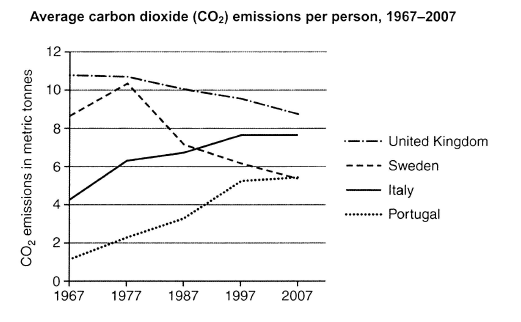
The graph below shows average carbon dioxide (CO2) emissions per person in the United Kingdom, Sweden, Italy and Portugal between 1967 and 2007.
Summarise the information by selecting and reporting the main features, and make comparisons where relevant.
Student answer (Band 6.0)
The line graph illustrate average carbon dioxide emmisions per person in 4 different states: United Kingdom, Sweden, Italy and Portugal between 1967 and 2007.
Overall,United Kingdom have a heighest average from start to end,In contrast Portugal stand with the lowest.Where as, Italy and portugal shows a significant increase thorugh out the period, However, trend of United kingdom and sweden falls slightly.
Firstly,In between [redacted phone] the avearge of carbon dioxide in portugal rose from 1.25 to 5.25 metric tonnes due to increase in per person emissions,In contrast, Italy also shows a significant rose from average of 4.25 to 7.75 metric tonnes through out the period.Where as, Average of Uk falls from 10.90 to 8.90 metric tonnes and Average of sweden falls from 8.40 to 5.25 metric tonnes with a slight increase upto 10.50 in 1977.
Finally, after all the period uk still stand above from all with the greatest percentage,However, Sweden and portugal meets at point 5.25 metric tonnes.Italy took over the sweden in 1987 and rise to the second heighest level on the table.
AI examiner evaluation
| Criterion | Band |
|---|---|
| Task Achievement / Task Response | 7.0 |
| Coherence and Cohesion | 6.0 |
| Lexical Resource | 5.5 |
| Grammatical Range and Accuracy | 5.0 |
| Overall | 6.0 |
Task Achievement / Task Response: Band 7.0
You provide a clear overview of the main patterns: the UK remains highest, Portugal starts lowest, Italy and Portugal rise, and the UK and Sweden decline overall. The body also includes relevant approximate figures and notes Sweden’s temporary peak in 1977 and Italy’s overtaking of Sweden by 1987. These details address the key features of the graph and support your comparisons. However, the overview is not fully precise: saying Portugal is lowest “from start to end” overlooks that it reaches the same level as Sweden in 2007. The claim that the UK has the “greatest percentage” is also unclear; it is highest in emissions, not percentage. Make the overview more exact and distinguish levels from rates of change.
Coherence and Cohesion: Band 6.0
The response has a recognisable structure, moving from an introduction and overview to details and a final comparison. This gives the reader a coherent overall route through the information, and comparisons such as the UK’s decline alongside Sweden’s fall are relevant. However, progression is weakened by mechanical or awkward linking, including repeated “In contrast,” “Where as,” and “However,” sometimes within the same paragraph. The final paragraph partly repeats earlier points rather than adding a clearly organised comparison. Some punctuation also makes boundaries between ideas unclear. Use fewer, more purposeful transitions, group the rising countries together and the declining countries together, and make each paragraph’s role distinct.
Lexical Resource: Band 5.5
You use relevant graph vocabulary, including “average,” “metric tonnes,” “rose,” “falls,” and “increase,” so the main trends are generally understandable. There is also some attempt to vary wording with phrases such as “took over” and “greatest.” However, the range and control are limited by repeated basic terms and inaccurate or unnatural expressions: “greatest percentage” does not describe the highest emissions level, while “stand above from all” and “significant rose” are not natural collocations. Spelling errors such as “emmisions,” “avearge,” “thorugh,” and “heighest” are noticeable. Build a more precise set of trend and comparison phrases, and check spelling and word forms carefully.
Grammatical Range and Accuracy: Band 5.0
You attempt both simple and more complex sentences, including contrasts joined with “whereas” and “in contrast,” and the overall meaning can usually be followed. However, control is inconsistent, particularly in subject–verb agreement and sentence construction: “The line graph illustrate” should be “illustrates,” “United Kingdom have” should be “the United Kingdom has,” and “Italy and portugal shows” should be “Italy and Portugal show.” Several clauses are joined with commas where a full stop or conjunction is needed, as in “Overall,United Kingdom have a heighest average …,In contrast…”. Articles and prepositions are also sometimes missing or incorrect. Practise accurate sentence boundaries and agreement before adding more complex structures.
See this exact question answered at other band scores. The same prompt compared across bands.
Browse more IELTS Writing model answers or get your own writing scored by the same AI examiner.