Band 5.5 IELTS Writing Task 1 Model Answer
Overall Band Score: 5.5 · Cambridge IELTS 15 · 2026-11-08
IELTS Writing Task 1 question
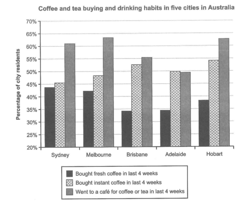
The chart below shows the results of a survey about people’s coffee and tea buying and drinking habits in five Australian cities.
Summarize the information by selecting and reporting the main features, and make comparisons where relevant.
Student answer (Band 5.5)
The chart given gives information about the drinking habits of australians in 5 different cities
Overall, citizens are known to visit coffee shops in all 5 cities, the instant coffee is well sold and popular compared to the fresh coffee all around the cities
Visiting a café is a habit for over than 60 percent of the population of two cities which are Melbourne, hobart and sydney. on the other hand we got Brisbane and Adelaide just right above averaging 55 percent and around 49 percent for each.
Consuming instant coffee is the main leader for all of the cities, reaching about 52-54 percent for Melbourne, Brisbane and hobart and for the other two its just below 50% for Adelaide, and the lowest of them all Sydney that got 45% in the last 4 weeks.
Ending it with the consumption of fresh coffee, the maximum percentage it reached was in Sydney close to 45% just right above Melbourne with around 43% continuing with the remaining cities averaging the percentage of 34% to 39%
AI examiner evaluation
| Criterion | Band |
|---|---|
| Task Achievement / Task Response | 5.5 |
| Coherence and Cohesion | 6.0 |
| Lexical Resource | 5.0 |
| Grammatical Range and Accuracy | 5.0 |
| Overall | 5.5 |
Task Achievement / Task Response: Band 5.5
You identify the chart’s three activities and give a broad overview that café visits are generally common and instant coffee purchases exceed fresh coffee purchases. You also include relevant comparisons, such as Sydney having the highest fresh-coffee figure and Adelaide’s café figure being around 50%. However, the overview is not fully accurate: café visits exceed 60% in Sydney, Melbourne and Hobart, not just two cities, and instant coffee is not the leading activity in every city because café visits are higher in Sydney, Melbourne and Brisbane. Some figures are also imprecise, particularly the claim that Melbourne, Brisbane and Hobart are all around 52–54% for instant coffee. A more accurate overview and clearer selection of the main contrasts would strengthen the report.
Coherence and Cohesion: Band 6.0
The response has a generally understandable order: it introduces the chart, gives an overview, and then discusses café visits, instant coffee and fresh coffee. This makes the main categories easy to follow. However, the ideas are presented as a single block rather than clearly separated paragraphs, and some transitions feel mechanical, such as “on the other hand” and “Ending it with.” The overview also leads into details without a clear distinction between the most important comparisons and supporting figures. Use separate paragraphs for the overview and key details, and connect comparisons more precisely—for example, contrast café attendance with instant-coffee purchases across the cities. This would make the progression clearer and reduce the impression of a list.
Lexical Resource: Band 5.0
You use enough topic vocabulary to communicate the chart’s subject, including “instant coffee,” “fresh coffee,” “population” and “percentage.” There is also some attempt to vary wording with “consuming” and “visiting.” However, several choices are unnatural or imprecise for a data report: “the main leader,” “well sold,” “Ending it with,” and “just right above averaging” make comparisons less clear. “Drinking habits” is also broader than the chart, which records purchases and café visits as well as drinking. Aim for concise, conventional reporting language and accurate collocations. For example, describe a category as “the most popular” or say that a figure “stood at” a percentage, rather than using conversational or awkward phrases.
Grammatical Range and Accuracy: Band 5.0
You attempt a mixture of sentence forms, including an overview sentence and longer comparisons, but control is inconsistent. Errors in sentence boundaries and punctuation are noticeable: the opening is followed by an unpunctuated overview, and “on the other hand” begins a sentence without appropriate capitalization. The construction “over than 60 percent” is faulty, while “which are Melbourne, hobart and sydney” has an unclear structure and inconsistent capitalization. Some clauses are also awkwardly joined, as in “the maximum percentage it reached was in Sydney close to 45% just right above Melbourne.” Use shorter, complete sentences with clear subjects and verbs, and check articles, comparative structures, capitalization and punctuation. This will make the figures easier to interpret.
See this exact question answered at other band scores. The same prompt compared across bands.
Browse more IELTS Writing model answers or get your own writing scored by the same AI examiner.