Band 5.0 IELTS Writing Task 1 Model Answer
Overall Band Score: 5.0 · Cambridge IELTS 15 · 2026-11-09
IELTS Writing Task 1 question
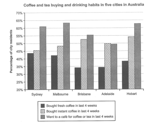
The chart below shows the results of a survey about people’s coffee and tea buying and drinking habits in five Australian cities.
Summarize the information by selecting and reporting the main features, and make comparisons where relevant.
Student answer (Band 5.0)
The bar chart illustrate camparison among the citizen who had a habbit of drinking of coffee and tea or buying it. overall,the most favrorite habbit is visting the cafee in three cities specially sydney ,melbourne, and hobart. in last four weeks .bought fresh cofee remian second option in sydney,malbourne.and bought instant coffee stand at lowest in consuption in sydney melbourne, but in brisbane and hobart it bought consistally. The bar cahrt gives ,the comparison between the citizen who had a habbit of drinking tea or coffee,we can see in bar chart the cafe visit is on the top of the list in almost every city,in sydney, melbourne,and hobart it remain at the peak.and almost 64% ,63%,and 62%.and the trend of bought fresh coffee remain drop in almost every city.but on the other hand ,the bought instant coffee trend goes higher among people specially in melbourne,it goes to 64% .and in sydney ,and hobert it remains almost same.but at the end most favourite habbit is to visiting the caffe among the indivialls.
AI examiner evaluation
| Criterion | Band |
|---|---|
| Task Achievement / Task Response | 5.0 |
| Coherence and Cohesion | 4.0 |
| Lexical Resource | 5.0 |
| Grammatical Range and Accuracy | 5.0 |
| Overall | 5.0 |
Task Achievement / Task Response: Band 5.0
You identify the chart’s main subject and recognise that café visits are especially popular in Sydney, Melbourne and Hobart. However, the overview is incomplete and some comparisons are inaccurate. For example, you say fresh coffee “remain second option” in Sydney and Melbourne, but instant coffee is slightly higher in both cities. You also claim instant coffee reaches 64% in Melbourne, whereas the chart shows about 48.5%; the highest figure for this category is in Hobart, at about 54.5%. The response gives little reliable coverage of all three categories across the five cities, and the overall trends are not clearly summarised. Select the main highs and lows, report figures accurately, and compare the categories systematically.
Coherence and Cohesion: Band 4.0
There is an attempt to provide an overview followed by further chart description, and phrases such as “on the other hand” show an effort to connect contrasting information. However, the ideas are not arranged in a clear progression: the response repeats that café visits are the most popular, while the category comparisons are mixed together and sometimes difficult to follow. The opening overview also runs into the next point without clear sentence boundaries. Organise the response into a brief introduction, a distinct overview, and one or two paragraphs grouping the city comparisons. Use linking expressions only where they clarify a genuine contrast, and make references such as “it” explicit.
Lexical Resource: Band 5.0
The response uses some relevant chart vocabulary, including “bar chart,” “trend,” “consumption,” and “percentage,” so the topic is generally recognisable. However, the range is limited and several word choices or collocations make the meaning unclear, such as “habbit of drinking of coffee and tea or buying it,” “stand at lowest in consuption,” and “it bought consistally.” Spelling errors—including “camparison,” “favrorite,” and “indivialls”—also distract the reader. Aim for precise, natural phrases for describing survey results, such as “the proportion of residents who bought instant coffee,” and check spelling and word forms carefully.
Grammatical Range and Accuracy: Band 5.0
You attempt both simple statements and longer sentences with contrast, for example, “but on the other hand,” which shows some effort to vary sentence structure. However, the longer constructions are often faulty, and frequent errors make relationships between ideas difficult to understand. Examples include “The bar chart illustrate,” “the trend … remain drop,” and “it goes to 64%,” which show problems with agreement, verb forms, and sentence construction. Articles and punctuation are also inconsistently handled, with several ideas joined by full stops or commas inappropriately. Practise building accurate subject–verb–object sentences first, then combine them using clear clauses such as “while” or “whereas.”
See this exact question answered at other band scores. The same prompt compared across bands.
Browse more IELTS Writing model answers or get your own writing scored by the same AI examiner.