Band 5.5 IELTS Writing Task 1 Model Answer
Overall Band Score: 5.5 · Cambridge IELTS 15 · 2026-11-09
IELTS Writing Task 1 question
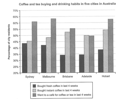
The chart below shows the results of a survey about people’s coffee and tea buying and drinking habits in five Australian cities.
Summarize the information by selecting and reporting the main features, and make comparisons where relevant.
Student answer (Band 5.5)
The bar chart provide data on the survey of people in buying and drinking coffee and tea in three different categories and five different cities (Sydney, Melbourne, Brisbane, Adelaide,Hobart) in Australia . It is measured in percentages.
Overall, the went to a cafe for coffee and tea in last 4 weeks was Highest contributor over the period. While, Bought instant coffee in last 4 weeks small fluctuated through out the period . However, Melbourne customers are increasing gradually over the period. And Adelaide customer are less prefer coffee and tea.
In Sydney, most of the people are prefer to go cafes in 4 weeks for coffee and tea 60% . While Melbourne slightly increased around 65% , although Brisbane comparatively less 55%. Brought Instant coffee in 4 weeks sydney at 45% slightly rose in melbourne and Brisbane around 48% and 53%. Brought fresh coffee in three areas are 44%,43% and 34% respectively.
In contrast, Hobart cities want go to cafe for coffee and tea in 4 weeks 64% and Adelaide around 50% . While, brought Instant coffee 54% less at Hobart 50%.
AI examiner evaluation
| Criterion | Band |
|---|---|
| Task Achievement / Task Response | 5.5 |
| Coherence and Cohesion | 5.5 |
| Lexical Resource | 5.5 |
| Grammatical Range and Accuracy | 5.0 |
| Overall | 5.5 |
Task Achievement / Task Response: Band 5.5
You identify the three survey categories and cover all five cities, with several figures broadly matching the chart—for example, café visits are about 60% in Sydney and 64% in Melbourne, while instant-coffee purchases are around 53% in Brisbane. However, the overview is unclear and includes unsupported claims: café visits are not the highest category in every city, since instant coffee is higher in Adelaide, and the statement that Melbourne customers are “increasing gradually” suggests a trend over time that the chart does not show. Some comparisons are incomplete or confusing, particularly the final sentence about Adelaide and Hobart. To strengthen the report, give a clear overview of the main contrasts and compare the categories consistently across the cities.
Coherence and Cohesion: Band 5.5
The response has a basic structure, moving from an introduction and overview to details about Sydney, Melbourne and Brisbane, followed by Hobart and Adelaide. This gives the reader some organisation, and comparisons such as “While Melbourne slightly increased” show an attempt to connect information. However, progression is uneven: the city groupings are not explained, and the final paragraph’s figures are difficult to follow, especially “brought Instant coffee 54% less at Hobart 50%.” Several sentence openings use “While” or “However” without forming clear relationships, and the overview repeats broad claims rather than guiding the comparisons. Group cities or categories systematically and use linking phrases to make each comparison explicit.
Lexical Resource: Band 5.5
You use relevant chart vocabulary, including “survey,” “categories,” “percentages,” “contributor,” and “comparatively,” so the topic is generally clear. However, the range is limited and several word choices or collocations are inaccurate or awkward, such as “highest contributor,” “small fluctuated,” “less prefer,” and “want go to cafe.” “Brought” is also used where the chart means “bought,” and “over the period” is unsuitable because the chart compares cities rather than changes over time. These choices sometimes make the intended comparison harder to understand. Aim for precise reporting language such as “the highest proportion,” “varied slightly,” and “a lower percentage preferred,” and check spelling and natural word combinations.
Grammatical Range and Accuracy: Band 5.0
The response attempts both simple and more complex sentence forms, including comparisons introduced by “While” and “although.” However, many sentences contain errors in agreement, verb forms, articles, or sentence construction. For example, “The bar chart provide data” needs subject–verb agreement, while “most of the people are prefer” combines incompatible verb forms. “The went to a cafe … was Highest contributor” is also difficult to parse, and several fragments beginning with “While” are not joined to a complete main clause. These recurring problems sometimes obscure the meaning. Practise building complete sentences with a clear subject and verb, and check agreement, articles, and punctuation before submitting.
See this exact question answered at other band scores. The same prompt compared across bands.
Browse more IELTS Writing model answers or get your own writing scored by the same AI examiner.