Band 5.5 IELTS Writing Task 1 Model Answer
Overall Band Score: 5.5 · Cambridge IELTS 15 · 2026-11-10
IELTS Writing Task 1 question
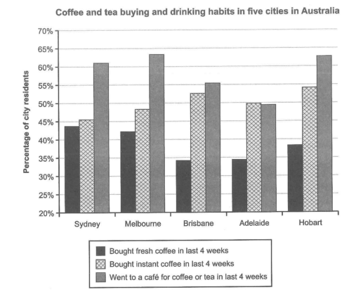
The chart below shows the results of a survey about people’s coffee and tea buying and drinking habits in five Australian cities.
Summarize the information by selecting and reporting the main features, and make comparisons where relevant.
Student answer (Band 5.5)
The bar chart illustrates the number of people consume coffee on a daily basis in different australian cities in three different ways( bought fresh, buy instant coffee and visited coffee shop) in the last 4 weeks.
Overall, the highest percentage can be seen for the residents visited the coffee shop in all five cities while buying the fresh coffee is the lowest among the three drinking habits of the people in while the instant coffee almost remain in the same number for the 5 cities.
First of all, the peak of cafe coffee can be seen for the Melbourne city around 64% in comparison to all the four major cities in which readymade is 48 percent and fresh coffee is 43%. On a second high percentage is Hobart city, 62% for cafe coffee, maximum percenttage (54%) for instant coffee while the third lowest 38% for the fresh coffee.
The other three cities ( Sydney, brisbane and Adelaid) are almost the same in number in which the highest for the cafe coffee is Sydney aorund 61% following by the Brisbane 50% while the lowest in this trend is Adalaide 48%. The highest trend can be seen for the instant coffee in Brisbane City 53 percent while the lowest in all coffee drinking habits is the Adelaide city.
AI examiner evaluation
| Criterion | Band |
|---|---|
| Task Achievement / Task Response | 5.5 |
| Coherence and Cohesion | 6.0 |
| Lexical Resource | 5.5 |
| Grammatical Range and Accuracy | 5.5 |
| Overall | 5.5 |
Task Achievement / Task Response: Band 5.5
You identify the chart’s broad pattern: café visits are highest in every city, and fresh coffee is generally the least popular option. You also include several relevant comparisons, such as Melbourne’s café figure (about 64%) and Brisbane’s instant-coffee figure (about 53%). However, some details are inaccurate or unclear: Sydney’s instant coffee is about 45.5%, not the “readymade” 48% given in the Melbourne comparison, and Adelaide’s café figure is about 49.5%, not 48%. The claim that the three cities are “almost the same” also overlooks meaningful differences. The overview is useful but the comparison of fresh coffee and instant coffee is not consistently accurate. Report the three series systematically and check each city’s figures against the chart.
Coherence and Cohesion: Band 6.0
The response has a recognisable structure: an introduction, an overview, and two paragraphs of supporting comparisons. This helps the reader follow the main message, and phrases such as “Overall” and “First of all” signal stages in the discussion. However, the progression within the final paragraph is difficult to track: it groups Sydney, Brisbane and Adelaide together, then gives figures without consistently identifying which series or city they refer to. “Following by the Brisbane 50%” is especially unclear. Some linking phrases feel mechanical, and the comparison of the cities would be clearer if each paragraph grouped one or two series and moved through the cities in a consistent order. Use explicit references and avoid combining unrelated figures in one sentence.
Lexical Resource: Band 5.5
You use some relevant chart vocabulary, including “percentage,” “peak,” “highest,” and “lowest,” and the reader can generally understand the topic. However, word choice and collocation are often imprecise: “the number of people consume coffee,” “cafe coffee,” and “the highest trend” do not describe the data naturally. “Readymade” is also an unsuitable label for instant coffee, while “drinking habits” blurs the distinction between buying coffee and visiting a café. Spelling errors such as “australian,” “Adelaid,” and “Adalaide” are noticeable. Build a more accurate range of terms for describing survey proportions and the chart’s three categories, and check spelling and word forms before submitting.
Grammatical Range and Accuracy: Band 5.5
You attempt both simple and more extended sentences, including comparisons introduced by “while” and “in which.” However, errors in sentence structure and verb forms are frequent enough to make several passages difficult to interpret. For example, “the number of people consume” needs a relative clause or a gerund construction, and “the residents visited the coffee shop” does not form a clear noun phrase. The sentence beginning “The other three cities” also lacks a clear grammatical relationship between its figures and comparisons. Articles, agreement and punctuation are inconsistent, as in “the Melbourne city” and the long, loosely joined sentences. Practise building complete sentences with a clear subject and verb, then use shorter, accurately punctuated comparisons before adding more complex clauses.
See this exact question answered at other band scores. The same prompt compared across bands.
Browse more IELTS Writing model answers or get your own writing scored by the same AI examiner.