Band 5.0 IELTS Writing Task 1 Model Answer
Overall Band Score: 5.0 · Cambridge IELTS 15 · 2026-11-10
IELTS Writing Task 1 question
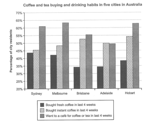
The chart below shows the results of a survey about people’s coffee and tea buying and drinking habits in five Australian cities.
Summarize the information by selecting and reporting the main features, and make comparisons where relevant.
Student answer (Band 5.0)
The bar chart below explains the outcomes of a study about people buying coffee and tea, and drinking habits in five different cities of Australia.
Overall, the column chart illustrates that; about 44% citizens in Sydney have bought fresh coffees; the highest ratio in last 4 week, on the other hand it has least ratio in Brisbane. In last 4 week about 55% of citizens in Hobart; the highest ratio have bought instant coffee, while about in Sydney the ratio of fresh coffee buyer is 45%; the lowest ratio, in Melbourne approximately 63% to 64%; the highest number of people went to cafe for coffee or tea in last month, on contrary only 50% went to cafes in Brisbane.
Sydney has the the highest number of fresh coffee buyers nearly 44% while Melbourne, Brisbane, Adelaide, and Hobart have about 42%, 33%, 34% and 37% buyers in last 4 weeks respectively.In Hobart 55% citizens bought instant coffee, while Melbourne has 43%, Brisbane has 53%,Adelaide has 50%, and Hobart has 54% buyers. Meanwhile; those people who went to cafes have highest ratio in Melbourn and Hobart nearly 64%, Sydney has 60%, Brisbane has 55%, and Adelaide have 50% people; those who visited cafes..
AI examiner evaluation
| Criterion | Band |
|---|---|
| Task Achievement / Task Response | 5.5 |
| Coherence and Cohesion | 4.5 |
| Lexical Resource | 5.5 |
| Grammatical Range and Accuracy | 5.0 |
| Overall | 5.0 |
Task Achievement / Task Response: Band 5.5
You identify the three measures and make relevant comparisons, including the high café figures in Melbourne and Hobart and the high instant-coffee figures in Hobart. However, the overview is difficult to follow and contains important inaccuracies: Brisbane, not Sydney, has the lowest fresh-coffee figure, while Adelaide, not Brisbane, has the lowest café-attendance figure. The statement that Sydney has the lowest instant-coffee figure is broadly right, but the later figure of 43% for Melbourne is inaccurate; it is about 49%. The response reports many city figures, but the overview does not clearly summarise the main patterns across the chart. A more accurate overview and careful checking of comparisons would make the task coverage clearer and more complete.
Coherence and Cohesion: Band 4.5
There is an attempt to organise the response into an introduction, an overview and a detail paragraph, and the final paragraph groups figures by category. However, progression is weakened by the overview’s long, semicolon-linked sequence of comparisons, which makes relationships between ideas hard to follow. Connectors such as “on the other hand,” “while” and “Meanwhile” are used, but some do not establish a clear contrast, and the repeated figures make the organisation feel circular rather than steadily developed. The final sentence trails off with “those who visited cafes,” leaving the paragraph unfinished. Use a concise overview followed by clearly separated comparisons, and ensure each sentence completes one point.
Lexical Resource: Band 5.5
The response uses relevant task vocabulary, including “bought instant coffee,” “fresh coffee buyers” and “went to cafes,” so the reader can generally identify the categories being described. However, the range is limited and several expressions are awkward or imprecise, such as “the highest ratio in last 4 week,” “the outcomes of a study,” and “the highest number” when describing percentages. “Ratio” is not the natural term for these chart values; “proportion” or “percentage” is more suitable. There are also spelling and form issues, including “Melbourn” and “coffees.” Aim for accurate collocations and vary the language for describing proportions and comparisons without changing the chart’s meaning.
Grammatical Range and Accuracy: Band 5.0
You attempt longer sentences and use subordinate clauses with “while” and “who,” but these structures are often not controlled successfully. For example, “about 55% of citizens in Hobart; the highest ratio have bought instant coffee” lacks a clear grammatical connection, and “the highest number of people went to cafe” does not form a complete, accurate comparison. Agreement and sentence construction are also inconsistent in “Adelaide have 50% people,” while the opening overview contains a run-on sequence joined by semicolons. Articles and plurals are sometimes missing or inconsistent. These errors can make the intended comparisons difficult to interpret. Build shorter, complete sentences first, then add complex clauses where the relationship between ideas is clear.
See this exact question answered at other band scores. The same prompt compared across bands.
Browse more IELTS Writing model answers or get your own writing scored by the same AI examiner.