Band 5.5 IELTS Writing Task 1 Model Answer
Overall Band Score: 5.5 · Cambridge IELTS 15 · 2026-11-10
IELTS Writing Task 1 question
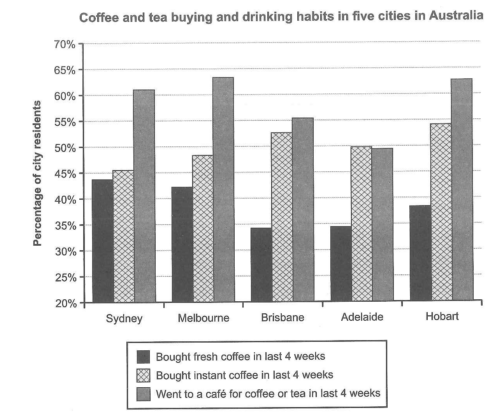
The chart below shows the results of a survey about people’s coffee and tea buying and drinking habits in five Australian cities.
Summarize the information by selecting and reporting the main features, and make comparisons where relevant.
Student answer (Band 5.5)
The chart represents the results of a survey about people who had coffee and tea buying and drinking habits in five different cities of Australia.
It is clear from the chart that city Melbourne had largest ratio of peoples who went to a cafe and Adelaide had least.
Starting from bar chart,The first city in the list is Sydney and the percentage of peoples that went to a cafe for coffee or tea in last 4 weeks is almost about 61% and the ratio of fresh coffee is just below 45% and instant coffee just above 45%.
The next and the largest ratio city is Melbourne and the ratio of people who went to a cafe in last 4 weeks is almost 63% and the percentage of fresh coffee is about 42% and instant coffee is about 47%.The leat ratio city is Adelaide and the percentage of peoples is just below 50% and the ratio of fresh coffee is much less than instant coffee.Other cites Brisbane and Hobart have percentage of peoples less than 63% and the ratio of fresh and instant coffee lies between 30% to 50%.
AI examiner evaluation
| Criterion | Band |
|---|---|
| Task Achievement / Task Response | 5.5 |
| Coherence and Cohesion | 5.5 |
| Lexical Resource | 5.5 |
| Grammatical Range and Accuracy | 5.0 |
| Overall | 5.5 |
Task Achievement / Task Response: Band 5.5
You identify the chart’s subject and report several relevant comparisons, including café visits being highest in Melbourne and lowest in Adelaide. The figures for Sydney and the broad contrast between fresh and instant coffee are also mostly consistent with the chart. However, the overview is brief and the report does not clearly summarise the main patterns across all five cities. Some details are inaccurate or too vague: Melbourne’s instant-coffee figure is about 48.5%, not 47%, and saying Brisbane and Hobart are both below 63% does not distinguish their café figures (about 55.5% and 63%). The final comparison that coffee figures lie between 30% and 50% is also imprecise, since instant coffee exceeds 50% in several cities. Select and compare the key trends more precisely.
Coherence and Cohesion: Band 5.5
The response has a basic sequence: an introduction, a brief overview, and then details beginning with Sydney and moving to other cities. This gives the reader some sense of organisation, and phrases such as “The next” help signal movement between cities. However, the progression is not consistently clear: the report jumps from Melbourne to Adelaide and then groups Brisbane and Hobart without giving their individual figures. “Starting from bar chart” does not establish a useful organising principle, and the repeated use of “ratio” makes the comparisons feel mechanical. Separate the overview from two clearly organised detail paragraphs—for example, one comparing café attendance and another comparing fresh with instant coffee—and use accurate linking and reference.
Lexical Resource: Band 5.5
You use relevant task vocabulary such as “percentage,” “fresh coffee,” “instant coffee,” and “went to a cafe,” so the topic remains understandable. However, the range is limited and several choices are inaccurate or unnatural for describing chart data. “Ratio” is repeatedly used where “proportion” or “percentage” is intended, while “largest ratio city” is not a natural expression. “Peoples” should be “people,” and “The leat ratio city” contains a spelling error and unclear wording. Repetition of “percentage of peoples” also reduces precision. Build a small set of accurate chart-description terms—such as “share,” “figure,” “highest,” and “lowest”—and use them consistently, while checking spelling and collocations.
Grammatical Range and Accuracy: Band 5.0
You attempt both simple statements and longer sentences, including clauses joined with “and,” and the main comparisons can generally be understood. However, the range is limited, and errors occur frequently enough to make some sentences awkward. For example, “city Melbourne had largest ratio” is missing an article and has an unclear noun phrase; “people who went to a cafe … is almost about 61%” has subject–verb agreement and sentence-structure problems. The sentence beginning “The next and the largest ratio city” is also difficult to follow, and punctuation is inconsistent, as in “Starting from bar chart,The first.” Practise clear comparison structures such as “Melbourne had the highest café attendance, at about 63%,” and check articles, agreement, and sentence boundaries.
See this exact question answered at other band scores. The same prompt compared across bands.
Browse more IELTS Writing model answers or get your own writing scored by the same AI examiner.