Band 5.5 IELTS Writing Task 1 Model Answer
Overall Band Score: 5.5 · Cambridge IELTS 15 · 2026-11-10
IELTS Writing Task 1 question
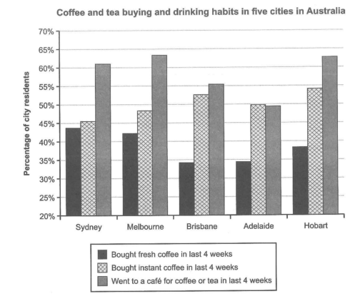
The chart below shows the results of a survey about people’s coffee and tea buying and drinking habits in five Australian cities.
Summarize the information by selecting and reporting the main features, and make comparisons where relevant.
Student answer (Band 5.5)
The chart represents the percentage of people who had coffee and tea buying and drinking habits in five cities of Australia.
It is clear from chart that peoples went to a cafe for coffee or tea in last 4 weeks many time instead of Adelaide.Only a small number of people bought fresh coffee in last 4 weeks.
In the chart the demand of going to cafe for coffee is larger than the other .In Sydney the ratio is above 60%.In Melbourne and Hobart the ratio is almost same atleast 65%.It is popular in Brisbane above 55% and in Adelaide it is less than from bought instant coffee less than 50%.
Peoples bought instant coffee mora than fresh coffee and less than from went to cafe for coffee in last 4 weeks.In all cities the percentage is below than 55%.In Sydney the ratio is almost 45% .In Brisbane the ratio is almost 53%.In Melbourne and Adelaide the percentage is below than 50% and above from 45%.In Hobart the percentage is almost 55%.
Peoples bought fresh coffee many less time.In Sydney and Melbourne the ratio is above than 40%.In Brisbane and Adelaide the ratio is below than 35%.In Hobart the ratio is almost 38%.
AI examiner evaluation
| Criterion | Band |
|---|---|
| Task Achievement / Task Response | 5.5 |
| Coherence and Cohesion | 5.5 |
| Lexical Resource | 5.0 |
| Grammatical Range and Accuracy | 5.0 |
| Overall | 5.5 |
Task Achievement / Task Response: Band 5.5
You identify the three activities and make a relevant overall comparison: café visits are generally the most popular, while fresh coffee purchases are lower. You also report several city figures, such as Sydney’s café rate above 60% and Hobart’s instant-coffee rate around 55%. However, some comparisons are inaccurate or unclear. Melbourne and Hobart café figures are about 63–64%, not “atleast 65%”; Brisbane is about 56%, rather than clearly above 55%; and Adelaide’s café figure is just under 50%, not simply described in relation to instant coffee. The claim that fresh coffee was bought by “only a small number” is also too broad, as rates range from roughly 35% to 44%. Select the main highs and lows and compare them precisely. (Nine words copied from the task prompt were excluded from the length count.)
Coherence and Cohesion: Band 5.5
The response has a basic, useful structure: an introduction, an overview, and separate discussion of café visits, instant coffee, and fresh coffee. This makes the categories easy to identify. However, progression within paragraphs is sometimes difficult to follow because comparisons are packed together and linking phrases are repetitive or unclear, as in “less than from bought instant coffee less than 50%.” Repeated openings such as “In the chart” and “In [city] the ratio” also make the report feel list-like. Use clearer grouping—for example, compare the highest and lowest café figures together—and connect contrasts with accurate phrases such as “whereas” or “by comparison.” Check that each sentence has a clear subject and comparison.
Lexical Resource: Band 5.0
You use enough topic vocabulary to identify the chart’s categories, including “bought instant coffee,” “fresh coffee,” and “went to a cafe.” However, the range is limited and several word choices or collocations are unnatural, which sometimes makes comparisons hard to understand. For example, “the demand of going to cafe” is not a natural way to describe survey participation, and “many less time” does not express a lower percentage clearly. “Ratio” is also less suitable here than “percentage” or “proportion.” There are noticeable spelling and word-form errors, including “mora” for “more” and “peoples” where “people” is needed. Build a small set of accurate reporting phrases and use them consistently.
Grammatical Range and Accuracy: Band 5.0
Most sentences use simple reporting patterns, and the reader can generally identify the city and activity being discussed. However, grammatical errors are frequent, and attempts to make comparisons often produce faulty structures. Examples include “It is clear from chart that peoples went,” “less than from bought instant coffee,” and “the percentage is below than 50% and above from 45%.” Articles and prepositions are often missing or incorrectly used, as in “from chart” and “went to a cafe.” Subject–verb agreement and plural forms also need attention. Practise a few reliable structures, such as “The proportion of residents who visited a café was highest in…” and “This was higher than the figure for…,” then check each sentence for articles, agreement, and comparison grammar.
See this exact question answered at other band scores. The same prompt compared across bands.
Browse more IELTS Writing model answers or get your own writing scored by the same AI examiner.