Band 5.0 IELTS Writing Task 1 Model Answer
Overall Band Score: 5.0 · Cambridge IELTS 15 · 2026-11-10
IELTS Writing Task 1 question
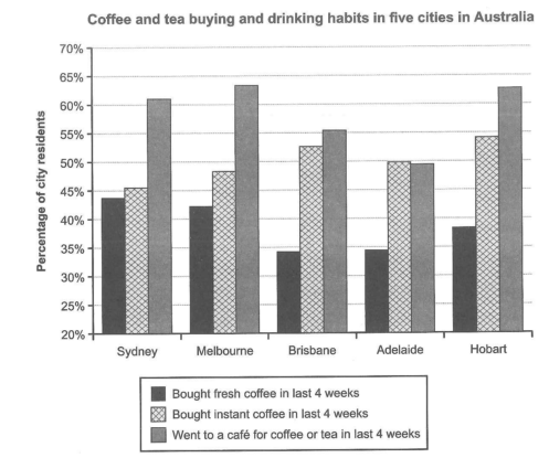
The chart below shows the results of a survey about people’s coffee and tea buying and drinking habits in five Australian cities.
Summarize the information by selecting and reporting the main features, and make comparisons where relevant.
Student answer (Band 5.0)
The bar chart campares outcome of a survey on people living in five Australian cities ( Sydney, Melbourne,Brisbane,Adelaide and Hobart) about their drinking habits.
Overall, more than 60 percent Australians went to a cafe for having coffee or tea accourding to given time.Brisbane and Adelaide cilizens are least interested on having coffee or tea.
Morely, if we focus on three urban areas sydney, Melbourne and Hobart individuals here prefer to go out around more then 60% and having fresh coffee at the bottom of the chart while sydney persons also not prefer instant coffee like other two cities
Other important key point is Brisbane and Adelaide citizens donnot like tea and coffee much and they are about less then 40 percent people to bought fresh coffee in last 4 weeks they are the lowest in the bar chart here is camparision in which Adelaide people are also notninterested to buy cofffee from outside like other 4 cities of Australia
AI examiner evaluation
| Criterion | Band |
|---|---|
| Task Achievement / Task Response | 5.0 |
| Coherence and Cohesion | 5.0 |
| Lexical Resource | 5.0 |
| Grammatical Range and Accuracy | 5.0 |
| Overall | 5.0 |
Task Achievement / Task Response: Band 5.0
You identify the chart’s subject and give an overview that café visits are high in several cities, while Brisbane and Adelaide are generally lower. However, the overview is partly inaccurate: café attendance is above 60% in Sydney, Melbourne and Hobart, not across Australians generally, and Adelaide’s café figure is about 50%, rather than clearly showing little interest. Some comparisons are also unsupported or mistaken: Sydney’s instant-coffee figure is slightly higher than its fresh-coffee figure, so saying Sydney residents do not prefer instant coffee is misleading. The response gives few precise figures and does not systematically compare all three activities across the five cities. Select the main highs and lows accurately, then support them with representative data.
Coherence and Cohesion: Band 5.0
The response has an opening, an overview and further comparison paragraphs, so the reader can recognise an attempt to organise the report. However, the progression is difficult to follow: the third paragraph shifts among three cities and several habits, while the final paragraph repeats the point that Brisbane and Adelaide are less interested without clearly distinguishing café visits from purchases. Linking phrases such as “Morely” and “Other important key point” do not create clear relationships between ideas, and some references, including “here,” are vague. Group the information by activity or by city, and use each paragraph to make one clear comparison. This would give the report a more consistent progression.
Lexical Resource: Band 5.0
You attempt a range of topic-related expressions, including “survey,” “citizens,” “prefer,” and “bar chart,” and the reader can generally identify the subject. However, spelling errors such as “campares,” “accourding,” “cilizens,” and “camparision” are frequent and distract from the information. Several word combinations are unnatural or imprecise, for example “least interested on having coffee or tea,” “at the bottom of the chart,” and “buy coffee from outside.” Repetition of “coffee and tea” and “interested” also limits precision. Use standard chart-reporting language such as “the proportion who visited a café” and “purchased instant coffee,” and check spelling carefully.
Grammatical Range and Accuracy: Band 5.0
You make some attempts to combine ideas, for example in “if we focus on three urban areas … individuals here prefer to go out,” but sentence structures are often incomplete or difficult to control. The opening lacks a clear article and uses an awkward construction, while “more than 60 percent Australians went” is missing “of” and has an unclear time reference. In “they are about less then 40 percent people to bought fresh coffee,” the comparison and verb pattern are faulty, making the meaning hard to follow. Punctuation and spacing around city names and parentheses are also inconsistent. Practise accurate simple comparison sentences first, then add subordinate clauses while checking articles, verb forms and sentence boundaries.
See this exact question answered at other band scores. The same prompt compared across bands.
Browse more IELTS Writing model answers or get your own writing scored by the same AI examiner.