Band 5.0 IELTS Writing Task 1 Model Answer
Overall Band Score: 5.0 · Cambridge IELTS 15 · 2026-11-11
IELTS Writing Task 1 question
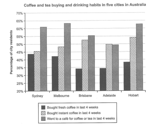
The chart below shows the results of a survey about people’s coffee and tea buying and drinking habits in five Australian cities.
Summarize the information by selecting and reporting the main features, and make comparisons where relevant.
Student answer (Band 5.0)
The bar chart illustrate a survey when individuals buying coffee and tea in Sydney, Melbourne, Brisbane, Adelaide,Hobart of Australia.In the first option in Sydney bought fresh coffee in last 4 weeks and the percentage is 43.7 percent.on the other hand Melbourne has 42.3percent.But Brisbane and Adelaide are quite similar,Hobart has 38.2 percent.And 2nd option shows instant coffee in last 4 weeks.in this point of view Hobart has the highest point to bought instant coffee which was 54.2 percent, Brisbane and Adelaide are small difference which was 53.2percent and 50percent.And Melbourne and Sydney has 48.2%and 45%.And the last one is went to a cafe for coffee or tea in last 4 weeks.In this point Melbourne was the highest which was 64.2%and 2nd highest was Hobart 63.2%, Sydney was 61.2%.On the other hand the amount of coffee and tea in the cafe in Brisbane has 55%, Adelaide has49.2%.overall Adelaide has the lowest point.
AI examiner evaluation
| Criterion | Band |
|---|---|
| Task Achievement / Task Response | 5.0 |
| Coherence and Cohesion | 5.0 |
| Lexical Resource | 5.0 |
| Grammatical Range and Accuracy | 5.0 |
| Overall | 5.0 |
Task Achievement / Task Response: Band 5.0
You cover all three survey categories and include figures for each city, so the response is relevant and gives the reader a useful amount of detail. However, the main features are not clearly selected or summarised: the overview is limited to “Adelaide has the lowest point,” which applies to café visits but not to every measure. Some comparisons are also inaccurate or unclear. For example, Melbourne, not Hobart, has the highest café attendance (about 63.5% versus 63%), and fresh-coffee figures for Brisbane and Adelaide are similar at about 34.5%, rather than being reported explicitly. To strengthen the response, state the broad patterns first, then support them with a few accurate comparisons instead of listing every city.
Coherence and Cohesion: Band 5.0
The response follows the chart’s three categories in order, and phrases such as “on the other hand” and “overall” show an attempt to connect information. However, the ideas are presented as one continuous block, with no clear paragraphing or overall progression from an overview to supporting details. Several transitions are repetitive or do not express a clear contrast, and the long sequence beginning “And the last one…” makes the comparisons difficult to follow. Group the information into an introduction and overview, followed by two short detail paragraphs. Use linking phrases only where they clarify a real comparison, and make each sentence focus on one or two related figures.
Lexical Resource: Band 5.0
You use relevant chart vocabulary, including “percentage,” “highest,” “lowest,” and “similar,” and the reader can generally identify the measures being discussed. However, the range is limited and some expressions are unnatural or imprecise, such as “highest point to bought instant coffee,” “small difference,” and “the amount of coffee and tea in the cafe.” Repeated use of “option” also does not accurately describe the chart’s categories. Choose standard reporting language and precise terms for proportions and café visits. This would make the comparisons clearer and reduce the effort required to interpret your meaning.
Grammatical Range and Accuracy: Band 5.0
You attempt to combine information using contrast and comparison, but the response relies mainly on simple sentence patterns, and errors occur frequently. For example, “The bar chart illustrate” has subject–verb disagreement, while “Melbourne and Sydney has” should use a plural verb. Several sentences are joined with full stops or conjunctions without appropriate punctuation, and missing spaces after full stops make boundaries unclear. Articles and sentence structure are also inconsistent, as in “in this point of view.” Practise accurate simple sentences first, then use controlled comparative structures such as “The figure for X was higher than that for Y.” Check agreement, sentence boundaries, and punctuation during revision.
See this exact question answered at other band scores. The same prompt compared across bands.
Browse more IELTS Writing model answers or get your own writing scored by the same AI examiner.