Band 4.5 IELTS Writing Task 1 Model Answer
Overall Band Score: 4.5 · Cambridge IELTS 15 · 2026-11-11
IELTS Writing Task 1 question
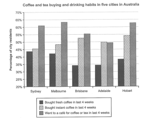
The chart below shows the results of a survey about people’s coffee and tea buying and drinking habits in five Australian cities.
Summarize the information by selecting and reporting the main features, and make comparisons where relevant.
Student answer (Band 4.5)
In the given chart illastrates below about survey of people's buying coffee and tea in five main cities of australia.
There are five main cities which are sydney, Melbourne,Brisbane,Adelaide and hobart having sharply increased and decreased while buying coffee and drinks.
If we saw the graph chart of sydney having 20% people bought fresh coffee in last 4 week can rise quickly up 43% sharply, While bought instant coffee having little rise upto 45.5% but the rosing line sharply gone to ward the sky up to 63% of went to coffee shop and drinking there.
if we saw in both 5 cities haveing 3 Line which demonstrate about riseing and decline of fresh coffee , Instant coffee, and went to coffee.
the main decline occur to 33% in two main cities Bisbane and Adelaide.
And the Line which toward the sky and sharply increased in three cities are Sydney, Melbourne and Hobart up to 60% to 65% using of coffee and drinking drinks.
AI examiner evaluation
| Criterion | Band |
|---|---|
| Task Achievement / Task Response | 4.5 |
| Coherence and Cohesion | 4.0 |
| Lexical Resource | 5.0 |
| Grammatical Range and Accuracy | 4.5 |
| Overall | 4.5 |
Task Achievement / Task Response: Band 4.5
The response identifies the five cities and refers to all three activities, so it is recognisably about the chart. However, it reports the data only partially and does not give a clear, accurate overview of the main patterns. For example, it says fresh coffee in Sydney rose from 20% to 43%, although the chart gives about 44% and contains no change over time; the figures are comparisons across cities. The claim that café visits reached 63% in Sydney is broadly accurate, but the response misses that café-going was highest in Melbourne and Hobart, and that instant coffee was the most popular activity in Brisbane, Adelaide and Hobart. Focus on the overall comparisons and report selected figures accurately.
Coherence and Cohesion: Band 4.0
There is some attempt to group information: the response names the cities, then discusses coffee types and café visits. However, ideas are not arranged in a clear progression, and the reader has to work to understand the comparisons. The opening repeats the task rather than presenting a concise overview, while phrases such as “if we saw” recur without clearly linking one point to the next. The final statements about a “decline” and lines “toward the sky” are difficult to connect to the chart, which shows city-to-city differences rather than changes over time. Organise the report into an overview followed by two comparison paragraphs, and use direct links such as “By contrast” or “Meanwhile” only where they clarify relationships.
Lexical Resource: Band 5.0
The response uses some relevant chart vocabulary, including “bought fresh coffee,” “instant coffee,” “cities,” and “percentage,” and attempts to describe comparisons with words such as “increased” and “decline.” However, the range is limited and several choices are inaccurate or repetitive, sometimes making the meaning unclear. “The rosing line sharply gone to ward the sky” is not an appropriate way to describe a bar chart, and “using of coffee” does not express the intended proportion. Spelling errors such as “illastrates,” “Bisbane,” and “haveing” also reduce clarity. Use precise terms such as “proportion,” “highest,” and “lowest,” and describe the chart as showing percentages across cities rather than lines rising over time.
Grammatical Range and Accuracy: Band 4.5
The response attempts longer sentences and conditional openings, but grammatical control is weak and errors frequently obscure relationships between ideas. For instance, “In the given chart illastrates below about survey” lacks a clear subject and verb structure, while “Sydney having 20% people bought fresh coffee” has an unclear construction and incorrectly frames the data as a change. There are also problems with articles, agreement, and sentence boundaries, as in “if we saw in both 5 cities haveing 3 Line.” Most sentences are not reliably controlled, and punctuation does not consistently separate complete ideas. Build accurate simple sentences first—for example, “In Sydney, about 44% bought fresh coffee”—then add comparisons using carefully formed clauses.
See this exact question answered at other band scores. The same prompt compared across bands.
Browse more IELTS Writing model answers or get your own writing scored by the same AI examiner.