Band 4.5 IELTS Writing Task 1 Model Answer
Overall Band Score: 4.5 · Cambridge IELTS 15 · 2026-11-11
IELTS Writing Task 1 question
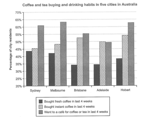
The chart below shows the results of a survey about people’s coffee and tea buying and drinking habits in five Australian cities.
Summarize the information by selecting and reporting the main features, and make comparisons where relevant.
Student answer (Band 4.5)
The graph show that the results of a survey about peoples buying and drinking coffee and tea habibts in five Australan cities. Overall, they can be seen that the percentage of buying coffee in Sydney, Brisbane, Adelaide are declined while in Melbourme ad Hobart growth same but Melbourme increased the ratio of buying and drinking.
The percentage of bought fresh in sydney since last four week was declined however instant coffee also decreased. In Melbourme brought fresh and instant coffee growth same but significantily decreased and In Brisbane and Adelaide the percentage of fresh and instant coffee ar typically declinedsince four weeks while the Hobart the fresh coffee declined but instant coffe increased since four weeks.
On the other hand the most people went to cafe for drinking and buying coffee and tea areincreased in melnoume tan other cities of Austrilia.
AI examiner evaluation
| Criterion | Band |
|---|---|
| Task Achievement / Task Response | 4.0 |
| Coherence and Cohesion | 5.0 |
| Lexical Resource | 5.0 |
| Grammatical Range and Accuracy | 4.5 |
| Overall | 4.5 |
Task Achievement / Task Response: Band 4.0
The response identifies the chart’s general subject and attempts an overview, but it does not accurately report the main patterns. For example, it says coffee buying “are declined” in Sydney, Brisbane and Adelaide, although the chart records survey proportions rather than changes over time; it also describes increases and decreases “since last four week,” which the data cannot show. The café comparison is relevant, but the claim that Melbourne had more café visits than other cities is inaccurate: Melbourne and Hobart are both among the highest, with Hobart slightly lower. The response is also below the required 150 words. To improve, describe comparisons across cities, identify the highest and lowest figures, and support the overview with accurate data.
Coherence and Cohesion: Band 5.0
There is some basic organisation: an opening and overview are followed by details about coffee purchases and a final café comparison. Connectors such as “Overall” and “On the other hand” show an attempt to guide the reader. However, the progression is difficult to follow because the response repeatedly treats the chart as a timeline, and the second paragraph combines several cities and products in one long sequence. The final sentence is not clearly linked to the preceding comparisons. Use separate paragraphs for the overview and key comparisons, and group cities or categories logically. More precise linking and reference would help readers understand which figures are being compared without relying on repeated city names.
Lexical Resource: Band 5.0
The response uses some task-related vocabulary, including “percentage,” “fresh coffee,” “instant coffee,” and “went to cafe,” so the topic is generally recognisable. However, the range is limited and several word choices or collocations make the meaning unclear, such as “growth same,” “brought fresh,” and “increased the ratio of buying and drinking.” Spelling errors—including “habibts,” “Australan,” “Melbourme,” and “significantily”—also reduce clarity. In addition, words such as “declined” and “increased” imply change over time, which is not what this chart measures. Practise accurate comparison language such as “the proportion was higher” and “recorded the largest share,” and check spelling before submitting.
Grammatical Range and Accuracy: Band 4.5
The response attempts both simple and longer sentence forms, including a contrast introduced by “while” and a final sentence beginning “On the other hand.” However, frequent errors in sentence structure, agreement, tense, and articles make several statements difficult to interpret. For instance, “The graph show” has incorrect subject–verb agreement, while “they can be seen that” is not a grammatical construction. The repeated use of “since last four week” also creates an inaccurate tense pattern, and clauses such as “the percentage of fresh and instant coffee ar typically declinedsince four weeks” are not reliably formed. Build shorter, complete sentences first, then practise combining comparisons with accurate verbs and articles.
See this exact question answered at other band scores. The same prompt compared across bands.
Browse more IELTS Writing model answers or get your own writing scored by the same AI examiner.