Band 5.0 IELTS Writing Task 1 Model Answer
Overall Band Score: 5.0 · Cambridge IELTS 15 · 2026-11-12
IELTS Writing Task 1 question
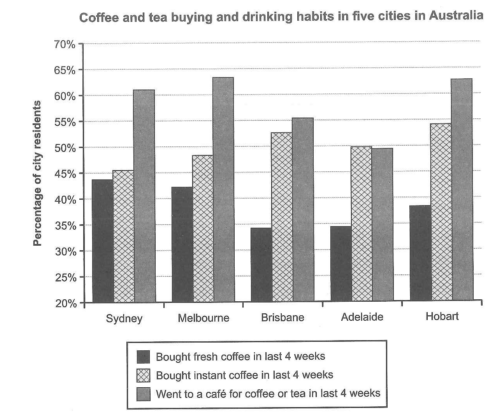
The chart below shows the results of a survey about people’s coffee and tea buying and drinking habits in five Australian cities.
Summarize the information by selecting and reporting the main features, and make comparisons where relevant.
Student answer (Band 5.0)
The given chart is from a survey conducted to find out the people's habit of buying tea, coffe and drinking habits. Survey is conducted in five major australian cities. Graphs shows that maximum number of people went to cafe for coffe or tea in last four weeks in four cities except the "Adelaide". Most of people bought instant coffee in all four cities but in Adeliade this ratio was less than the people who went to cafe for coffee or tea. Buyers of fresh coffee remains less in all five cities. On average buyers of fresh cofee are less in Brisbane but high in sydney compratively. Similarly the buyers of instant cofee are high in Hobrat. but low in sydney. The choice of buying fresh coffe or instant coffee all depends upon the personal choice of individuals. In some cities, some cultural elements also add in people's choice. Then weather and life routine is also the element which add in choosing between fresh or instant coffee.
AI examiner evaluation
| Criterion | Band |
|---|---|
| Task Achievement / Task Response | 5.5 |
| Coherence and Cohesion | 4.5 |
| Lexical Resource | 5.5 |
| Grammatical Range and Accuracy | 5.0 |
| Overall | 5.0 |
Task Achievement / Task Response: Band 5.5
You identify several relevant overall patterns: café visits were highest in most cities, instant coffee was especially popular in Hobart, and fresh coffee was comparatively less popular. These observations show an attempt to summarise rather than list every figure. However, the account is only partly accurate and does not report the chart’s main comparisons precisely. Café visits were highest in four cities, but in Adelaide instant coffee purchases (about 50%) were slightly above café visits (about 49.5%), not below them as your wording suggests. Fresh coffee was lowest in Brisbane and Adelaide, rather than simply “less in Brisbane,” and the response gives no figures to support its comparisons. The comments about culture, weather and routine are speculative and not shown by the chart. Focus on a clear overview and selected, accurate comparisons.
Coherence and Cohesion: Band 4.5
The response moves from a brief introduction to general comparisons and then to possible explanations, so there is some organisation and the reader can follow the broad topic. However, the ideas are crowded into one paragraph, with no clear separation between the overview and supporting details. Several transitions, such as “Similarly” and “Then,” do not establish a precise relationship between the points that follow. The final comments about personal choice, culture and weather also interrupt the progression from describing the data. Group the response into an introduction, an overview, and one or two paragraphs comparing the cities. Use linking expressions to show clear contrasts, such as “whereas” or “by comparison,” and keep each sentence focused on a chart feature.
Lexical Resource: Band 5.5
You use relevant topic vocabulary, including “survey,” “buyers,” “instant coffee,” and “personal choice,” and the meaning is generally understandable. However, the range is limited and some expressions are imprecise or repetitive, particularly repeated forms of “coffee” and “people.” There are also noticeable spelling errors, including “coffe,” “cofee,” “Adeliade,” and “Hobrat,” which reduce accuracy. Phrases such as “maximum number of people” and “this ratio” are not natural or precise ways to describe percentages in a chart. Use standard terms such as “proportion,” “percentage,” and “residents,” and check spelling carefully. More precise comparative language would help you report the data clearly without adding unsupported explanations.
Grammatical Range and Accuracy: Band 5.0
You attempt some longer sentence structures, for example, “Most of people bought instant coffee in all four cities but in Adeliade this ratio was less than the people who went to cafe.” However, the response relies mainly on simple statements, and errors in articles, agreement, and sentence construction are frequent enough to make some comparisons awkward. Examples include “Survey is conducted” and “Graphs shows,” where the article or verb form is incorrect, and “the element which add” lacks subject–verb agreement. The opening sentence also combines ideas in an unclear structure. Practise accurate present-tense reporting patterns, such as “The chart shows…” and “The proportion of residents who bought…,” and use a controlled mix of simple and complex sentences.
See this exact question answered at other band scores. The same prompt compared across bands.
Browse more IELTS Writing model answers or get your own writing scored by the same AI examiner.