Band 6.0 IELTS Writing Task 1 Model Answer
Overall Band Score: 6.0 · Cambridge IELTS 15 · 2026-11-13
IELTS Writing Task 1 question
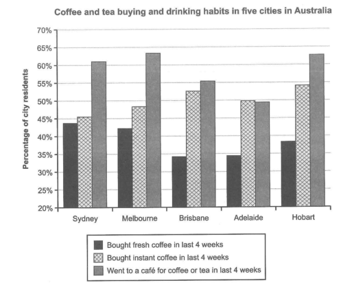
The chart below shows the results of a survey about people’s coffee and tea buying and drinking habits in five Australian cities.
Summarize the information by selecting and reporting the main features, and make comparisons where relevant.
Student answer (Band 6.0)
The bar chart illustrates the result of a survey about people's purchasing and using behaviour of coffee and tea in different five cities of Australia.
The chart compares three main categories of people who buy fresh coffee, instant coffee and those who went to a cafe for coffee or tea in last 4 weeks in Sydney, Melbourne, Brisbane, Adelaide and Hobart.
In overall trend the person who went to a cafe for coffee or tea is more in all cities except in Adelade. In Adelaide the person who use instant coffee is 50% while the percentage of people who went for cafe for coffee or tra is 49%. On the other hand the percentage of people who use fresh coffee os less in all cities as compare to other categories.
The overall average of person who use intant coffee is at second number more than the persons who use fresh coffee but less than the people who went to cafe for coffee or tea.
AI examiner evaluation
| Criterion | Band |
|---|---|
| Task Achievement / Task Response | 6.0 |
| Coherence and Cohesion | 6.0 |
| Lexical Resource | 5.5 |
| Grammatical Range and Accuracy | 5.5 |
| Overall | 6.0 |
Task Achievement / Task Response: Band 6.0
You identify the three survey categories and all five cities, and your overview captures two important patterns: café visits are highest in most cities, while fresh coffee is generally the least popular category. You also correctly note Adelaide’s close comparison between instant coffee (50%) and café visits (about 49.5%). These are relevant features and show a sound understanding of the chart. However, the overview is not fully precise: café visits are not the highest in Adelaide, and fresh coffee is not the lowest in every city, since Sydney’s fresh-coffee figure is slightly below its instant-coffee figure. The final statement about the overall ranking is also broad and unsupported by specific comparisons. Select the main exceptions accurately and support the overview with a few key figures.
Coherence and Cohesion: Band 6.0
The response has a clear basic structure: an introduction, a description of the chart’s categories and cities, and a paragraph presenting overall patterns. This makes the information generally easy to follow. You also use linking expressions such as “On the other hand” and “but,” which help signal comparisons. However, the progression is limited because the response gives almost no city-by-city detail, and the final paragraph repeats the ranking already stated rather than developing a new comparison. Some references are unclear, particularly “the person” and “the overall average of person,” which make it harder to identify exactly what is being compared. Organise the body around the main patterns, then use clear references to the proportions or categories and include selected city comparisons.
Lexical Resource: Band 5.5
You use relevant chart vocabulary, including “bar chart,” “survey,” “percentage,” “categories,” and “compares,” so the topic is clear. There are also attempts to vary expressions, such as “purchasing and using behaviour” and “overall trend.” However, several word choices and collocations are inaccurate or unnatural, including “different five cities,” “the person who went to a cafe,” and “use fresh coffee.” Spelling errors such as “Adelade,” “tra,” and “intant” also reduce accuracy. These issues do not prevent the reader from understanding the main message, but they limit precision and naturalness. Use terms such as “residents,” “proportion,” and “bought fresh coffee,” and check spelling carefully when editing.
Grammatical Range and Accuracy: Band 5.5
You attempt both simple and more complex sentence forms, including a comparison with “while” and a contrast introduced by “On the other hand.” The main ideas remain understandable, which is a strength. However, some grammatical errors recur in sentence construction and agreement. For example, “The chart compares three main categories of people who buy…” does not clearly match the categories, and “the person who went to a cafe … is more” has incorrect singular/plural agreement and an incomplete comparison. “In overall trend” also lacks the appropriate article and preposition. Aim for direct structures such as “The chart compares the proportions of residents who…” and “Café visits were more common than…” Check articles, agreement, and complete comparative forms while retaining your attempts at complex sentences.
See this exact question answered at other band scores. The same prompt compared across bands.
Browse more IELTS Writing model answers or get your own writing scored by the same AI examiner.