Band 5.5 IELTS Writing Task 1 Model Answer
Overall Band Score: 5.5 · Cambridge IELTS 15 · 2026-11-13
IELTS Writing Task 1 question
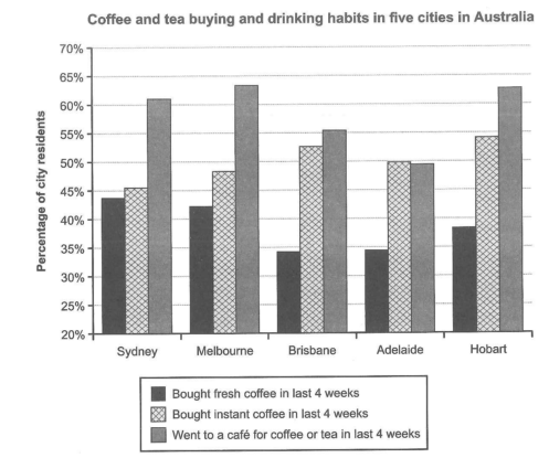
The chart below shows the results of a survey about people’s coffee and tea buying and drinking habits in five Australian cities.
Summarize the information by selecting and reporting the main features, and make comparisons where relevant.
Student answer (Band 5.5)
The bar chart illustrates the five Australian cities named Sydney, Melbourne,Brisbane,Adelaide,Hobart and shows the survey about the people's drinkinking habits and coffee and tea buying.
Overall it can be seen that, the people who went to cafe for coffee or tea in last four weeks was the highest across the countries while the least percentage belongs to the instant coffee.
Acccording to the bar chart, in Sydney 44% of residents brought fresh coffee in last 4 weeks while around 46% of people had instant coffee. however the percentage of people who visited cafe for coffee and tea in last 4 weeks was really high. Meanwhile in Mellbourne the people who brought fresh coffee in last 4 weeks was 42% and instant coffee was 49%. Melbourne has the highest percentage of 64 those who visited cafes for having tea and coffee.
Turning to the remaining three cities Brisbane shows the lowest propotion of 33% in fresh coffee and a huge incerease in the people who buy instant coffee. This city holds the third position for residents who visited cafes.Based on the five cities Brisbane has the lowest percentage of people buying fresh coffee The persons who brought fresh coffee in Adelaide was 34% and according to this city the residents whho brought instant coffee has the highest rate rather than the residents who visited cafes. Talking about the city Hobart it had a spike of 63% in people who visted cafes and 54% of people inisited instant coffee in last 4 weeks and 38% of people drinked fresh coffee.
AI examiner evaluation
| Criterion | Band |
|---|---|
| Task Achievement / Task Response | 5.5 |
| Coherence and Cohesion | 5.5 |
| Lexical Resource | 5.0 |
| Grammatical Range and Accuracy | 5.0 |
| Overall | 5.5 |
Task Achievement / Task Response: Band 5.5
You identify the chart’s subject and include relevant comparisons across the five cities, with several figures close to the chart, such as Sydney’s 44% for fresh coffee and Hobart’s 63% for café visits. However, the overview contains a major misreading: café visits are the highest category, but fresh coffee—not instant coffee—is generally the lowest; instant coffee is highest in Brisbane, Adelaide and Hobart. Some details are also unclear or inaccurate, including the claim that Adelaide’s instant-coffee rate is the highest, when Hobart’s is higher. The response therefore covers the task only partially: it reports data, but the overview and selection of key features are not consistently accurate. Compare the three categories systematically and make the overall patterns precise.
Coherence and Cohesion: Band 5.5
The response has a basic structure, moving from an introduction and overview to city-by-city details, and phrases such as “Meanwhile” and “Turning to the remaining three cities” help signal shifts. However, progression becomes difficult to follow in the final paragraph: Brisbane is discussed repeatedly, and the Adelaide and Hobart information is crowded together. Some links are mechanical or unclear, as in “Based on the five cities,” while the repeated references to fresh coffee do not always add a new comparison. Use one paragraph for the overview and organise the details into clear groups, such as Sydney and Melbourne followed by the other cities. Ensure each sentence has a clear subject and comparison.
Lexical Resource: Band 5.0
You use some task-relevant vocabulary, including “percentage,” “residents,” “visited cafes,” and “highest,” so the reader can generally identify the categories being compared. However, the range is limited and several word choices or forms are inaccurate, which makes parts of the report harder to understand. Examples include “drinkinking,” “brought fresh coffee” for buying coffee, “propotion,” and “a spike” for a high figure. “Huge increase” also suggests a change over time, although the chart compares cities rather than showing a trend. Check spelling carefully and choose precise reporting language, such as “the proportion who bought” or “recorded the highest figure.”
Grammatical Range and Accuracy: Band 5.0
You attempt both simple and more complex sentences, including clauses beginning “while” and “who,” but control is inconsistent. Errors in agreement and sentence construction appear in examples such as “the people … was the highest” and “the people who brought fresh coffee … was 42%.” Some sentences are joined awkwardly or lack clear punctuation, particularly the long final paragraph, which makes relationships between ideas difficult to follow. Articles and prepositions are also sometimes missing, as in “visited cafe” and “in last 4 weeks.” Practise forming accurate comparison sentences with plural subjects and consistent past-tense reporting, and divide long sentences where they contain several city figures.
See this exact question answered at other band scores. The same prompt compared across bands.
Browse more IELTS Writing model answers or get your own writing scored by the same AI examiner.