Band 6.0 IELTS Writing Task 1 Model Answer
Overall Band Score: 6.0 · Cambridge IELTS 15 · 2026-11-13
IELTS Writing Task 1 question
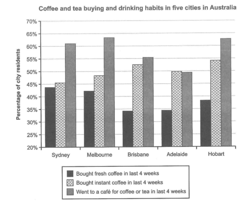
The chart below shows the results of a survey about people’s coffee and tea buying and drinking habits in five Australian cities.
Summarize the information by selecting and reporting the main features, and make comparisons where relevant.
Student answer (Band 6.0)
The given illustration represents the information about the results of a survey about people's drinking habits as well as buying tea and coffee in five different cities of Australia.
Firstly, in Sydney, around 44% of the residents bought fresh coffee and 46% of the locals bought instant coffee in the last four weeks whereas, 61% of people went to a cafe for coffee or tea in the given time period. Almost same goes for Melbourne with some little increase in the number of people going to cafes or buying instant coffee and decrease in people buying fresh coffee. 34% of locals of Brisbane and Adelaide bought fresh coffee, around 50% bought instant coffee and up-to 55% of the residents preferred visiting cafes. In Hobart, majority of people (around 63%) visited cafes, 54% bought instant coffee and 37% bought fresh coffee in the last four weeks.
Overall, it can be considered that people mostly prefer going to cafe for having tea or coffee.
AI examiner evaluation
| Criterion | Band |
|---|---|
| Task Achievement / Task Response | 6.0 |
| Coherence and Cohesion | 6.0 |
| Lexical Resource | 6.0 |
| Grammatical Range and Accuracy | 6.0 |
| Overall | 6.0 |
Task Achievement / Task Response: Band 6.0
You cover all three survey categories and all five cities, and the figures you report are generally close to the chart. Your overview correctly identifies café visits as the most popular activity overall, while the city-by-city details include useful comparisons, such as Sydney’s 44% for fresh coffee and about 61% for café visits. However, some comparisons are vague or inaccurate: Melbourne’s café figure is slightly higher than Sydney’s, but its instant-coffee figure is also higher, not merely described as a “little increase”; Brisbane and Adelaide do not both have café visits of up to 55%, since Adelaide is just under 50%. The overview would be stronger if it also highlighted that instant coffee leads fresh coffee in every city and that café attendance is lowest in Adelaide.
Coherence and Cohesion: Band 6.0
The response has a clear overall arrangement: an introduction, a sequence of city-based details, and a concluding overview. This makes the information reasonably easy to follow, and phrases such as “whereas” and “Overall” help signal contrast and summary. However, the body is compressed into one long paragraph, and the transitions between cities are sometimes mechanical. “Almost same goes for Melbourne” does not clearly identify which figures are being compared, while the sentence grouping Brisbane and Adelaide together obscures their different café results. Use separate paragraphs for the overview and key comparisons, and organise the body around patterns across the cities—for example, café attendance versus coffee purchases—so that references and comparisons are more precise.
Lexical Resource: Band 6.0
You use an adequate range of vocabulary to describe the chart, including “residents,” “bought,” “visited,” and “increase” and “decrease.” These choices communicate the main information, and the response remains understandable. Some wording is imprecise or unnatural for formal data reporting, however. “The given illustration represents the information about the results” is wordy, “locals” is less suitable than “residents,” and “people mostly prefer going to cafe” sounds like a general preference rather than a report of survey results. “Up-to 55%” is also an imprecise way to report the figures. Aim for concise chart language such as “the chart compares,” “the proportion of residents,” and “the highest/lowest figure,” while varying reporting verbs carefully.
Grammatical Range and Accuracy: Band 6.0
You use a mix of simple and more complex sentence forms, including a comparison joined with “whereas” and a concluding sentence beginning “Overall.” Most of the meaning is clear, but some grammatical and punctuation errors remain. In “whereas, 61%,” the comma is misplaced; “Almost same goes for Melbourne” needs an article and a more complete construction, such as “A similar pattern is seen in Melbourne”; and “34% of locals of Brisbane and Adelaide” has an awkward, unclear noun phrase. The final sentence also needs an article in “going to a cafe.” Greater control of articles, sentence boundaries, and parallel phrasing would make the comparisons more accurate and polished.
See this exact question answered at other band scores. The same prompt compared across bands.
Browse more IELTS Writing model answers or get your own writing scored by the same AI examiner.