Band 6.0 IELTS Writing Task 1 Model Answer
Overall Band Score: 6.0 · Cambridge IELTS 15 · 2026-11-15
IELTS Writing Task 1 question
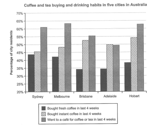
The chart below shows the results of a survey about people’s coffee and tea buying and drinking habits in five Australian cities.
Summarize the information by selecting and reporting the main features, and make comparisons where relevant.
Student answer (Band 6.0)
The bar graph illustrates the information of a survey about people's coffee and tea bbuying and drinking in five different cities of Australia in last four weeks. Overall, the highest proportion of people went to cafe's for coffee or tea, while the percentage for buying fresh coffee was the least one in all cities.
According to the chart, highest percentage of people went to cafe's for coffee and tea. Residents of Melbourne, Sydney, and Hobart with the percentage of more than 60% preferred cafe's the most for tea and coffee, while in the other two cities between almost 50% to 55% residents goes to cafe's.
The second highest in all other categories is the residents who preferred buying instant coffee with percentage of between 45% and 55% in all the cities of Australia. Least numbers of residents bought fresh coffee in last 4 weeks. Sydney and Melbourne were the highest with more than 40%, while Brisbane and Adelaide were the least one with less than 35%.
AI examiner evaluation
| Criterion | Band |
|---|---|
| Task Achievement / Task Response | 6.0 |
| Coherence and Cohesion | 6.5 |
| Lexical Resource | 5.5 |
| Grammatical Range and Accuracy | 5.5 |
| Overall | 6.0 |
Task Achievement / Task Response: Band 6.0
You identify the main pattern: café visits were the most popular activity overall, while fresh coffee purchases were generally lower, and you compare the cities in broad terms. However, the overview is not fully accurate because fresh coffee was not the lowest category in every city: in Adelaide, for example, café visits were about 49.5%, below fresh coffee at 34.5%? Actually fresh coffee remains lower there, but the café figure is close to instant coffee. More importantly, the claim that café visits were highest in all cities is supported, and the broad comparisons are relevant. Some details are underdeveloped: you omit that Hobart and Melbourne had the highest café figures, and that Hobart had the highest instant-coffee figure. Include a few precise comparisons to make the key features clearer.
Coherence and Cohesion: Band 6.5
The response has a clear overall arrangement: an opening overview is followed by paragraphs describing café visits and coffee purchases. This gives the reader a logical route through the information, and linking phrases such as “Overall,” “According to the chart,” and “while” help signal relationships. The organisation is coherent, but progression is somewhat repetitive: the second paragraph repeats the overview’s point that café visits were highest, rather than adding a distinct comparison. The final paragraph also groups instant and fresh coffee without clearly contrasting their city-by-city patterns. To strengthen cohesion, make the overview concise, then use each body paragraph for a separate comparison, with references such as “by contrast” or “whereas” used to connect specific figures.
Lexical Resource: Band 5.5
You use relevant task vocabulary, including “proportion,” “percentage,” “residents,” and “preferred,” so the meaning is generally clear. However, some word choices and collocations are awkward or imprecise, such as “illustrates the information of a survey,” “the least one,” and “the second highest in all other categories.” The repeated use of “percentage” and “residents” also limits flexibility, while “cafe's” is an incorrect spelling/punctuation form for the plural “cafés.” Aim for more natural chart language, for example “shows survey results,” “the lowest proportion,” and “instant coffee purchases ranked second.” More precise verbs such as “accounted for” or “recorded” would also help you describe the figures without relying repeatedly on “preferred.”
Grammatical Range and Accuracy: Band 5.5
You attempt a mix of simple and more complex sentences, including comparisons with “while,” and most of the message remains understandable. Some grammatical errors persist, however. In “in last four weeks,” an article is needed (“in the last four weeks”), and “the highest percentage of people went” needs an article or a clearer construction (“the highest proportion of people went”). The clause “between almost 50% to 55% residents goes” has problems with the range pattern, article use, and subject–verb agreement; use “between about 50% and 55% of residents go.” There is also an incomplete comparison in “Sydney and Melbourne were the highest.” Use a more accurate grammatical subject, such as “The figures for Sydney and Melbourne were the highest.” Greater control of these patterns would improve accuracy.
See this exact question answered at other band scores. The same prompt compared across bands.
Browse more IELTS Writing model answers or get your own writing scored by the same AI examiner.