Band 5.5 IELTS Writing Task 1 Model Answer
Overall Band Score: 5.5 · Cambridge IELTS 15 · 2026-11-15
IELTS Writing Task 1 question
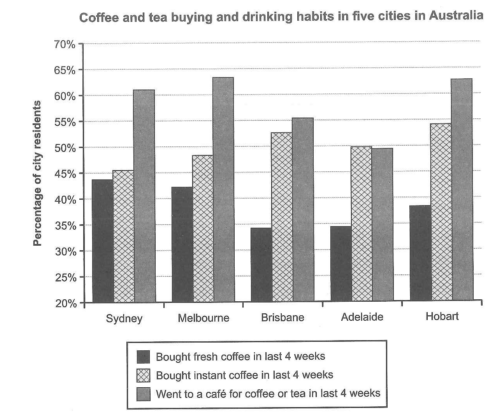
The chart below shows the results of a survey about people’s coffee and tea buying and drinking habits in five Australian cities.
Summarize the information by selecting and reporting the main features, and make comparisons where relevant.
Student answer (Band 5.5)
The given bar chart illustrate the result of a information about pulis coffee and tea buying and drinking habits in few Australian mega cities.
overall, it can be see people went to a cafe for coffee or tea in last 4 weeks is clearly dominate almost four cities expect Adelaide. In contrast, bought fresh coffee showed lowest percentage over the information.
Sudney accounted 62% for went to a cafe gor coffee or tea in last 4 week. and brisbane , adelaide and Hobart had demanded according to 56% , 49% and 63%. remaining melbourne has 64% wich is highest demanded over the information.
Bought instant coffee people habits showed 46% in Sydney, 48 % in melbourne, 53% in Brisbane, 50% in Adelaide and 54% in hobart in last 4 weeks. while , Bought fresh coffee habits represent 44% in sydney, 42% in melbourne, 34% in Adelaide , 38% in hobart and brisbane accounted 33% in last 4 weeks. wich is inforrm lowest percentage of residents habits throughout the chart.
AI examiner evaluation
| Criterion | Band |
|---|---|
| Task Achievement / Task Response | 6.0 |
| Coherence and Cohesion | 6.0 |
| Lexical Resource | 5.0 |
| Grammatical Range and Accuracy | 5.0 |
| Overall | 5.5 |
Task Achievement / Task Response: Band 6.0
You cover all three measures across the five cities and include a useful overview: café visits were generally the highest category, while fresh coffee purchases were usually the lowest. Most figures are close to the chart, including the café percentages for Sydney, Brisbane, Adelaide, Hobart and Melbourne, and the instant-coffee figures. However, the overview says café visits dominate in “almost four cities,” although they are highest in all five. Some comparisons are also unclear: fresh coffee is not the lowest category in every city, since instant coffee is slightly higher in Sydney and Melbourne, and the claim that it is the lowest “throughout” overgeneralises. A more precise overview and clearer city-by-city comparisons would make the key features more fully developed.
Coherence and Cohesion: Band 6.0
The response has a recognisable overall structure: an introduction, an overview, and then details about café visits and coffee purchases. This gives the reader a coherent route through the information. However, progression within paragraphs is sometimes weakened by abrupt sentence breaks and unclear links, such as “Sudney accounted 62%…” followed by a lower-case “and brisbane,” and “while” introducing the final comparison without a clear sentence structure. The repeated listing of cities and figures also makes the report feel more like notes than a connected comparison. Grouping the café figures together and then contrasting fresh with instant coffee, using accurate linking phrases such as “whereas” and “by comparison,” would improve cohesion.
Lexical Resource: Band 5.0
You use relevant task vocabulary, including “bar chart,” “percentage,” “residents,” and “bought instant coffee,” so the subject is generally identifiable. However, several word choices and collocations are inaccurate or unnatural, which sometimes makes the meaning difficult to follow. For example, “a information,” “pulis coffee,” “mega cities,” and “had demanded” do not express the intended ideas clearly; “demanded” is especially unsuitable for survey proportions. Spelling errors such as “Sudney,” “gor,” “wich,” and “inforrm” also reduce precision. Aim for straightforward, accurate reporting language—such as “the proportion who visited a café” and “accounted for”—rather than attempting phrases that do not fit the data.
Grammatical Range and Accuracy: Band 5.0
You attempt both simple statements and more complex comparisons, and the reader can usually identify the categories and cities being discussed. However, grammatical control is inconsistent. Errors include subject–verb agreement in “The given bar chart illustrate,” article use in “a information,” and incomplete or poorly joined sentences such as “overall, it can be see people went to a cafe…” and “Sudney accounted 62%… and brisbane…”. There are also problems with verb forms and sentence construction in “Bought fresh coffee habits represent” and “which is inforrm lowest percentage.” These errors sometimes make relationships between ideas unclear. Practise complete sentence patterns such as “The chart illustrates…” and “The figure for Sydney was…” while retaining a mix of sentence forms.
See this exact question answered at other band scores. The same prompt compared across bands.
Browse more IELTS Writing model answers or get your own writing scored by the same AI examiner.